Why you should think beyond the fold in web design
Gene Crawford suggests an approach to designing websites that prioritises screen size over the fold.
There's a ton of debate about the 'fold' in website design. If you haven't heard of it before, the term harks back to newspapers and how they're folded. It's important to place your best headlines above the fold to encourage consumers to buy the newspaper.
This principle has been applied to the screen with important content placed 'above the fold'. However, I don't really think of it like that any more. I think about screens and, specifically, about how many different screen sizes there are. I rely on what I've always done, which is to think first about the message I'm designing for and the context I'm putting it in. Scrolling is OK. It can be used in an awesome way to help convey your message.
Design for message and context
A website has to do lots of things: it has to communicate a brand, help users, sell to users, cross-promote underlying details, and on and on. When designing for a message, the trick is to establish and maintain the site's core focus.
Through all of the website design meetings and client requests, it's our job as designers to focus on the core message or mission of the website and make sure that's what the person visiting it can discover easily. That's not always easy with everything going on in a design project. Add in all these screens we have to consider and it gets even more complicated.
To create something that is simple and works great, first figure out what the core message or mission is and make sure that it's the core element of your design. Then, of course, make sure that it's visible on a variety of screen sizes, across a variety of devices.
Check out these examples of sites that think beyond the fold.
01. Electric Pulp
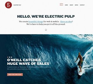
The homepage for the web design firm Electric Pulp follows a minimal design approach. Its brand message is easily accessible and allows you to scroll for more details. It even puts a little arrow below its copy so you know to scroll. It's all about context.
02. MailChimp
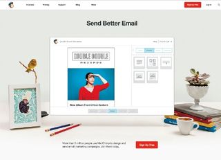
On the email marketing app homepage for MailChimp, no matter what screen width you view it at, the 'Send Better Email' and signup button are obvious.
03. Do
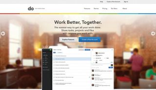
The website for the project management app Do wants you to either explore features or sign up. It keeps these options easily visible and prevents too much scrolling down for more info in its design.
04. Petsafe

The pet product ecommerce site Petsafe wants to make sure you know it has free shipping, so it keeps that visible through different screen widths.
05. Bold
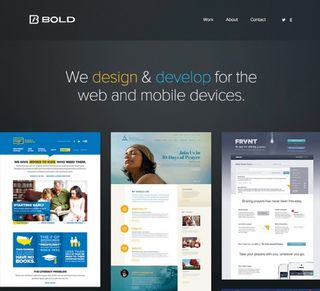
The website for web design firm Bold ensures the message and logo are the first things you get, no matter what screen size.
Words: Gene Crawford
Gene Crawford's mission is to work tirelessly at providing inspiration and insight for developers. This article originally appeared in net magazine issue 247.

Thank you for reading 5 articles this month* Join now for unlimited access
Enjoy your first month for just £1 / $1 / €1
*Read 5 free articles per month without a subscription

Join now for unlimited access
Try first month for just £1 / $1 / €1
Get the Creative Bloq Newsletter
Daily design news, reviews, how-tos and more, as picked by the editors.
The Creative Bloq team is made up of a group of design fans, and has changed and evolved since Creative Bloq began back in 2012. The current website team consists of eight full-time members of staff: Editor Georgia Coggan, Deputy Editor Rosie Hilder, Ecommerce Editor Beren Neale, Senior News Editor Daniel Piper, Editor, Digital Art and 3D Ian Dean, Tech Reviews Editor Erlingur Einarsson and Ecommerce Writer Beth Nicholls and Staff Writer Natalie Fear, as well as a roster of freelancers from around the world. The 3D World and ImagineFX magazine teams also pitch in, ensuring that content from 3D World and ImagineFX is represented on Creative Bloq.
