Why people focus on the right-hand side of a design
Website users instinctively have greater trust for content on the right-hand side, says UX designer Chris Da Sie.
In Western culture, we've always been told to design left to right to help guide users. We read left to right so we should position the most important content and elements in our designs to where a user's eye is going to look first. But let me ask you: by designing this way are users trusting the information you are providing? Are we getting the most interaction out of our users that we possibly can?
I would argue no. They are finding information and clicking on links because they have been trained to do so, not because of trust or emotional connections to our products.
These days there is a lot of talk about emotional design and how to properly create a connection between users and our products. Focusing on the right-hand side of our designs can create these connections. We have the ability to influence and change a user's belief in what is right and honest with our designs.

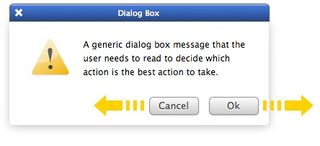
Take, for example, these simple dialog boxes (above). Which will get the best positive reaction by users? I’ll tell you: it's the one with the positive actionable button on the right. This is because users trust that the next step will pull them forward in the journey they are on.

By having the positive action on the right, we're helping create a more intuitive response. So why do we change this in our full sites by placing the most important and actionable elements in an area that the majority of the population doesn’t trust, connect with or find intuitively?
Trust the Golden Ratio
Recent studies suggest that people who are right-handed (which is 90% of us) tend to trust information positioned on the right of the page; more so than the information provided to us on the left side. Whereas individuals who are left-handed trust information given to them on the left side.
This plays well into the implementation of the Golden Ratio. Most times the Golden Ratio starts from the top left then spirally to a focus on the right. This is the argument presented by Daniel Casasanto of The New School for Social Research. He suggests that the majority of us "prefer the product, job applicant, or extraterrestrial positioned to their right."
Get the Creative Bloq Newsletter
Daily design news, reviews, how-tos and more, as picked by the editors.
Casasanto discovered that people "associate goodness with the side they can act more fluently on", and wanted to test several hypotheses to see what was causing this correlation. The questions he wanted to answer were: “Does motor experience ‘give rise to these preferences, or are they hardwired in the brain?’ If the former, ‘how flexible are these preferences? How much motor experience does it take’ to instill them?”
Neglected sidebars
When we look at this in regards to web design, have we been doing it all wrong? It would appear so. Our poor neglected sidebars are actually significantly more important than we've giving them credit for.
A sidebar can become an important tool for gaining creditability and trust with the majority of your users. We should start looking at this area as a place to drive important messages or actions.
This is an opportunity for us to connect with users on a deeper emotional level than we can with use of colours or fonts. We can move our emotional designs further than we’ve initially attended to.
Get Terminal
Further support for moving actionable and important information to the right side of our screens comes from a rather old concept; particularly a theory that’s been bouncing around since the age of newspaper design.
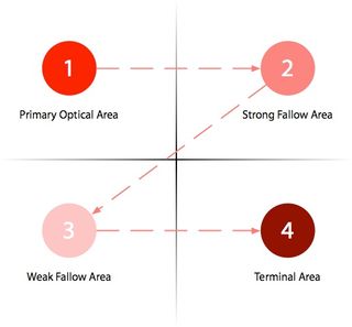
Known as the Gutenberg Diagram, this theory was first presented by Edmund C. Arnold. He believed that any medium could be split into four quadrants.
The first is the Primary Optical area, where intro copy could sit. The Strong Fallow area, then the Weak Fallow area, would follow the Primary Optical area, and finally in the bottom right corner would be the Terminal area.
It was suggested that users would spend the least amount of time viewing, remembering or even connecting with information within the Strong or Weak Fallow areas.

This theory is commonly used to help optimise layouts with a limited number of elements present. But since users move their eyes from top-left to bottom-right, we can see that putting an actionable item in our final quadrant will get the best result.
Not only does this theory help support the movement of placing our most important information in an area that becomes a user's focus but it helps increase the support for the Casasanto theory regarding trust and the association of goodness within the right-hand region of a display for right-handed users.
In designing your next product page, think about combining the Golden Ratio and the Gutenberg Diagram together to help build trust and the emotional connection between your product and the users. Let the subconscious sense of goodness be emphasised with users by making your sidebar or right-hand side of the screen push action.
Shifting the trust – the backwards F
Since our designs have been focusing on left to right and emotional connections through the use of colours and fonts, we need to shift users' accepted paradigms.
This doesn’t mean we are trying to train the eye to start reading right to left, but further guiding the experience to the right side of our screens to help create connections and actions.
Is this actually possible? It is: we can shift users' trust by “neural rewiring” what they consider to be right, credible and trustworthy through offering cues that lead focus a certain experience.
Experimental evidence
Look at the experiment that Casasanto did with 13 right-handed patients who'd suffered cerebral injuries that had left them weakened or paralysed on one side of their bodies.
A handful of these patients remained right-handed. The rest were now effectively left-handed. The group was shown two cartoon characters heads, a panda and a zebra. The zebra, they were told, was the good animal and the panda was the bad. They were asked to put the good animal, the zebra, into two empty boxes, left or right.
The patients that remained right-handed all put the zebra in the box on the right. All the now-left-handed patients put the zebra in the left box. This essentially showed that based on the ability to make decisions on trust and what is considered right and wrong or good and bad can be neural-rewired by which hand we can act more fluently with.
Quick rewiring
Casasanto determined that this rewiring could be done in as little as 12 minutes. He experimented with 53 individuals who had no cerebral damage and who were all right-handed. Twenty-six were given a glove on their left hand and the other 27 were given a glove for their right. They were given the same task as the initial test patients.
All of the ungloved rights hands put their good animal, the zebra, in the right box. Over two-thirds of the temporary lefties put the zebra in the left box. He concluded, “People generally believe that their judgments are rational and their concepts are stable, but if a few minutes of gentle training can flip our judgments about what’s good or bad, then perhaps the mind is more malleable than people think.”
Depending on your site and objectives, 12 minutes to influence your users' interactions with your content can be a long time. But we have already rewired users' sense of good and bad by forcing them into reading content left to right through our use of design patterns. We are changing and influencing users' values through these design patterns without them even being aware of these changes.
Other cultures
But what about the cultures that don’t read left to right like some Asian cultures? Would it be better to design the web in a backwards F instead of the forward F we use in Western cultures? It's argued that we've helped rewire the majority of the world populations’ trust to fit this mould.
Does this mean we are designing in the right way? Should we not be making the users' choice of trust as simple as possible? Should we not be digging deeper and letting the primitive instincts that are buried inside each of us control our choices?
You can do lots of market research to determine whether this is right or wrong but users won’t be able to answer this one, as the ability to trust part of a deeper subconscious decision. We can as designers help prove this theory by providing the best in user experience through adoption of these primitive and instinctive behaviours. Some designers have already when they implement the Golden Ratio into their designs. As mentioned, this is creating a certain trust and understanding between the user and the site or app.
Find your ancient caveman
Even though rewiring might be true and proven to be successful, we need to indulge these primal instincts to help users trust our content at levels that they wouldn’t even be aware of. Let’s start working towards building a stronger foundation with the majority of the population through the use of credible content located within the sidebar areas of our sites. Or even be so bold as to switch our design patterns to focus credible content on the right side and let the left stand as our secondary less important content.
We should treat this as one of the several emotional design techniques we can use to create pleasurable web experiences. If this theory proves correct we should see more engagement from a larger audience? Maybe so. Right now there is very little research into this debate, but it’s worth considering.
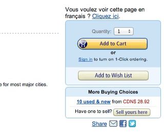
Look at where we place Buy Now buttons or float Learn More buttons. The majority of the time they are to the right. Sure we argue that its the colour, the font choice or even the messaging that causes users to click but does it come down to the primal instinct that designers have tapped into that says, “People are going to click here because they trust the placement of this button”? The majority of the time this is probably true based on the current research done by Casasanto.

Go with your gut
We are building a subtle primal trust that users aren’t even aware of when we start our layouts. We are making choices of right or wrong that sometimes get classified as gut reactions. But it goes deeper than that. It boils down to primal ways that we’ve worked so hard to bury.
We trust those gut reactions and most of the time we can’t even explain where they’ve come from. Wouldn’t this be true then for the users who are using your site?
Look at the design patterns around navigation placement. We typically float these to the right. Why? Is it because we always want to have the logo floating left? Not really. These decisions just feel correct and we argue that it’s what users expect. We are inviting users to participant in the content by placing navigation in a location they trust. Not because they have been rewired and are used to this, but in a primal way it’s right to do so.
Conclusion
We do so much to gain users' trust and build an emotional connection, but we can do more. Let’s start making our credible content work harder when it comes to building trust with users.
Instead of putting fluff in the sidebars, let’s put important information here that can be used as a key function building trust in our sites and apps. Let’s engage users at the primal level and connect our content to them as deeply as we can.
If the findings of this research are true then it can be predicted we will see a higher rate of engagement if this happens. We will also see stronger brand followers and supporters because they have that ingrained trust in our products. As more research is done on this topic, we’ll be able to see greater designs and smarter user experiences across the web.
Words: Chris Da Sie
Chris Da Sie solves digital problems with clean and clear designs. This is an edited version of an article that first appeared in net magazine.

Thank you for reading 5 articles this month* Join now for unlimited access
Enjoy your first month for just £1 / $1 / €1
*Read 5 free articles per month without a subscription

Join now for unlimited access
Try first month for just £1 / $1 / €1
The Creative Bloq team is made up of a group of design fans, and has changed and evolved since Creative Bloq began back in 2012. The current website team consists of eight full-time members of staff: Editor Georgia Coggan, Deputy Editor Rosie Hilder, Ecommerce Editor Beren Neale, Senior News Editor Daniel Piper, Editor, Digital Art and 3D Ian Dean, Tech Reviews Editor Erlingur Einarsson and Ecommerce Writer Beth Nicholls and Staff Writer Natalie Fear, as well as a roster of freelancers from around the world. The 3D World and ImagineFX magazine teams also pitch in, ensuring that content from 3D World and ImagineFX is represented on Creative Bloq.
