What's the point of unsolicited redesigns?
Why do some designers spend their time creating unsolicited redesigns of other people's sites? We take a closer look at this online phenomenon.
For better or worse, uncommissioned, unsolicited and uninvited redesigns have become somewhat of a fad. There's even a whole site dedicated to showcasing them, called Uninvited Designs.
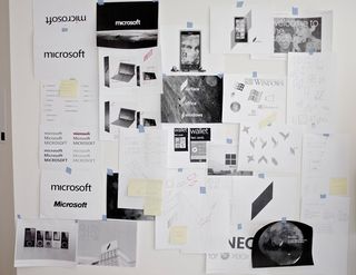
In some cases, they can lead to great things. Designer and student Andrew Kim posted his own rebranding of Microsoft - and Microsoft hired him. In other cases, they can come off as shallow and cosmetic - and poorly reflect the designer who created them.

What role do uninvited redesigns play in our industry? "They have zero context into the business goals, user needs and strategic plan," says Josh Brewer, former principal designer at Twitter. "You're essentially looking at the surface and saying, 'I would paint this painting differently.' It's a great creative exercise and I'm not knocking anyone that has done this. There are some great third-party Twitter apps that have done good, interesting takes on the core Twitter experience, and they meet the needs of a certain, small group of people. But there's all this context that's nonexistent in the approach and solutions they're proposing."
Designer and author Andy Rutledge has been creating unsolicited redesigns - which he instead calls 'Redux' - for years, at least publicly since 2005. "It's mostly a fun exercise for me. Traditionally, I've done it because I've spent most of my design time over the last few years trying to offer some sort of instructional material.
"So, they're not just, 'Hey, let's redesign XYZ.com'. It's more like, 'Something's wrong with this; let's see how it might be done better, and why'. It also helps me exercise my chops on things I don't get to design that much."
Making things better
Rather than redesigning a particular site, Rutledge prefers to address the category. "My [news redux] didn't take on The New York Times website as its subject; it took on news websites as its subject. For example, I removed many of the ads, but, in the article, I accounted for why it was necessary, beneficial and a positive step for the publication.
"I'm highly critical in my exercises, but the purpose is to affect something positive," he says. "The most common transgression is that it's just a redesign that never mentions what problems are being addressed or what issues are being tackled other than aesthetic preference. Unless there are specific constraints, design has no purpose, which is to say that redesign has no purpose. Even if it's a fun exercise, those constraints have to be acknowledged."
Get the Creative Bloq Newsletter
Daily design news, reviews, how-tos and more, as picked by the editors.
Words: Dan Mall
This article originally appeared in net magazine issue 248.
Liked this? Read these!
- Brilliant Wordpress tutorial selection
- Create a perfect mood board with these pro tips and tools
- The ultimate guide to logo design

Thank you for reading 5 articles this month* Join now for unlimited access
Enjoy your first month for just £1 / $1 / €1
*Read 5 free articles per month without a subscription

Join now for unlimited access
Try first month for just £1 / $1 / €1
The Creative Bloq team is made up of a group of design fans, and has changed and evolved since Creative Bloq began back in 2012. The current website team consists of eight full-time members of staff: Editor Georgia Coggan, Deputy Editor Rosie Hilder, Ecommerce Editor Beren Neale, Senior News Editor Daniel Piper, Editor, Digital Art and 3D Ian Dean, Tech Reviews Editor Erlingur Einarsson and Ecommerce Writer Beth Nicholls and Staff Writer Natalie Fear, as well as a roster of freelancers from around the world. The 3D World and ImagineFX magazine teams also pitch in, ensuring that content from 3D World and ImagineFX is represented on Creative Bloq.
