UX design for start-ups: get to know your users
UXPin CEO Marcin Treder explains his techniques for carrying out low-cost user testing that will make a world of difference to your UX design
User experience design is deeply human centric - it dies without a decent amount of interaction between human beings.
When was the last time you talked to your users? Hope it wasn’t too long ago! Even if it was though, don’t worry - it’s never too late to get to know your users. Today we’ll learn how to befriend them and use their unique perspective on a product to your benefit.
I’m Marcin, CEO of UXPin (the user experience design app), experienced UX designer and UX manager. I’m here to help entrepreneurs dive deep into the world of user experience design, and this is the second part of the course. If you haven’t read the first one: here it is.
If you have any questions, don’t hesitate to ask them through comments or on twitter (@marcintreder).
All right! Let’s befriend our users!
Getting out of the building
How do you imagine people designing a product? If you’re anything like me, you’re picturing people in front of desks full of papers, watching a huge screen with tired eyes while drawing some part of an interface.
The solitude of the designer.
Get the Creative Bloq Newsletter
Daily design news, reviews, how-tos and more, as picked by the editors.
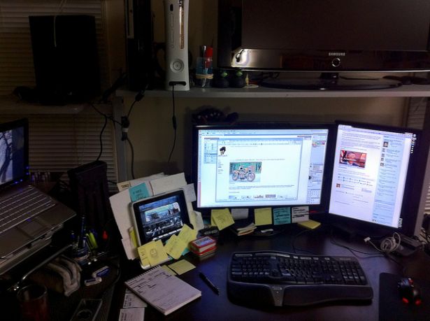
Damn, it’s depressing! Luckily, the image above is true only for one phase of the design process, the least important one - drawing. In the drawing phase you need to sum up your previous design efforts in a set of sketches - either on paper or as a digital wireframe or mockup. You might even go further and simulate interactions in a prototype made in a dedicated software, or in HTML; it won’t change the fact though, that drawing is not where great user experience design happens. Great user experience design happens when you talk to your customers and solve their problems.
Let’s remind ourselves of Steve Jobs’ words: “Design is not just what it looks like and feels like. Design is how it works”.
To succeed on the “how it works” side and create something really valuable, you need to focus on the whole experience, not just the aesthetic value. In design, thinking precedes drawing, so think through any design decision and always refer it to your C-P-S hypothesis (Customer, Problem, Solution):
- Does your design address your target group?
- Does it resolve their real problem?
- Is your solution an accurate response to your target group’s needs?
Remembering about the C-P-S triangle is the first smart thing you can do while designing. The second thing is to actually discuss your strategy with potential customers
Let me share the single most important thing that I’ve learnt about customer development: you won’t meet your customers in the reflection on your screen. You have to get out of the building and really talk to people. It doesn’t matter if you reach them by Skype (you might get out metaphorically) or in person - the important thing is to transcend the boundaries of your ego.
Don’t try to hack it, or your design will be lost.
If I’m asked to give one piece of design advice, it’s always: Root your design in the actual knowledge about your customers and execute mercilessly based on this. Don’t daydream, don’t say “my mom wouldn’t get it”, or “well I would use it!” - reach out to your customers and ask them what their thoughts are. Back up your design assumptions with knowledge to minimise the risk of failure.
When we started to negotiate our founding deal with our investors at UXPin, their first piece of advice was: “Pack your stuff and go to San Francisco to talk to your customers!” (We’re lucky to have wise investors, who were successful as entrepreneurs). We didn’t need much persuasion. A 14-hour flight and we were where the majority of our clients are – the USA.
And yes, it wasn’t easy to break our comfortable habits and start to have three meetings a day for around two weeks, instead of dilly-dallying in front of a computer for the whole day... but we did it. We put our introversive natures aside and fought for the sake of the people who trust us - our users.
We needed to know what they think about us, how they work, what they really need. There’s no other way to learn that than getting out of a building, approaching the users and asking the right questions.
When we got back home, we continued talking to customers via Skype and until today this is a part of our product development process, a routine which we do to make sure we’re on the right track.
This whole trip and our conversion to “customer centric madcaps” was the smartest thing that we could ever do for UXPin. Conversations with customers led us to change to a strategy which accelerated our growth to a rate of 50% (minimum) in sales each month.
This is amazing. You can actually be successful by creating a product that’s truly valuable to your customer! Captain Obvious strikes back? Kind of. How many start-ups do you know, though who seem to try hard to avoid talking to customers? I’m sure I know plenty of them.
You may wonder what the cost is of this kind of user research? If you’ve heard anything about professional user and market research, you're probably thinking thousands of dollars. Well, that’s true for professional lab research. The methods that we use cost us $0.
Guerrilla research
Guerrilla research methods were first used in the market research field following Jay Conrad Levinson's 1984 book “Guerrilla Marketing”. Guerrilla stands for atypical, cheap and somewhat aggressive methods of achieving goals.
An example of guerrilla marketing would be a graffiti or a flash mob used for promotional reasons. The crazier and more buzz-generating the better.
In the user experience design world guerrilla methods became known after the famous book “Don’t make me think” by Steve Krug, who encouraged designers to do research even if the only subject they tested their design on was their mom. It’s better to check your product with one person than not check it at all, argued Krug. Today we can call such a research method "guerrilla user testing".
There was a time in my career when I strongly disagreed with Krug. I believed that only methodologically valid research lead to meaningful results (no wonder, I’m kind of a statistics nerd). When I started my own company I quickly re-learnt Krug’s old wisdom though. Whether the results of a study are meaningful or not depends on your definition of meaningful. And you should always do research that is the most economically valid, that is, that creates the biggest value for the least amount of money.
Of course, the methodology of guerrilla user testing isn’t right. You can’t extrapolate the results achieved by one, two, or even ten people on the whole targeted population, but it doesn’t make it meaningless. It just makes it meaningful in a different way. Judge its meaning by the results it brings to your company and you’ll see the benefits in a brighter light than the flaws.
Quick and dirty research is an amazing way to explore your product. You’ll find out more possible problems than you ever bad-dreamed of. An additional perspective on your project is a lever that may be crucial for the whole endeavor. Each time we make a quick usability study (usually on around seven subjects) we learn so much about our own mistakes, which is just overwhelming. And bear in mind that two of the UXPin founders are experienced UX designers.
Each tested person increases the probability of your success, so I strongly encourage you to make it your routine. After all, it’s free and all you’re risking is a couple of hours.
How to do guerrilla user testing
Reach out to your users (or any approximation of the target group)
Think about where you can find your users. A local Starbucks? Walmart? Perhaps a park? It all depends on your target group. In our case, it’s easy since UXPin provides tools for UX designers, we just invite local UX designers to visit us in our office (it’s a small community and we all know each other somehow).
Wherever they are, grab your laptop and go and talk to them. Show them what you have and check if it’s usable. If finding your users is a problem (e.g. there’s no cafe or shop in your neighborhood and extreme weather plus polar bears make it tough to go outside) try your neighbors. In the worst scenario use your family. Just talk to somebody! Go outside your ego and check the value of your work.
You must remember though that your closeness to subjects will affect the feedback. Your family probably don’t want to hurt you.
Prepare a testing script
This is the single most important thing while preparing a usability test. The script guides your testers and shapes the whole interaction. Plan it thoroughly thinking about specific parts of the product that you want to test.
I always prepare a short story that provides a context for research. It lets subjects use their empathy and kind of role play (like in an old-fashioned RPG). Thanks to the context, people soak up the research and the whole situation is closer to real-life.
For example, in the last research we did at UXPin, we provided a brief from a client and a story out of a UX freelancer’s life. It helped our subjects stay on the right track and feel the pain of the problem they were trying to solve.
The results of the research were stunning.
Get your gear ready
The one thing that’s surprisingly easy to break during guerrilla usability testing is your gear. Here’s my short checklist, originating from my personal list of shameful mistakes:
- Always check your screen recorder before the session (recently, I didn’t notice that Silverback - which I strongly recommend, stopped working after a Mac OS X update).
- Always use ethernet or cable network, rather than WiFi (which likes to disconnect you during a study - been there, done that).
- Check that the mouse works properly (a customer sitting on my mouse almost ruined the research).
- Check the power source (oh yes, I’ve run out of power).
- Avoid any non-standard keyboard shortcuts (again custom settings on my Mac made it really awkward).
- Turn off all the unnecessary software (taking extra care with Skype and Messages).
Avoid these lame mistakes and you’ll be good.
Prepare the participants
First of all, accept the fact that people may be scared of your research. Give them confidence and treat them like experts in the field. Say clearly that the results of the tasks don’t matter; what matters is their opinion. Encourage them to speak aloud while performing tasks and justify this by the fact that you need to know what they’re thinking while interacting with the product.
Don’t let them blame themselves if something goes wrong. Let this experience be pleasurable.
Record the session
Record the screen (in the case of mobile app testing - a whole mobile), the face and voice of your research participants. It’ll let you easily assess what was going on during the interaction.
Analyse the results immediately
Always take some notes during the study. Write down only catchwords, which will help you remind yourself of a specific situation and won’t take too much time and attention during the test. As soon as possible after the study, change your notes into specific tasks.
In my experience - if you don’t do this in the first two days after each session, you’ll never do it.
Further research
So that’s guerrilla user testing. When to use it? As a cheap and quick method of research, guerrilla user testing is suitable for any phase of the product’s development in which you have at least a prototype that you can check.
And what if you don’t have a prototype? Or you want to test something other than an interface, like a general strategy of future development, or you want to check how people are dealing with some specific problems?
Use customer interviews
A customer interview is a simple, straight-forward, research method. You basically talk to people according to a script that you’ve prepared and you try to get as much from the conversation as possible. Ask in-depth questions, stretch your empathy to its limits, pay attention to every tiny detail, ask your participants to sketch solutions to their problems and sketch your own ideas. Just do whatever is needed to really dig in to the true nature of the problem.
The interaction should be natural. It’s like talking with a friend about their work problems. You need to encourage them to share at the start and when it blows, just listen and carefully dig deeper to really get to the core of the problem.
Though a customer interview may seem to be a little long-winded, it’s super efficient.
A conversation with customers is a truly refreshing experience and if you play it right, every minute will be super valuable.
Skype as a research tool
What if your customers live far away from you and you can’t visit them every couple of weeks? You might do your start-up thing from a remote forgotten land, like, say, Poland (oh yes, that's where we’re based). It shouldn’t stop you from doing a decent amount of guerrilla style user research. Make no compromises when it comes to your product’s user experience.
Just use Skype.
People are more willing to talk via Skype than have a coffee with a stranger. The awkwardness is kept to a bare minimum and the interaction feels somehow safer. You can stop it at any time, easily postpone, follow-up, etc.
Secondly, there’s no distance barrier. It makes the research even cheaper and eliminates any possible excuse for not having a conversation with a client.
Finally, you can easily record the conversation with your user and even see their screen using the “screen share” option.
Could it be easier? Don’t think so – I've done Skype research dozens of times and I have only positive experiences. Try it!
Systematic surveys
When you have all your guerrilla research methods in place, it’s time for creating a systematic way of gathering large amounts of feedback. This is an important addition, which is much closer to proper research methods than guerrilla style usability testing and customer interviews.
Why?
First of all, systematic surveys are, well, systematic. You can see how any changes made in a product affect the survey answers of your users. Every gathered reply is placed in a specific place in time. It’s ongoing, unstoppable research.
What’s more, you have a chance to reach out to a statistical representation of your target group. You can easily gather dozens of results and sum them up using statistical analysis.
All right, but how can you create an efficient survey? It doesn’t seem to be easy. What questions should you ask? How can you gather answers? How should you distribute the survey? I’m sure you have tons of questions.
Don’t worry about them. Seriously. Just use Survey.io supplied by KissMetrics and create a full-blown Customer Development Survey in two minutes.
We did it (leaving behind the surveys made in Google Docs) and honestly, this simple tool is one of my personal favorites.
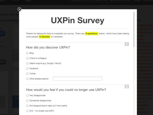
The results of using Survey.io are stunning. Applied in an unobtrusive way (take a look at the screenshot’s bottom right corner), it attracts lots of users. People want to share their thoughts with you. Just let them do it without any extra effort.
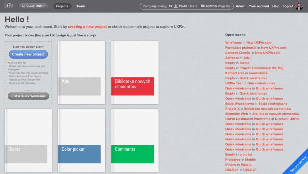
Users can click (whenever they are ready) on the blue ribbon (bottom right, on the screenshot above) and fill in the form that’s created automatically out of the template crafted by Sean Ellis, one of the start-up marketing gurus.
Could it be easier? Doubt it. Get ready to use a survey created by an experienced marketer.
Set up a feedback forum
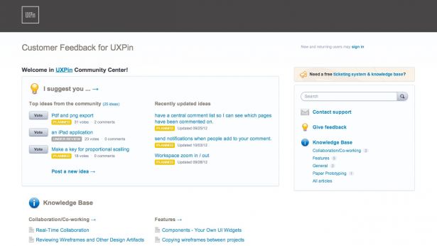
What’s that? It’s a special forum optimised to let people easily share their opinion about your product and suggest changes.
Sounds simple right? And it is. It’s a conversational space where you not only gather super valuable information, but also build your community. By creating a feedback forum you show your customers that you really care about their opinion.
There’s just one rule - talk with people. You should be the most active part of the community. Be with your users and listen to them.
There are many options on the market for setting up a forum, but the one I strongly recommend is User Voice. It’s an easy-to-use and highly efficient tool with a ticketing system, knowledge base and suggestions forum. Try it!
Communicate!
There’s one way to build a great user experience: active communication with customers.
Without the voice of your customers, your design will be an empty shell. Don’t let it happen.
Any stories about meetings with your users? Share them in comments!

Thank you for reading 5 articles this month* Join now for unlimited access
Enjoy your first month for just £1 / $1 / €1
*Read 5 free articles per month without a subscription

Join now for unlimited access
Try first month for just £1 / $1 / €1
The Creative Bloq team is made up of a group of design fans, and has changed and evolved since Creative Bloq began back in 2012. The current website team consists of eight full-time members of staff: Editor Georgia Coggan, Deputy Editor Rosie Hilder, Ecommerce Editor Beren Neale, Senior News Editor Daniel Piper, Editor, Digital Art and 3D Ian Dean, Tech Reviews Editor Erlingur Einarsson, Ecommerce Writer Beth Nicholls and Staff Writer Natalie Fear, as well as a roster of freelancers from around the world. The ImagineFX magazine team also pitch in, ensuring that content from leading digital art publication ImagineFX is represented on Creative Bloq.
