UI design pattern tips: popovers
In the latest in a series looking at website design patterns, Chris Bank of UXPin looks at popovers.
Once someone starts using your website or web application, they need to know where to go and how to get there at any point. If they can't navigate through your your application easily, you'll quickly lose them. Thus, designing effective navigation in your web application is crucial.
In this series for Creative Bloq, Chris Bank of UXPin, the UX design app, discusses the importance of navigation design patterns and details examples from some of the hottest websites and web apps today.
You can see previous posts in this series here. Meanwhile, for more examples of web design patterns, download UXPin's free e-book, Web UI Design Patterns 2014.
The problem
The user wants to view relevant information without losing their current place in the UI.
The solution
Show important notifications and additional information in popovers. This UI pattern has the advantage of providing a lightweight and straightforward way of viewing additional information or taking a particular action, but they do so without pulling the user out of their current activity.

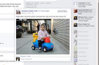
Pinterest and Fitocracy use modal popovers for quick actions, and Facebook uses popovers to quickly show snippets of content from the Activity Bar. The popover UI pattern is important for actions like these because they are being performed on the data and this way users always know what these controls apply to.
With the content still visible in the background, the user can tweak sorting options or change the font size without having to go back and forth between the views - it all happens right there. Popovers and modal windows can also be used to display important notifications or notices where it’s essential to get the user’s attention because dismissing them requires a tap or swipe.
Words: Chris Bank
Chris Bank is the growth lead at UXPin, a UX design app that creates responsive interactive wireframes and prototypes.

Thank you for reading 5 articles this month* Join now for unlimited access
Enjoy your first month for just £1 / $1 / €1
*Read 5 free articles per month without a subscription

Join now for unlimited access
Try first month for just £1 / $1 / €1
Get the Creative Bloq Newsletter
Daily design news, reviews, how-tos and more, as picked by the editors.
The Creative Bloq team is made up of a group of design fans, and has changed and evolved since Creative Bloq began back in 2012. The current website team consists of eight full-time members of staff: Editor Georgia Coggan, Deputy Editor Rosie Hilder, Ecommerce Editor Beren Neale, Senior News Editor Daniel Piper, Editor, Digital Art and 3D Ian Dean, Tech Reviews Editor Erlingur Einarsson and Ecommerce Writer Beth Nicholls and Staff Writer Natalie Fear, as well as a roster of freelancers from around the world. The 3D World and ImagineFX magazine teams also pitch in, ensuring that content from 3D World and ImagineFX is represented on Creative Bloq.
