UI design pattern tips: overflow menus
In the latest in a series looking at website design patterns, Chris Bank of UXPin looks at overflow menus.
Once someone starts using your website or web application, they need to know where to go and how to get there at any point. If they can't navigate through your your application easily, you'll quickly lose them. Thus, designing effective navigation in your web application is crucial.
In this series for Creative Bloq, Chris Bank of UXPin, the UX design app, discusses the importance of navigation design patterns and details examples from some of the hottest websites and web apps today.
You can see previous posts in this series here. Meanwhile, for more examples of web design patterns, download UXPin's free e-book, Web UI Design Patterns 2014.
The problem
The users want quick access to additional options or actions they can perform.
The solution
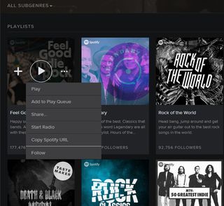
Hide extra options and buttons in an expandable menu so that they don’t clutter the main interface.

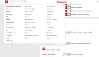
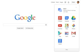
Both Facebook and Google use 'overflow menus' to maintain very clean user interfaces on their web apps by hiding the most important secondary options in an expandable menu. This can also be used to show the most important actions in terms of engagement.

For example Pinterest, keeps a share on Facebook button visible to help speed up a common and desirable user action on each pin.

Alternatively, an overflow menu can be used to contain additional menu items or actions as they are incrementally added to the UI.
Words: Chris Bank
Chris Bank is the growth lead at UXPin, a UX design app that creates responsive interactive wireframes and prototypes.

Thank you for reading 5 articles this month* Join now for unlimited access
Enjoy your first month for just £1 / $1 / €1
*Read 5 free articles per month without a subscription

Join now for unlimited access
Try first month for just £1 / $1 / €1
Get the Creative Bloq Newsletter
Daily design news, reviews, how-tos and more, as picked by the editors.
The Creative Bloq team is made up of a group of design fans, and has changed and evolved since Creative Bloq began back in 2012. The current website team consists of eight full-time members of staff: Editor Georgia Coggan, Deputy Editor Rosie Hilder, Ecommerce Editor Beren Neale, Senior News Editor Daniel Piper, Editor, Digital Art and 3D Ian Dean, Tech Reviews Editor Erlingur Einarsson and Ecommerce Writer Beth Nicholls and Staff Writer Natalie Fear, as well as a roster of freelancers from around the world. The 3D World and ImagineFX magazine teams also pitch in, ensuring that content from 3D World and ImagineFX is represented on Creative Bloq.
