Tie your website together with a strong narrative
Whether you create it purposefully or not, Gene Crawford says all websites have a narrative experience to communicate.
A narrative is any story or account that presents connected events. Your website is a narrative: the way a user traverses through a site's pages is the story that gets built for them. There are lots of ways to create a narrative, but the best experiences are natural ones.
Narrative experience in a website isn't new ground. There's been an explosion in websites that utilise long-form scrolling homepages. I think the main reason for this is companies' desire to tell their stories. Keeping things 'above the fold' has stopped being a deal breaker for website designs and the primary reason for breaking this mould is narrative.
Don't be unaware
Whether you create it purposefully or not, a website has a narrative. If a user comes to your site, scrolls and goes through a couple of pages, that is the story for them. All things lend to the narrative. It could be the writing itself, but often it's the partnership between the content and interactions. How users get to the content, view it, scroll it or catalogue it, will also all lend a hand in shaping their interpretation of what you are trying to say to them. Make sure to weave your personal or business goals into that narrative, too.
Don't force it
A natural inclination is to try to force a narrative. It isn't super-hard to pay attention to the story that's being told as you design a website, but it can get difficult if it's forced. Something as simple as the way you show off your products or the work your company has done can be the central narrative you build on. Delivering those things in an interesting way is the backbone of a strong story.
Here are five examples to check out...
01. Bold
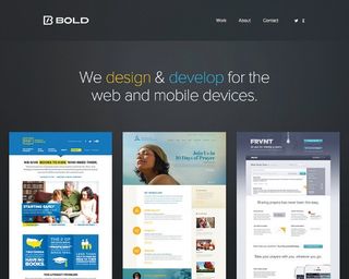
The web design company Bold uses a clear statement to describe who they are. It puts its recent work front and centre as the story of their company.
02. The Haberdash Fox
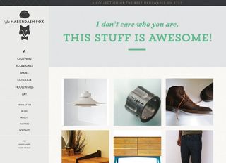
Online store The Haberdash Fox sells cool stuff. It tells you the story of how cool its stuff is by using clever headlines and revealing products as you scroll down the pages.
Get the Creative Bloq Newsletter
Daily design news, reviews, how-tos and more, as picked by the editors.
03. Playground
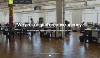
The creative agency Playground tells you its core values by way of literally having it written in blocks of story with supporting animations as you scroll down.
04. Shun Cutlery
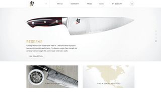
The cutlery store Shun Cutlery gives you a back story on each product and then reinforces that by letting you look upon the blades as if they are each pieces of art.
05. MailChimp Gather
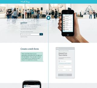
The SMS messaging app by MailChimp Gather shows you how to use the app as the central narrative on its homepage, reducing users' confusion and promoting them to think about how they will use it.
Words: Gene Crawford
Gene's mission is to work tirelessly at providing inspiration and insight for developers. His projects include www.unmatchedstyle.com and conferences such as www.convergese.com. This article originally appeared in net magazine issue 245.

Thank you for reading 5 articles this month* Join now for unlimited access
Enjoy your first month for just £1 / $1 / €1
*Read 5 free articles per month without a subscription

Join now for unlimited access
Try first month for just £1 / $1 / €1
The Creative Bloq team is made up of a group of design fans, and has changed and evolved since Creative Bloq began back in 2012. The current website team consists of eight full-time members of staff: Editor Georgia Coggan, Deputy Editor Rosie Hilder, Ecommerce Editor Beren Neale, Senior News Editor Daniel Piper, Editor, Digital Art and 3D Ian Dean, Tech Reviews Editor Erlingur Einarsson and Ecommerce Writer Beth Nicholls and Staff Writer Natalie Fear, as well as a roster of freelancers from around the world. The 3D World and ImagineFX magazine teams also pitch in, ensuring that content from 3D World and ImagineFX is represented on Creative Bloq.
