Switch styles with CSS
Nomensa’s Mark Napthine outlines the benefits of switching styles with CSS, and then provides a working example of how to create one

The debate on whether or not to provide text-resize widgets was a hot topic on a number of blogs towards the end of 2007. At one end of the spectrum, some felt they should be forever banished from the internet and that we, as web experts, should concentrate on educating users how to use their technology.
At the other end of the spectrum, it was argued that there are enough situations to justify such a widget and that educating users is too high a mountain to climb.
Let’s look at the plausibility of educating the user. In essence it sounds like the most practical, and ethical choice. Imagine everyone on the planet knowing how to resize text using their browser. Bliss! There are, however, some considerable pitfalls that stop this from being 100 per cent viable.
Firstly, there are a lot of people that require education; an international advertising campaign would be required to even make a dent. Not only do people lack the knowledge of how to resize text, the majority don’t know that it’s even possible, so they don’t look for ‘how to’ information.
There are some users that won’t or can’t be taught. These users include those with learning difficulties or cognitive disabilities, as well as infrequent users and those intimidated by technology.
The browser war we’re witnessing at the moment is gaining momentum. As a result, new browser versions are being released with the inevitable rearrangement of browser options. This may require a lot of help videos and online documentation – who’s to say in years to come we won’t be asking users for the versions of their browser!
It’s also been claimed that a text-resize widget may mislead users into thinking this functionality is only available if such a widget exists on a site. In my personal experience, however, they actually help educate through the sparking of conversation:
Get the Creative Bloq Newsletter
Daily design news, reviews, how-tos and more, as picked by the editors.
“Ooh, it has a lovely text resizing thingy on it!”
“Yes mother, you can do that on all websites these days, would you like me to show you how?”
There’s a tendency at the moment for implementations to be poor or inconsistent, but that shouldn’t detract from the concept. A typical misconception is that a text-resize widget relies on Javascript, but this isn’t the case. In addition, simply adding this type of widget to a site won’t magically make it accessible, usable or standards-compliant. That will come down to how the site, as a whole, has been implemented.
The bigger picture
The fact of the matter is that text-resize widgets are here, and appear to be getting more popular. There are also more people trying to educate their users through the use of videos and online documentation than ever before. But it’s not just about text size: the issue runs deeper. Layout options and colour switchers should be included in the debate because they’re as important as text size from an accessibility point of view, yet cannot be easily changed from the browser side.
Some people prefer a high contrast colour scheme for reading. Some use the Mac’s accessibility options, and some use browser-based widgets to apply a dark scheme to a website. I’ve also spoken to some super-techies who customise their text editors in this way, presumably to match that of their beloved terminal windows. Many older, partially sighted users and those with dyslexia also find text easier to read when it’s not presented on a pure white background (see www.lighthouse.org/accessibility/legible).
When it comes to layout options, switching to a ‘relaxed’ layout with plenty of space for the expansion of fonts is particularly useful for users with vision problems. Nomensa conducted research into the effects of applying zoom layouts off the back of a challenge set by Joe Clark at the 2005 @media conference.
Our research found multi-column layouts quicker to navigate, whereas zoom layouts were found to be easier to read. A two-column hybrid version was proposed as it offers the best of both worlds. When implemented as a style-switcher, it also allows the site to keep its visual identity.
Whose responsibility?
So who should be taking responsibility for this stuff? Leaving operating systems alone, we have the following shoulders on which to pile responsibility:
- The users
- The browsers
- The site developers

First, the users. People have to take some responsibility in knowing how to use their technology. Users do, however, need guidance, so how much responsibility they should take is a grey area. The usability of a browser’s interface is crucial in making sure a person can find the options they need, such as ‘text size’ and ‘print page’.
The browsers, meanwhile, can only take so much responsibility when it comes to changing the layout options and colour schemes on a site. They can’t be expected to cope with the amount of styling methods in use.
It could be argued that browsers are a hindrance rather than a help to the situation. Some browser vendors due to their size are in a powerful position to dictate how users interact with their browsers. Perhaps browser vendors should make their text resizing functionality more apparent to all users by default, therefore taking their online social responsibility more seriously.
Our responsibility as site developers is to understand the bigger picture, provide the facts and advise our clients as best we can. We should build websites that conform to web standards as well as the latest version of the Web Content Accessibility Guidelines (WCAG) v1.0, while preferably striving to exceed these recommendations where possible. This could allow greater progress on the web, which in turn could lead to more accessible and usable online experiences. This ultimately will allow more people to do more things online; this is innovation!
It’s reasonable to assume that no matter what browser technologies exist today or will exist in the future, there will always be scenarios in which the site can best deal with visual enhancements. These include alternative colour schemes and layouts. Text size is handled well by default browser functionality, even if the user is unaware of it. If you’re considering implementing a text-resizing widget, it would be prudent to change your mind, and provide a useful and effective style-switcher instead.
The draft of WCAG v2.0 includes a level AA requirement stating that ‘text (but not images of text) can be resized without assistive technology up to 200 percent without loss of content or functionality’. I’ve audited enough websites to know that many will fail this new success criterion – will your existing websites make the grade?
Building your style-switcher
When building anything, the first thing to do is get the requirements sorted. Based on what we’ve covered, the requirements for our style-switcher are as follows:
- It must not rely on JavaScript
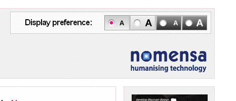
- It must use a simple and consistent user interface
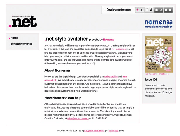
- It must provide a robust and fluid two-column layout as well as the default
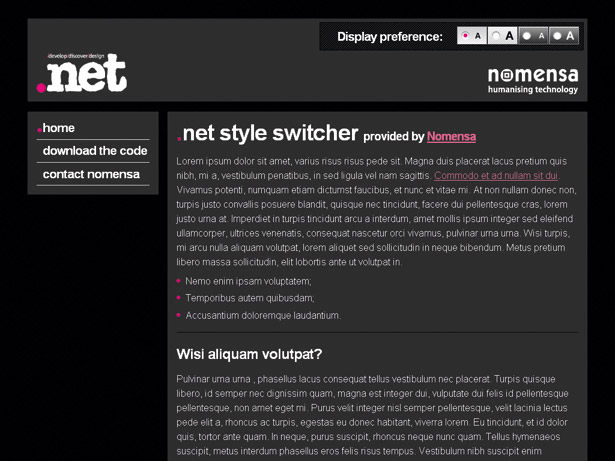
- It must provide positive and negative colour schemes for the two-column layout
- It must use the browser’s default text size when the two-column layout is in use
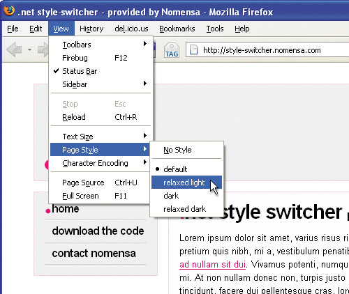
- The techniques used must be compatible with current browser functionality
- To keep the amount of design work to a minimum we only need to design the two-column layout with the negative colour scheme.
- When it comes to coding, the dark colour scheme will work with the default layout and vice-versa; the light column scheme will work with the two-column layout.

Coding the HTML and CSS
With the design aspect sorted we can go about coding the HTML and CSS. It’s always easier to start coding from scratch. Although possible, retrofitting a style-switcher to an existing site can be more difficult and take a lot more time. Remember to keep your code organised, think about how you’ll switch things as you go and remember to keep the general colour and layout styles separate.
The files for this style-switcher example can be found on the CD. There are two folders, named templates and live. The templates folder contains the development HTML and CSS. The live folder contains the optimised CSS and PHP code required to run the example.

Within the templates folder there’s an HTML file called style-switcher.html and a number of style sheets. The main style sheet, main.css, contains all the common styles as well as the default layout styles. There are also all the layout variant CSS files that together provide the styles for the layout options. For example, light.css includes all the additional styles for the light colour scheme.
/*======== LIGHT COLOURS AND CUSTOMISATIONS =======*/ /*= Colours and fluffyness for layout =*/ #header, #related {background: #f0f0f0} #content {background: #fffeff;} …I mentioned poor implementations earlier and one of our requirements was that the style-switcher must not rely on JavaScript. PHP code was used for this example (included on the CD with comments) but any server-side scripting will do. If you want to use JavaScript to enhance the switch, a good starting place would be 24ways.org/2005/introducing-udasss.
With a little care and attention it’s possible to structure your code in an effective way in order to provide all the styling needed to build a useful style-switcher. You can provide four layout and colour variations with minimal code and effort. Why not give it a go yourself? Your users will love you for it! The live style-switcher example can be found at style-switcher.nomensa.com.

Thank you for reading 5 articles this month* Join now for unlimited access
Enjoy your first month for just £1 / $1 / €1
*Read 5 free articles per month without a subscription

Join now for unlimited access
Try first month for just £1 / $1 / €1

The Creative Bloq team is made up of a group of art and design enthusiasts, and has changed and evolved since Creative Bloq began back in 2012. The current website team consists of eight full-time members of staff: Editor Georgia Coggan, Deputy Editor Rosie Hilder, Ecommerce Editor Beren Neale, Senior News Editor Daniel Piper, Editor, Digital Art and 3D Ian Dean, Tech Reviews Editor Erlingur Einarsson, Ecommerce Writer Beth Nicholls and Staff Writer Natalie Fear, as well as a roster of freelancers from around the world. The ImagineFX magazine team also pitch in, ensuring that content from leading digital art publication ImagineFX is represented on Creative Bloq.
