Seven lessons learned from responsive web design
What’s good for the developer isn’t necessarily good for the customer. Vince Allen, senior front-end developer at Lot18, gives the background on why responsive web design is the right focus for web development
While it may be exciting to work at a quickly expanding ecommerce company such as Lot18, our fervour was tempered a few months ago when the development team was faced with a choice: keep building on top of the site’s engine, which was never intended to be used for more than a few months after launch; or build an entire new platform from the ground up, one that could last us for years. We opted for the latter, cramming a year’s worth of work into three and a half months.
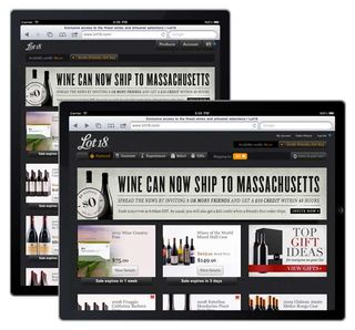
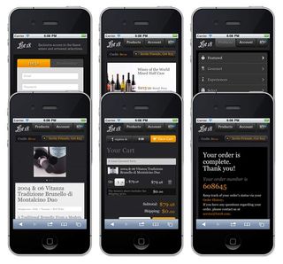
We also knew our visitors were accessing Lot18 in increasingly diverse ways, and that this trend would continue. Rather than anticipate our users’ preferences, we developed a responsive site that adapts and feels natural on a wide range of web-connected devices. Responsive web design was central to our development strategy, but it forced us to think differently than we ever had in development work.
Here are seven things we learned in building a responsive site in a short amount of time.
1. Really, how many sites can you build?
The good thing about being a developer is there’s always another device, browser or operating system to adapt to – no shortage of work. But building one version or app after another isn’t a sustainable strategy at a small company. Developing, testing and deploying a single code base streamlines almost every step in the process. When it’s crunch time and your eyes are tired, you can focus on one critical path – without distraction.

2. The business comes first
The holiday shopping season is the busiest for ecommerce – and it’s completely mental for sites specialising in food and wine, as Lot18 does. With thousands of shoppers planning parties and buying gifts, we couldn’t assume every purchaser would be sitting at a desk or, alternatively, would take the time to search for an app, download it and use it.
It was an equally unsafe assumption that any particular user would employ the same type of device for each and every visit to the site, or that any of a user’s friends invited to join Lot18 would have similar devices. Taking a responsive approach prioritises the business and reorients our thinking as a development team. We’re closer to customer experience and not solely focused on our own schedules and timetables.
3. Stop chasing platforms and build features
Freed up from targeting platforms, we could dedicate more time to building features for the new site. For example, as we overhauled our checkout system, we could focus on one UI/UX strategy without worrying about device-specific builds. Moving forward, the development team will be more feature-focused and efficient.

4. Everyone is QA
At a small company, everyone is busy and may not have time to walk through the new version of the site to help find bugs or unintended complications. But we encountered a nice consequence with our new responsive design: everyone could test the site on their own time.
Get the Creative Bloq Newsletter
Daily design news, reviews, how-tos and more, as picked by the editors.
If someone wanted to test or just check out the site in progress, they could use their phones during their commutes, or their tablets – or their TVs at home. Even better, this type of testing is likely closer to how our members use the site.
5. Be consistent across native apps and the mobile web
Lot18 will release a native iPhone app soon. Like most native apps, it is designed for iPhone and feels natural.
However, even the most dedicated app users will run into the mobile site via email, Twitter, Facebook, etc. The responsive site provides a consistency across the native and mobile web experiences, and reinforces the overall brand experience.

6. Explore new interactions
Leading up to the launch, we observed a new behaviour in people previewing the site. Once they figured out that the site responded to them, they started playing with it. Responsiveness adds dimension to the experience and provides a fresh look as users move from one device to another - or one device mode to another.
What I saw was an emotional reaction that translated as, "This is fun." This is always a good thing.
7. You’ll get reliable analytics
Finally, when comparing stats, it's nice to know that users are hitting the same code and interacting with the same content. We’ve also gained new perspectives on how users behave, and have already seen positive changes reflected in our metrics.
The best thing about our recent launch is that, for us, there’s no longer a 'real' Lot18.com. Instead there’s a Lot18 experience, with any visitor – regardless of the device used – capturing a particular facet. As a result, our development group is closer to the business and can act almost like an extension of the customer-service department, providing a better online-shopping experience – which can’t be bad in the highly competitive ecommerce space.

Thank you for reading 5 articles this month* Join now for unlimited access
Enjoy your first month for just £1 / $1 / €1
*Read 5 free articles per month without a subscription

Join now for unlimited access
Try first month for just £1 / $1 / €1
The Creative Bloq team is made up of a group of design fans, and has changed and evolved since Creative Bloq began back in 2012. The current website team consists of eight full-time members of staff: Editor Georgia Coggan, Deputy Editor Rosie Hilder, Ecommerce Editor Beren Neale, Senior News Editor Daniel Piper, Editor, Digital Art and 3D Ian Dean, Tech Reviews Editor Erlingur Einarsson and Ecommerce Writer Beth Nicholls and Staff Writer Natalie Fear, as well as a roster of freelancers from around the world. The 3D World and ImagineFX magazine teams also pitch in, ensuring that content from 3D World and ImagineFX is represented on Creative Bloq.
