The secrets of a creative approach to charity
Viktoria Harrison, creative director of charity: water, chats to Martin Cooper about rethinking the process of giving.
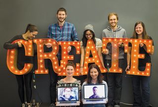
charity: water is a New York-based organisation founded in 2006 by Scott Harrison after a period spent in West Africa opened his eyes to the misery that a shortage of clean drinking water causes in many developing nations. The team's ethos involves exploring how creative approaches can re-energise people to engage with the idea of charity. We spoke to creative director Viktoria Harrison to find out more.
Can you introduce charity: water, and tell us a little of its story?
It started in 2006, on a couch in New York City after Scott Harrison returned from a two-year, life-altering experience in Liberia, one of the poorest countries in the world. Scott had come to NYC at 18 to rebel and escape from his (loving) parents. He joined a band, grew his hair and started working in nightlife, becoming one of the most successful and popular nightclub promoters in NYC. For years, he flew on private planes, spent his time with models and rich bankers, and drank a lot of champagne. But, he'll say, "I was the most selfish person I knew, and deep down, I was miserable".
One day, when he was about to turn 30, he decided it was time for a change. He began exploring his long-lost Christian faith, trying to find his true purpose in life, and realised he wanted to serve the poor.
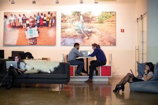
He moved out of his apartment, sold everything he owned, and dedicated a year of his life to volunteering on a travelling hospital ship in Liberia. He documented the work of volunteer surgeons who provided lifesaving surgeries in a country with one doctor for every 50,000 people. That's where Scott first saw the need for clean water in rural villages. He came back to New York inspired and convinced that access to clean water could greatly reduce the world's disease burden.
How many people do you employ, and how many have you helped?
We've got 67 staff. We've now funded more than 11,000 water projects in 22 countries that will serve over four million people with clean water.
How would you describe the charity: water brand?
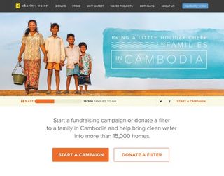
Often charities think you've got to shock people into opening their wallets by showing images of poor kids or abused animals. Our vision is to bring people who are disenchanted with traditional charity brands back to the table, and to project hope, life, laughter and the human spirit in our stories, photos and videos. At the end of the day, hope is much more powerful than guilt.
How important is the web to your organisation, and its goals?
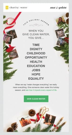
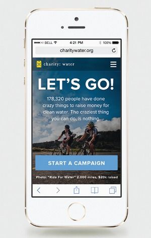
Very. We raise a lot of our donations online. We've built a platform called my.charitywater.org where people can start their own campaigns to raise money for clean water. For example, the actor Nathan Fillion's page has raised more than $200,000 from his fans.
We've found inspiring people to support our mission via grassroots efforts is much more exciting that just trying to persuade donors to sign big cheques. Participants express their personalities through these fun, often quirky personal campaigns; we believe in the power of tribes to change culture, and the internet is the biggest tribe there is. We've got a lot of culture shifting to do when it comes to people's attitude towards giving.
Another reason the web is important is because we want everyone who donates to see where their money goes. We post GPS coordinates of every well we build on a public map on our site, and send people a report letting them know which water project their money was spent on. We could never do this if people were writing us cheques, and we had to send them GPS coordinates in the mail.
Have you optimised charity: water's site to work in areas of the world with less plentiful bandwith than New York?
No: we don't raise funds from people in low-bandwith countries yet. Our site is mostly geared towards the US, Europe, Australia and Canada.
Your site design is very strong, purposeful and consistent. What are your guiding design principles?
We're a small team so we don't have a lot of 'rules'. Most of the UI is done by two people: Denny McFadden, our senior product designer, and Alessandra Mosenifar, who just moved from China to be our UI designer. Our graphic designer, Mike Smith, comes up with each new campaign's look and feel and then Denny and Alessandra translate it into simple, beautiful and responsive page layouts.
If I had to give guiding principles, I'd say our biggest ones are 'be passionate about the work' and 'excellence happens through iteration'. Every time we design a page or a campaign, we know it's going to raise money to bring clean water to people in need, so it's easy to be passionate about the design. And because we're passionate about what we do, we also want it to be as excellent as possible. We average about 16 revisions of a page design, before ending up with the final product.
What's the key to consistent design?
We keep our basic site pages pretty consistent – they derive from a template. Otherwise, I'd rather have originality and creativity over consistency: we give each initiative its own look and feel.

'Design is at the centre of everything we do': it's easy to say; hard to live by. But in your case, it seems to be true…
That mightn't be the case if you asked the accounting department, but it is for the Creative Team and the founder. Scott was passionate about design from the beginning: he thought charities were poorly designed, and that was a shame. [New York Times columnist] Nicholas Kristof has a famous quote: "toothpaste is peddled with far more sophistication than all the world's life saving causes". We knew from the beginning good design would make us different.
How should a designer go about generating and conveying emotion?
It always helps to care about what you're creating. More practically, we think real, beautiful photography is imperative in design. We've always relied on photography to tell the stories of the people we serve; it's one of our most important tools. There's just nothing that can describe a day in the life of a woman in Mali or Niger, who has to wake up at 5am to carry water for three hours, like a good photo. Great photography tends to compress distance and remind us that we are all made of the same stuff.
How important is social media? And how do you select the right platforms?
Social media has played a very important role in awareness about our cause. We're careful to use it as a two-way conversation, not as a megaphone. We typically select platforms based on our gut – so we knew instantly Instagram was totally 'us' when we saw it. We were the first non-profit and the second company on there when it was still small.
Beyond the web, does charity: water produce physical items that tell its story?
Yes, we have a little store on our site. It doesn't make a lot of money, but we're passionate about the things we make for it – we want people to be able to own a piece of charity: water in their daily lives.
If you have one piece of advice for another charity, what would it be?
Don't neglect creativity and great communication. A lot of charities are so good at helping people, but stink at telling their own story in inspiring ways. Many believe hiring creatives, designers and great photographers is a waste of money, which is a shame, because if they saw how well a good creative team could tell their story, they would see that it could raise a lot more money for their cause, and ultimately help more people.
What do you look for in a designer?
All our designers have to be able to work really well with others – it takes an entire team to do the work we do –and we also look for curiosity about the business.
Dieter Rams said: "Good design is as little design as possible". That's a hard concept to master – you naturally want to insert yourself into the work, which often creates excess. It takes discipline to know when the time is right for self-expression, and when it's not. So we find designers who keep their eyes on the business purpose of a project will most likely prune out a lot of the unnecessary fluff.
So we look for experienced designers who've got all the design stuff out of their systems long ago, and assess, "Is this page design accomplishing all this feature needs it to do in the simplest way possible? If so, my work here is done." Anything beyond that is just design for design's sake. And that tends to be really unattractive.
What are your plans for the future?
Have better design than most for-profits. Have the most fun, genuine and passionate working environment of any US company. Continue to treat people with kindness and respect while demanding excellence. Change the world and go down in the history books. Help 100 million people access to clean water. Then help a billion. And then... end the water crisis in our lifetime. Is that crazy? But around here we like to say: "The craziest thing we can do... is nothing."
Words: Martin Cooper
This article originally appeared in net magazine issue 254.

Thank you for reading 5 articles this month* Join now for unlimited access
Enjoy your first month for just £1 / $1 / €1
*Read 5 free articles per month without a subscription

Join now for unlimited access
Try first month for just £1 / $1 / €1
Get the Creative Bloq Newsletter
Daily design news, reviews, how-tos and more, as picked by the editors.
The Creative Bloq team is made up of a group of design fans, and has changed and evolved since Creative Bloq began back in 2012. The current website team consists of eight full-time members of staff: Editor Georgia Coggan, Deputy Editor Rosie Hilder, Ecommerce Editor Beren Neale, Senior News Editor Daniel Piper, Editor, Digital Art and 3D Ian Dean, Tech Reviews Editor Erlingur Einarsson, Ecommerce Writer Beth Nicholls and Staff Writer Natalie Fear, as well as a roster of freelancers from around the world. The ImagineFX magazine team also pitch in, ensuring that content from leading digital art publication ImagineFX is represented on Creative Bloq.
