Psychedelic site captures music festival's design philosophy
Is this what you'd see if you plugged your finger into the socket that's animating the universe? The Moogfest team think so!

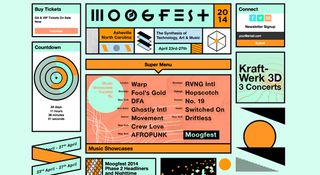
Moogfest is an annual event that honors Robert Moog and his amazing musical inventions. A five-day, multi-venue event, Moogfest is dedicated to the synthesis of technology, art and music.
This year, the Moog team has given the festival's brand and website a complete makeover. Here, we speak to brand director Emmy Parker about the redesign.
What was the inspiration behind this year's design?
Over the last 15 months we've completely redesigned Moogfest as brand and an event to more closely reflect the Moog ethos. We are a small company of builders, engineers, musicians, physicists, artists and designers - there are a lot of dynamic minds, wild ideas, otherworldly sounds and moving parts in our factory and we wanted that frenetic energy to be captured in the design of the Moogfest website.
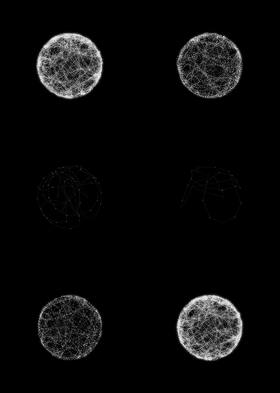
I kept coming across these brilliant animated GIFs by Mat Lucas on Tumblr. I reached out to him and he understood what we were trying to achieve so we ultimately tapped him to develop the identity for Moogfest 2014. Mat worked closely with Logan Kelly, the design lead in the Moog multimedia department, to bring that identity to life across all the various platforms. Together, Mat & Logan did 100 per cent of the design work.

How did you choose the striking colour palette?
The same team responsible for Moog Music's branding is responsible for Moogfest, so we all have an intimate connection to our inspiration which is the innovative spirit of Bob Moog, the founder of Moog. We are guided by something Bob said about our design philosophy: "Everything has some consciousness, and we tap into that."
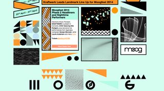
These are the colours we think you'd see if you could plug your finger into the socket that's animating the universe
These are the colours we think you'd see if you could plug your finger into the socket that's animating the universe. Moogfest is basically our idea of what the Moog brand would experience on a good psychedelic trip. It's a personification of all the ideas, concepts, sounds, images, artists and technologies that have informed and continue to influence the journey Moog has been on for the past 60 years - designing tools for artists to create the sounds of the future.

Which font did you use for the Moogfest title?
A tweaked version of Gestalt Bold.
What did you use to build the site?
We're using Drupal but it's all hand coded by Jeff Rix. Moog's site is also built on Drupal.
What was the most technically challenging part of the project?
The splash page, the counter and when Jeff broke his arm skateboarding.
Liked this? Read these!
- Create a perfect mood board with these pro tips
- The ultimate guide to logo design
- Brilliant Wordpress tutorial selection
Have you come across any wonderful websites? Let us know in the comments box below!

Thank you for reading 5 articles this month* Join now for unlimited access
Enjoy your first month for just £1 / $1 / €1
*Read 5 free articles per month without a subscription

Join now for unlimited access
Try first month for just £1 / $1 / €1
Get the Creative Bloq Newsletter
Daily design news, reviews, how-tos and more, as picked by the editors.
The Creative Bloq team is made up of a group of design fans, and has changed and evolved since Creative Bloq began back in 2012. The current website team consists of eight full-time members of staff: Editor Georgia Coggan, Deputy Editor Rosie Hilder, Ecommerce Editor Beren Neale, Senior News Editor Daniel Piper, Editor, Digital Art and 3D Ian Dean, Tech Reviews Editor Erlingur Einarsson, Ecommerce Writer Beth Nicholls and Staff Writer Natalie Fear, as well as a roster of freelancers from around the world. The ImagineFX magazine team also pitch in, ensuring that content from leading digital art publication ImagineFX is represented on Creative Bloq.
