Providing responsive images with Drupal
Serving images to mobile devices can prove a major annoyance for developers. Michael Herchel highlights a number of methods to make life more flexible
This article first appeared in issue 232 of .net magazine – the world's best-selling magazine for web designers and developers.
Most web developers using responsive techniques know that serving up images to low-bandwidth mobile devices can be an ache within a headache.
Even if you set your max-width on your images to 100% and set your height to auto (you should), the web server still sends the full image to your user’s device. This sucks up potentially precious bandwidth on your user’s mobile connection. And, as we all know (right?), mobile optimised websites shouldn’t just be formatted to the screen, they should be optimised for the low bandwidth connections mobile devices frequently encounter.
Luckily for most devs, our industry’s geniuses have been hard at work devising techniques to ease this pain. Popular techniques include Mairead Buchan’s method, creating responsive images using the noscript tag, and Matt Wilcox’s adaptive image system.
In this tutorial, we’ll be solving this problem four times, thanks to the latest version of the Drupal CMS, 7, and its vast, user contributed module library. We’ll be looking at the adaptive image module, the adaptive image styles module, the client-side adaptive image module and, finally, the responsive images and styles module. These represent great solutions to optimising your Drupal website for bandwidth starved mobile devices; all modules used employ the techniques listed above.
START Adaptive image module

Download and extract to your sites/all/modules directory. Log in to Drupal and navigate to Admin > Modules. You’ll find the module under the Other section. Check the box; hit Save Configuration.
Article continues below2 Adjust module
Navigate to Admin > Configuration > Image styles. Create a new image style by clicking Add Style. Name it adaptive. On your next screen, Drupal enables you to add effects: you can resize, crop, scale, rotate and more. Select adaptive then hit Add.
3 Set breakpoints
In the next screen you’ll have an option to set resolution breakpoints. The module uses four resolutions by default; it also provides the option to send either the smallest or largest in the event resolution cannot be determined. Select appropriate options; hit Add Effect.
4 Configure content
We need to configure our content type to use our new image style. Navigate to Admin > Structure > Content Types. You’ll see a list of all of your website’s content types. Click the manage display link next to the content type you want to use this image style.
5 More options
Next, select the cog icon that appears to the right of the image you want to apply this style to: several options will appear. Within the Image style drop-down menu, select adaptive. Once that is selected, scroll down and hit the Save button to save your settings.
Sign up to Creative Bloq's daily newsletter, which brings you the latest news and inspiration from the worlds of art, design and technology.
6 Adaptive image styles
Like the adaptive image module, this uses Matt Wilcox’s system. Download and extract to sites/all/modules. Navigate to Admin > Modules in Drupal – AIS will be under the Media section. Check the box; hit Save Configuration.
7 AIS changes
AIS requires you to make a change to your web server’s .htaccess (or web.config) file. This tells the server to call the AIS script when it gets a request for an adaptive image. Add the above code to Drupal’s .htaccess file at the end of the rewrite rules section (near line 99).
8 Breakpoint edits
On installation, AIS will have an image style called adaptive, and will create several adaptive image styles listed under image styles. To configure, head to Admin > Configuration > Adaptive Image Styles. From here you can edit breakpoints for your adaptive images.
9 Set node type
After you’ve edited your breakpoints (if needed), you still need to set your node type to use the adaptive image style. To do this, navigate to Admin > Structure > Content Types, and click the manage display link. From here, click the cog icon next to the image field, and modify the image style to adaptive.
10 Client-side adaptive image
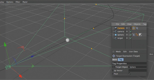
This employs Mairead Buchan’s use of the noscript tag. Download and extract it to sites/all/modules. Log in, navigate to admin/modules, find module under Media, check box and click Save Configuration.
11 New techniques
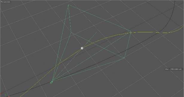
Client side adaptive image is different from the previous modules. First we need to set our breakpoints. By default the module provides five, but you can adjust this under Admin > Configuration >Adaptive Images. Here we’re setting this value to 3.
12 Add more styles
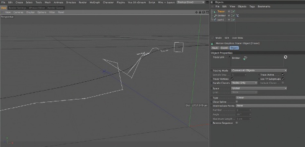
In this next step, we need to configure image styles for each breakpoint. Go to Admin > Configuration > Image Styles and hit Add Style. The first style will be called 420_small. In the select list, pick Scale and hit Add. Set the width to 420px and hit Add Effect.
13 Further sizes
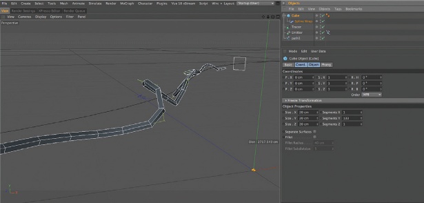
Next, we need to do the same for our next two breakpoints. We’ll create a new image style called 730_med, and set the scaling width to 730px, and another style called 1020_large with the scaling width set to 1020px. At the end, you’ll have three new image styles.
14 Content type
Next we set our content type to use the new styles. Go to Admin > Structure > Content Types, and click manage display next to your content type. Client-side adaptive image uses a different display formatter; under the format column change Image to Adaptive Image.
15 Configure styles and breakpoints
After changing the content formatter for your image, click on the cog icon that appears to the right. The screen above will appear. This allows you to associate specific image styles with breakpoints. Configure the breakpoints and image styles as shown and we’re all done.
16 Responsive images and styles
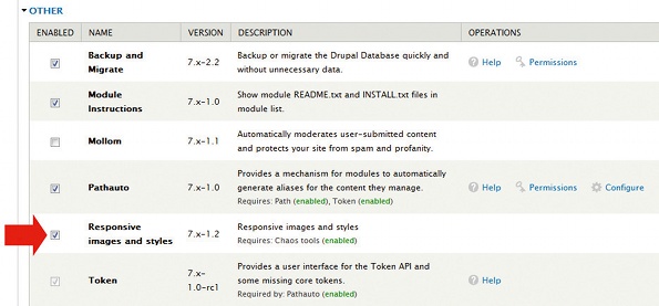
This final module dynamically changes image style (and resolution) via JS that detects screen size. Install, extract to sites/all/modules, log in, go to Admin > Modules and Other. Tick box and hit Save Configuration.
17 Several styles
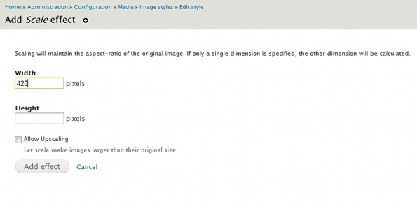
We need to create a few image styles. We’ll call the first demo_narrow. From the available effects drop-down, select Scale and hit Add. Set width to 420px and click Add effect. Create two more styles, demo_normal and demo_wide, scaled to 730px and 1020px.
18 Associate styles with breakpoints
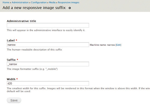
Go to Admin > Configuration > Responsive Images. Click Add at the top. Set label to Narrow, suffix to _narrow and width to 420. Repeat the process to create two more responsive image suffixes for the remaining image styles.
FINISH Ready to roll
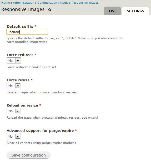
Select the Settings tab at the top right of the Responsive Images Configuration page. Set the default suffix to _narrow. Click Save Configuration. At this point, the responsive images and styles module is ready and will load the appropriate images to your device!
Thanks to Lyza Gardner for her technical peer review of this tutorial
Discover the top 20 online resources for web design training at Creative Bloq.

The Creative Bloq team is made up of a group of art and design enthusiasts, and has changed and evolved since Creative Bloq began back in 2012. The current website team consists of eight full-time members of staff: Editor Georgia Coggan, Deputy Editor Rosie Hilder, Ecommerce Editor Beren Neale, Senior News Editor Daniel Piper, Editor, Digital Art and 3D Ian Dean, Tech Reviews Editor Erlingur Einarsson, Ecommerce Writer Beth Nicholls and Staff Writer Natalie Fear, as well as a roster of freelancers from around the world. The ImagineFX magazine team also pitch in, ensuring that content from leading digital art publication ImagineFX is represented on Creative Bloq.
