Prototype construction basics with Axure
In this exclusive excerpt from Axure RP 6 Prototyping Essentials, Ezra Schwartz explains how to set up a solid foundation for an Axure file and create use case as well as task flow diagrams and generate an HTML prototype
Sign up to Creative Bloq's daily newsletter, which brings you the latest news and inspiration from the worlds of art, design and technology.
You are now subscribed
Your newsletter sign-up was successful
Want to add more newsletters?
Five times a week
CreativeBloq
Sign up to Creative Bloq's daily newsletter, which brings you the latest news and inspiration from the worlds of art, design and technology.

Once a week
By Design
Sign up to Creative Bloq's daily newsletter, which brings you the latest news and inspiration from the worlds of art, design and technology.
Once a week
State of the Art
Sign up to Creative Bloq's daily newsletter, which brings you the latest news and inspiration from the worlds of art, design and technology.

Seasonal (around events)
Brand Impact Awards
Sign up to Creative Bloq's daily newsletter, which brings you the latest news and inspiration from the worlds of art, design and technology.
This is an edited excerpt from Chapter 3 of Axure RP 6 Prototyping Essentials by Ezra Schwartz.
User experience design is part art, part craftsmanship; the fusion of methodology and patterns with creative problem solving. The prototype plays a major role in the success of UX projects because it is simultaneously a concrete interactive preview of both the vision and the actuality of the application being designed. For the UX designer, Axure offers the ability to deliver simulations of rich interactive user experience, quickly, iteratively, and without having to know programming.
A few years ago, the cost of providing timely interactive prototypes was prohibitive for many companies. Most UX designers are not programmers and so have been limited to producing static wireframes in Visio or similar tools. Skilled developers had to be engaged in order to convert the static wireframes into interactive JavaScript, Dynamic HTML, or Flash simulations.
This was a mini development effort that required the UX designer to invest a significant amount of time to communicate interaction flows and the behaviour of various widgets to the developer, and later help debug the simulation. Once a prototype has been coded, it typically reflected an outdated version of the actual static wireframes because in the meanwhile, the wires were subject to a number of iteration cycles.
With Axure, UX designers can create very sophisticated interactive prototypes without having to know how to code or having to engage developers in order to create the simulation. The gap between our ability to imagine the experience and articulate it in the prototype had closed. With this power also comes a demand for prototyping methods, techniques and best practices. As projects have so many processes after all, why re-invent the wheel.
In this post, we cover how to set up a solid foundation for an Axure file.
Prototyping principles
I would like to propose three simple, project-agnostic guiding principles to prototyping, which you can keep in mind as you approach a new UX project and throughout the effort:
Sign up to Creative Bloq's daily newsletter, which brings you the latest news and inspiration from the worlds of art, design and technology.
- Estimate, plan, and keep re-evaluating the prototyping and specifications effort. This will go a long way to help you deliver on vision, on time, and on budget while maintaining your sanity.
- Master the tools you are using, including Axure. The tools we master and the quality of our craftsmanship help shape our deliverables, and in turn increase the confidence of our clients and partners in our expertise and in the vision we help shape.
- Just because you can do it in Axure does not mean you have to. Be strategic about the amount of low-level high fidelity details to which you are committing.
Throughout my book, I demonstrate the application of these principles to real life scenarios using a demonstration project or sample snippets, which you can download from www.packtpub.com/support. You will find that, although many of the ideas and best practices are presented in the context of Axure, they are in fact tool-agnostic and can help you in your work even if you use other prototyping tools.
Alexandria, the Digital Library Project
Elephants and mice share common ancestors and similarly, albeit oddly compared, UX projects for the global enterprise, share the DNA of much smaller UX projects. Core activities such as discovery, user and application research, requirements gathering, iterative design, and usability testing are fundamental to user-centered design despite potentially profound differences in the scale and complexity of the projects.
My book's sample project simulates the design process of a digital library web and mobile application, named after the city that was home to the largest library of ancient times, Alexandria. The choice of this subject matter was driven by the many opportunities to demonstrate numerous Axure features and techniques, in the context of an application that conceptually, is familiar to most readers.
Of course, there are many ways to skin a UX project and obviously, the demo project is a much simplified, abstracted version of what happens in reality, where the process involves rapid cycles of iterative design as we move from the concept to the detailed design. Still, the goal is to demonstrate the process of developing an interactive prototype and generating UI functional specifications with Axure from the ground up.
Any prototype incorporates many inputs that inform the design approach, including:
- Business requirements.
- Feedback from users and stakeholders.
- Intermediate usability tests to validate the proposed design.
We begin the demo project by incorporating some high-level requirements and use cases, which serve as the foundation of a high-level, conceptual framework for the wireframing and prototyping phase. It will be an opportunity to discuss how Axure's diagramming capabilities feed the wireframing process. We will move to construction methods that include masters and dynamic panels, and include some examples of iteration and feedback that will require a rework of our initial construction.
As we dive into topics such as interactions, widget libraries, styling, and annotations, the demo project helps visualise various concepts and construction methods, when applicable. From a workflow perspective, we begin with a stand-alone RP file, Axure's default file format, and discuss collaboration extensively in Chapter 9, when we convert the project into a shared project RPPRJ file to demonstrate teamwork features and workflows. Throughout, we consider various prototyping and specifications activities in the context of the overall project plan, development methodologies, effort, and resources estimation.
Getting started — productivity in 30 minutes
Pardon the gimmicky header, but I want to emphasise Axure's value proposition as a primary UX design application. Any tool must balance its cost, feature set, and ease of use. If you purchase software with your own funds, clearly you ask: "If I invest time and money in this new tool, how soon can I be productive and do actual work?" In the case of Axure, the answer is days, often hours, and minutes, which will be the case for most of the activities outlined in this chapter.
In many projects, the initial use of Axure will be to develop a vision prototype, or a proof of concept (POC) — a high-fidelity, polished, and clickable prototype. More than anything else, it is a sales tool that plays a major role in rallying top management to support major investment in the next generation of a software product, or to persuade investors to bet on a new venture. Key attributes of the POC are:
- Not burdened too much by detailed business, functional, or technical requirements.
- Highly interactive simulation that highlights new features of the proposed approach to innovative user experience.
- Highly polished execution that incorporates branding and visual design.
The POC articulates the appearance and behavior of the new software. It presents its 'look and feel' in the best of all possible worlds. The closer the actual product ends up being to the vision, the better job we did as UX architects. It is an opportunity to think 'out of the box', while keeping in mind the fact that a box does exist in the form of budgetary and technical constraints.
Therefore, let's assume you have already completed some of the initial project tasks, including:
- Strategy sessions with various stakeholders in the company.
- Contextual interviews with end users.
- Establishing a base line by conducting usability studies of the existing application.
- Reviewing of competitive and related applications.
- Analysing the site's content.
- Developing the taxonomy and global navigation.
- Having a list of key features and user flows.
- Developing personas and a matrix of user roles and their key tasks.
- Having high-level business requirements.
With this solid understanding of the product and its intended users, you are ready to dive into Axure and unleash your creative energies. In this post, you will learn how to use Axure to:
- Create use-case diagrams.
- Create interaction flow diagrams.
Initial requirements and use cases
Based on discovery activities conducted so far, you have a list of high-level requirements that provide a core set of guidelines and define the product offerings. In some projects, the list of business requirements is handed to you, and in other projects, you can play a key role in their development. Regardless, the requirements should not define the user experience. Rather, our contribution as UX designers is to translate the requirements into an excellent practical user experience.
Let's digest the first set of requirements:
- From the home page, the user should be able to browse or search the library.
- The user should be able to get more information about a title without leaving the home page.
- Each title should have a dedicated page with full details, as well as preview capabilities.
- The user should be able to search the library from any page, using either a simple Google type search box or an advanced search feature.
- Search results will be presented in a list of matching titles.
- The user should get more information about a title without having to leave the search results screen.
- From the search results screen, the user should be able to access any title's detail page.
- If no matching titles are found, then provide the user with a relevant notification.
Good requirements can be easily broken into short and unambiguous sentences with a syntax that includes the user, a user action, and the interaction outcome. In other words, each of these sentences becomes a use case. Use case methodology is beyond the scope of this book, but a wealth of information on this subject matter is available.
The high-level requirements with which we started, drive the following use cases:
- Browsing items of the library.
- Searching the library for specific item(s) with Simple search.
- Searching the library for specific item(s) with Advanced search.
- Viewing search results.
- Viewing item details.
Axure is an integrated wireframing, prototyping, and specifications system. It means that we can start developing the specifications document in parallel to the wireframing and prototyping effort. Diagrams are a good example of important documentation that can be created in Axure and generated in the Word specification document.
Use case diagram page
When you launch Axure, it opens with a blank new file with a home page and three nested siblings (see the following screenshot, A). I recommend keeping the structure and flow pages, such as use case and flow diagrams, in a section above the wireframe pages. Note that the order of pages in the Sitemap pane is the order in which those pages will appear the HTML prototype and Word specifications table of contents.
By placing the structure and flow pages first, you control the logical narrative that provides high-level abstractions, such as user flows, before moving into the actual wireframes and interaction. This will work well in early review meetings, as you describe the prototype. Additionally, in a later stage, readers of the UX specification will be able to form a clear idea of the application by following the page progression.
In the Sitemap pane, add a New Sibling page above the Home page (B) as shown in the following screenshot:
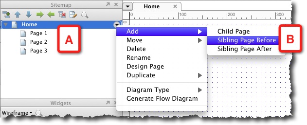
Double-click on this new page to open it as a tab in the Wireframe tab. Next, rename the new page Use Cases. (as shown in the following screenshot, A). Axure provides a method to differentiate between wireframe pages and diagram pages: Right-click and select the Flow option (B) from the Diagram Type contextual menu. Notice that the page icon (C) has changed making it easier to distinguish between wireframe and flow pages:

Wireframe and Flow pages are identical in all aspects except the icon to the left of their name.
Next, select the Flow widget library (see the following screenshot, A) in the Widgets pane. Drag out the Actor widget (B) to the page. This stick figure is the standard representation of users in UML and most diagramming methodologies. Drag out an Ellipse widget and label it Browse Path (C). The Ellipse is the UML notation for a use case. Continue to add and label ellipse widgets as needed:
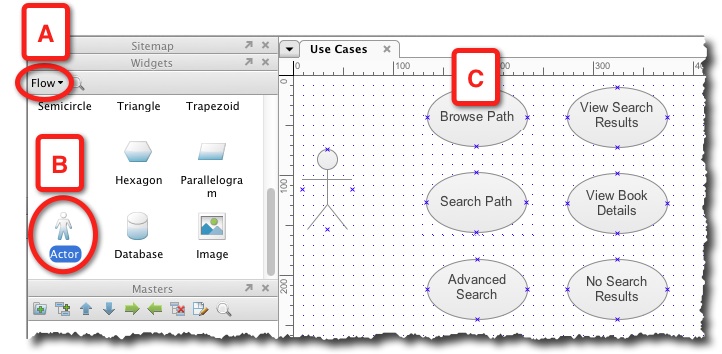
In order to complete the use case diagram, we want to connect the actor widget to the use cases and organise the widgets nicely on the page for a polished presentation. Begin with the layout and organise the cases in a vertical order that follows a logical progression of possibilities.
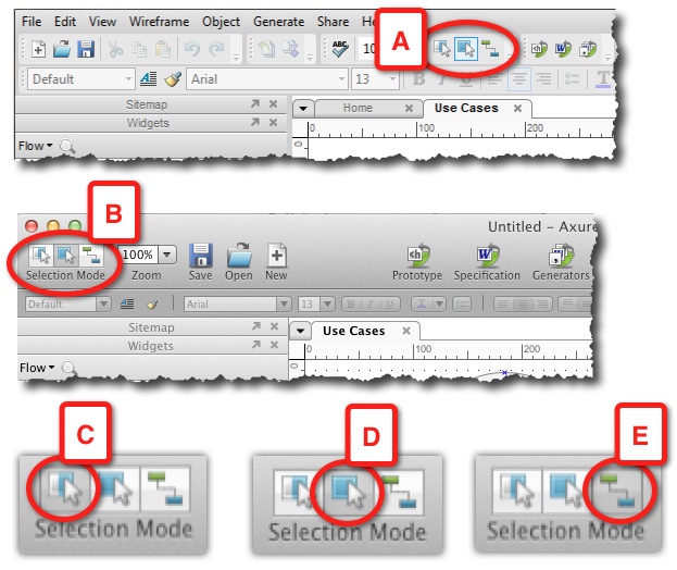
This is a great opportunity to get familiarized with Axure's three selection modes, which facilitate moving and arranging widgets on wireframe and flow pages. You can find the Selection Mode on the Axure's toolbar. (See the following screenshot, A for the Windows version, and B for the Max version.)
- Select Intersected Mode (C): This is Axure's default mode. When you click and drag your mouse over the wireframe, all the widgets that are part of your selection area, even if they were only partially included in it, are selected.
- Select Contained Mode (D): In this mode, only widgets that are fully included in your selection are selected.
- Connector Mode (E): This mode is most effective when you work with Flow widgets because it generates connector lines that you can use to hook up the various flow widgets in your diagrams.
Personally, I prefer the Select Contained Mode over the default Select Intersected Mode, because it provides precision by including only items fully encompassed by my selection, leaving out others that are in close proximity:
In order to organise widgets on a page, use the tools in the Object toolbar. The following screenshot shows the tools on the Mac version; the identical tools are on the Windows version:
- Group and ungroup objects (A).
- Move forward or backwards, top or bottom (B).
- Align objects left, right and middle and top, bottom and center (C).
- Distribute objects horizontally and vertically (D) .
- Lock and unlock objects (E).

Select a group of widgets in the use case page, as illustrated in the following screenshot, and use the Align (A) and Distribute (B) options on the toolbar to balance the cases on the page:
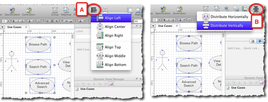
With all the use cases vertically aligned and evenly distributed, group them together using the Group option on the toolbar. Select this group and, while holding the Shift key, select the Actor widget. Use the Align Middle option to have the Actor facing the use cases.
Next, switch to the Connector mode and draw lines from the Actor widgets to each of the use cases. You should end up with a page that looks something similar to the following screenshot:
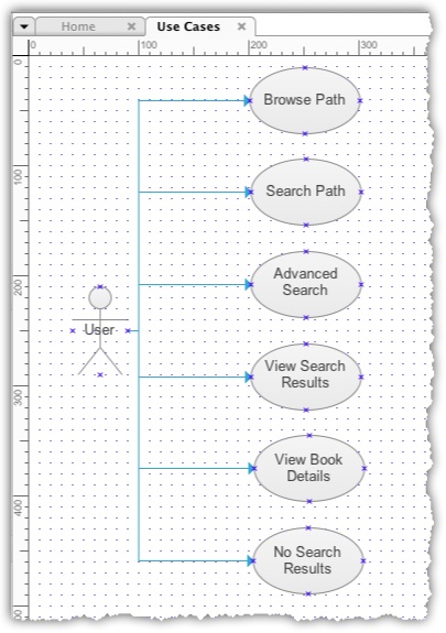
Saving the project file
To paraphrase the joke on Chicago elections: Save your work early and often. In my experience, Axure is very stable, but long ago, I developed the instinct to save my work frequently. In addition to the standard save, I recommend a strategy to support iterative design work: Use the Save As command at the end of each day to create an archive of daily versions of your RP file. It is also a good idea to use the Save As command before making dramatic changes to key wireframes.
Here is why: Your Axure file will evolve rapidly to incorporate a tremendous amount of detail, as you address increasingly finer requirements. Ideas that looked initially promising will not work as well as you thought. Feedback from stakeholders and users will require more changes, sometimes requiring that you backtrack to the previous version.
It is in your best interest then, to maintain an on-going history of your Axure file. When you work on a stand-alone file (.RP), this means that you are responsible for managing the revision history. I am not talking here about merely backing up your file, which is a given.
For managing the history of revisions, a technique or rather, a behaviour that works for me is quite simple and easy to implement: At the end of each workday, save the file. Then, use Save As to save the file in an archive directory and append the date to the file name. The next day, open the file from the current directory. With this method, you will always be able to restore or find previous items and add them back to the current file, if needed.
First wireframe pages
With initial use cases in place, let's move forward to create relevant wireframe pages. The pages that immediately come to mind are:
- Home Page.
- Search Results Page.
- Item Details Page.
As you might have noticed, when you launch Axure, it opens a new document similar to an MS Office application, such as Word or PowerPoint. You will see in the Sitemap pane that Axure places a Home page and three nested pages. This is the default for each new Axure file.
Rename the non descript Page 1 and Page 2 labels of the nested pages (see the following screenshot, A) to something more meaningful, and delete Page 3. Your Sitemap pane should look something similar to the following screenshot, (B):
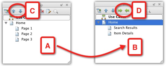
You can change the order of pages by using the move up and move down arrows (C), and change their nesting level by using the indent and outdent arrows (C).
Task flow diagram page
A prototype is tailored to visualise and demonstrate the user experience. Before we can develop the demonstration, we really need to nail down key user tasks which are, after all, the reason for the existence of the application. As the scope of this book limits our discussion of the topic to the context of Axure, I will focus on the aspect of creating task flow diagrams.
Task flow diagrams are a model, an abstraction of the Ping-Pong exchange that makes up user-system interaction. These diagrams also play an important role in:
- Validating the sequence and logic of each task with business and technical stakeholders.
- Developing an agreement on which flows and parts of flows should be prototyped, and to what level of fidelity.
The diagrams should be shaped by explicit context, which is determined by a combination of inputs, including:
- What the system knows about the given user.
- The options afforded to the user by the system .
- The user's actions.
While there are no set standards for UX flow diagrams, keep in mind that clarity, precision, and organisation would help you during joint sessions with stakeholders.
Axure provides a one-stop shop for creating both flow diagrams and the wireframes that are associated with them. The ability to use a single application for modeling, simulating and documenting the user experience, gives us a powerful work environment.
Two main flows that immediately come to mind in the context of Alexandria involve browsing and searching. In the first option, the user can browse titles on the home page and drill down for more details. The other path lets the user search for a set of titles, or for a specific title. Matches are presented in the search result list and the user can drill down to the details of a desired title. Thus, both paths may end on the same item-detail page.
Let's create a couple of task flow diagram pages, one for modeling the browse path and the other for search. In the Sitemap pane, add the two siblings below the Use Case diagram page. Label the pages and use the Diagram Type menu to change their icon to mark them as flow pages.
Browse path flow diagram
In order to compose the diagram, carry out the following steps:
- Double-click to open the Browse Path page in the Wireframes pane.
- From the Widgets pane, drag over the Actor widget.
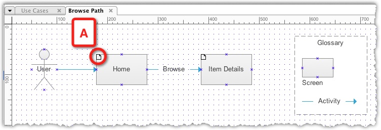
- Now comes the cool part: From the Sitemap pane drag over the Home page - it is the entry point to this flow. Notice that the widget inherits its label from its parent page on the Sitemap pane. Also note the document icon on the upper-left corner of the widget (see the following screenshot, A). It means that when you generate the HTML prototype, clicking on this widget will link to the actual Home page.
- From the Sitemap pane, drag over the Item Details page.
- Select the shapes and use Align Middle and Distribute Horizontally to clean up the presentation.
- Change to Connector Mode to draw connectors from the Actor widget to the Home page and from there to the Item Details page. Use the Arrow Style options to add directional arrowheads to the connectors.
- In order to add an interaction label to the arrow, add a glossary using the Wireframe library widgets and you have just completed your first flow diagram in Axure. It should look similar to the one shown in the following screenshot:
Search path flow diagram
The initial requirements call for two search features:
- Simple search.
- Advanced search.
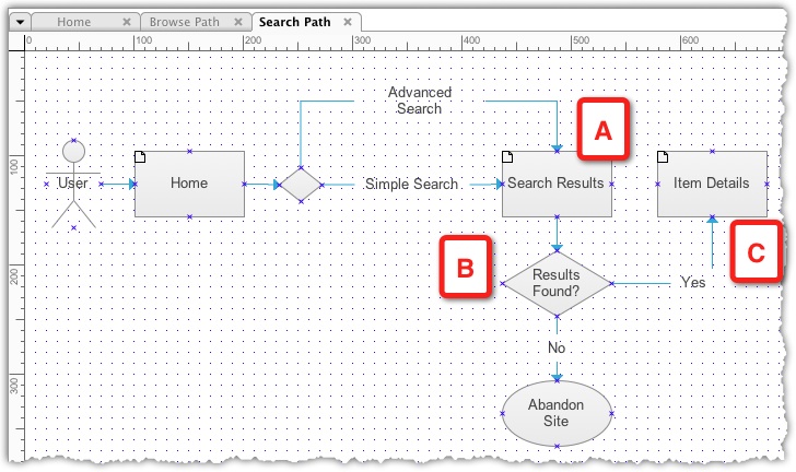
Both methods take the user through a similar path: If any matches are found, they are displayed in the Search Results page (see the following screenshot, A) and the user can drill down to the Item Details page (B). If no matches are found, then the user can run a new search.
As you complete the search path, you realise that it exposes an important risk. If users run either a simple or an advanced search but do not find what they are looking for, then there is a possibility that the users would abandon the flow (C) and move on to another site. The justification for providing powerful, simple, and advanced search features should be tied to the strategic importance of Search in the application. This is an example of strategic insight that underscores the business value of developing supporting diagrams for the prototype:
Link use cases to flow diagrams
In addition to being able to create and store diagrams and wireframes within the same application, you can link Axure diagrams and wireframes to create a seamless transition from the one to the other:
- Open the Use Cases page in the Wireframe pane.
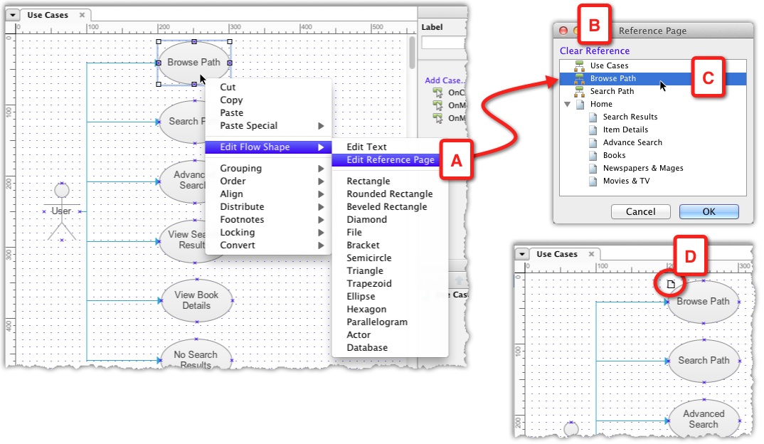
- Right-click on the Browse Path use case and select the Edit Reference Page option (see the following screenshot, A) from the Edit Flow Shape submenu.
- The Reference Page pop-up (B) lists all the pages in the Sitemap pane.
- Select the Browse Path page to link the use case to the page and close the pop up.
- Notice the reference page icon (D) that now appears on the upper-left corner of the use case. The behavior of the widget has changed: Before it is associated with a reference page, double-clicking on it enables the editing of the widget's label. By double-clicking on it, it references another page in the sitemap to open the Reference Page pop up. This is because the widget's title inherits the title of the referenced page and is no longer editable:
Generating the HTML prototype
It's now time to generate your first HTML prototype to review the work you have completed so far. As your prototype advances, you will find yourself generating previews quite often in order to validate that the HTML output works in the way you intended.
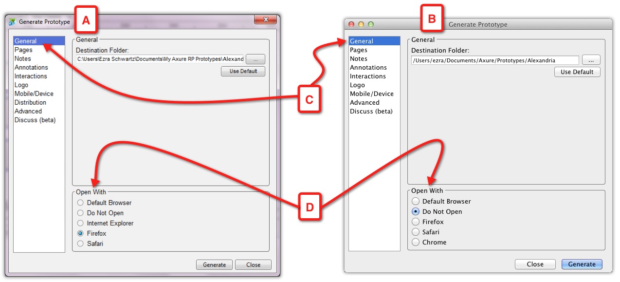
Accessing the HTML prototype generation feature is accomplished either from the toolbar icon or from the Generate menu. The Generate Prototype dialog (see the following screenshot (A) for the Windows version and (B) for the Mac version), allows you to specify various settings that impact the output. However, at this early point, you want to start with the General section (C) and let Axure know where to output the HTML prototype.
Either use Axure's default for the destination folder, a directory labeled "Axure Prototypes" in your Documents folder or keep all your project work under the same directory, as described in Chapter 2. This makes it easier to find all your project stuff, especially when you want to transport or backup up your work.
Firefox is the recommended browser, but you can specify your choice in the Open With section (D). Each time you generate the HTML prototype, it opens a new browser tab. It is a good idea to bookmark the page after the first time you generate the prototype, and from then on, use the Do Not Open option to reduce the proliferation of open tabs in the browser. Just generate and refresh the page:
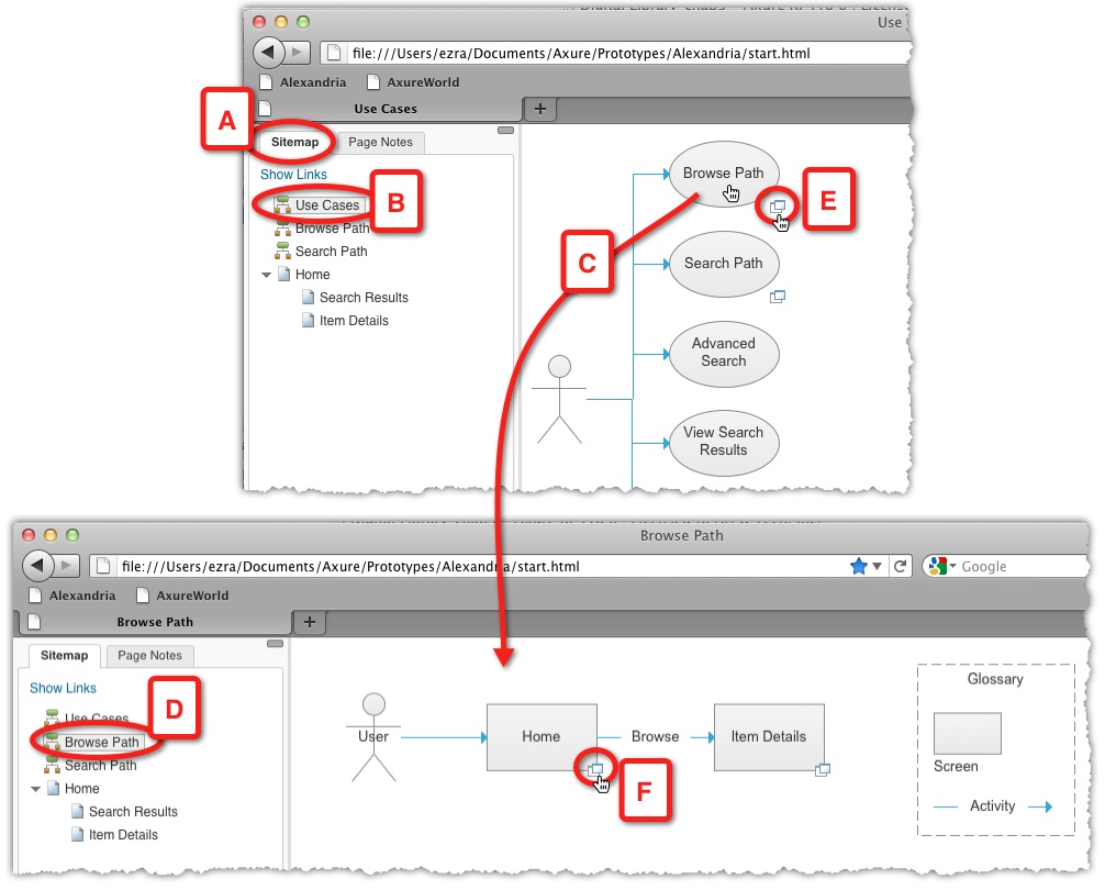
Hit the Prototype icon to generate the HTML prototype. The screen is divided into two sections:
- On the left, a pane with two tabs: the Sitemap and Page Notes. The Sitemap tab (see the following screenshot, A) is selected by default.
- The main body which displays the diagram or wireframe; the top page in the Sitemap is the default.
In our example, the Use Cases page (B) is selected in the Sitemap pane and displayed in the main section of the screen. As you roll your mouse over the Browse Path use case (C), notice that the cursor changes indicating an active link, which on click, will load the referenced Browse Path diagram page (D). Alternatively, clicking on the icon in the lower-right corner of the use case (E) opens the referenced page in a new tab. In our example, the Browse Path diagram shows the Home and Item Details page. The boxes in the diagram were made by dragging over the actual pages from the Sitemap.
Now, in the HTML prototype, these boxes too have a link icon (F), and clicking on the box of the icon links to the referenced wireframe page:
To summarise what we have covered so far:
- Creating use case diagrams.
- Creating task flow diagrams.
- Referencing and linking flow and wireframe pages from diagrams.
- Generating an HTML prototype.
Even an Axure novice can complete the activities we covered above in 30 minutes or so, and create a meaningful piece of work. As you continue to build the prototype, the underlying use cases and task flow will always be available for confirmation and validation.

The Creative Bloq team is made up of a group of art and design enthusiasts, and has changed and evolved since Creative Bloq began back in 2012. The current website team consists of eight full-time members of staff: Editor Georgia Coggan, Deputy Editor Rosie Hilder, Ecommerce Editor Beren Neale, Senior News Editor Daniel Piper, Editor, Digital Art and 3D Ian Dean, Tech Reviews Editor Erlingur Einarsson, Ecommerce Writer Beth Nicholls and Staff Writer Natalie Fear, as well as a roster of freelancers from around the world. The ImagineFX magazine team also pitch in, ensuring that content from leading digital art publication ImagineFX is represented on Creative Bloq.
