20 Photoshop tips for web design
Being a web design hero isn't about trendy effects, but sound design fundamentals and knowing your way around Photoshop, says Dan Rose.
The phrase 'I wish I were better at Photoshop' is uttered by web designers young and old. Yet there's something inherently wrong with that statement. It implies that our proficiency in a software program would make us better designers.
The reality is that just knowing the basics of Photoshop is sufficient for web design heroics. What if we took a step back from adding noise and insetting text to evaluate our efficiency using Photoshop?
Too simple for you, Level 42 PSD Sage? Not your cup of tea, Fireworks Fanboy? I beg to differ.
01. Sketch first
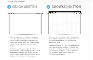
Ironically, the most essential Photoshop tip doesn't even involve turning on your computer. I can guarantee you'll spend less time playing around with layout by doing some sketches. Buy a solid sketchbook or print out your own templates (raincreativelab.com/paperbrowser) and go to town doing some rough layouts. Then translate those sketches in Photoshop.
02. Use a grid system

Alignment and relationship of size are two attributes your designs should address. Set yourself up with a grid system from the get-go. Most grid systems have PSD templates with guides for columns and gutters. Here's a bunch: 960px, 978px, 1140px.
03. Turn on snapping
There truly isn't anything worse than to be off by one pixel. Turn on snapping by going to View>Snap and then View>Snap to>Guides. If you've implemented a grid system, snapping to guides is genius. With less squinting at the screen, you won't need those trendy designer glasses.
04. Organise your PSD
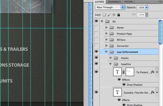
Is it a pain to name your layers and put them in folders? Sure. Most designers buy in to the logic that you'll spend more time doing so, but there are reasons that's not true. If you work by yourself, you'll save time searching for things later on. If you work with others, you'll be doing them a favour when they search. If you name layers as you go along, it's not hard to keep up with it as opposed to doing it after.
05. Master shortcuts
The key to Photoshop stardom is efficiency. It's not just knowing how to do something, but how to do something quickly so that you're using valuable time executing a function. Some specific shortcuts to know? Start with Save for Web: Cmd+Opt+Shift+S, Image Size: Cmd+Opt+I, Canvas Size: Cmd+Opt+C. Don't forget Levels: Cmd+L, and Hue/Saturation: Cmd+U.
06. Be subtle - everything in moderation

As designers, we tend to discredit our audience's ability to perceive the effect we're trying to achieve. So our response is to add too much noise, make harsh gradients and use too much contrast. The perfect blend is when you use effects with some grace, and, more importantly, self control.
07. Utilise layer comps & smart objects
Unfortunately, Photoshop doesn't have a great system for compositions such as navigation states. However, you can leverage Layer Comps (Window>Layer Comps) to make versions of layouts fairly well. Smart Objects (Layer>Smart Object>Convert to Smart Object) will compile multiple elements into a file that can be edited outside of your PSD.
08. Keep integral shapes vector smart objects
There's nothing worse than going to 'make the logo bigger' and realising you can't because it's a rasterised graphic in your PSD, or trying to resize a button only to find that it's no longer a shape. The solution is to keep these shapes in vector format, and you can do that by importing them as Vector Smart Objects or converting them to Smart Objects before you rasterise them.
09. Use masks intelligently
Globalising masks makes for some sweet Photoshop efficiency. For instance, if you have five slider images in your design, group them and put a mask on the folder instead of each individual layer. It's a far superior solution than sifting through 20 masks, not knowing which ones do what.
10. Refine masks for easy hair silhouetting
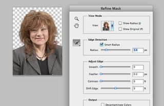
Who doesn't loathe having to silhouette hair? Here's a trick that works well on various sizes of images, no matter how crazy the hairdo. Make a rough mask of the person, then go to Select>Refine Mask (Refine Edge in versions previous to CS5). Play with the Radius and watch the magic unfold.
11. Perceive drop shadows accurately
Piggybacking on the last tip, the sign of an amateur designer is when you see drop shadows far too dark. It translates that the object is under a spotlight. Probably not the case. Be sure to decrease the opacity, and better yet, use a colour that's a dark hue of the background behind it instead of black.
12. Teach yourself the pen tool
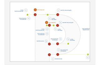
It's worth the time to get good at using the pen tool. It's one of those things we tend to avoid, but if you want to pull off some crisp masks or add illustration to your designs, the pen tool is your weapon of choice. Brush up your skills with this tutorial.
13. Sharpen photos using high pass

Ready for some Photoshop Magic? So, you've received a low-res photo from your client, and it's just too blurry to use. Duplicate the layer, then go to Filter>Other>High Pass. Choose something low (around 2.0) and then set that layer's Blending Mode to Overlay. If it's too crisp, decrease the opacity. Results may vary.
14. Be consistent

Five different blues, and none of them are the one from the brand guide? Be sure to check the colours being used, especially when exporting images. Another handy tool for colour accuracy is 0to255.com, which provides hex values that arharmoniously lighter and darker of a given colour.
15. Don't default to default settings
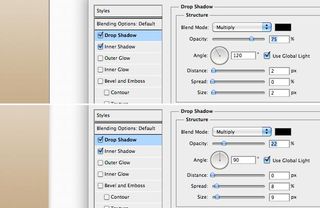
One of the hardest things to ward off is Photoshop autonomy. If you're treating the Effects panel like a checklist of desired styles, you're most likely not crafting their settings to a reasonable state. The default settings are generally harsh in order to show their appearance. Soften the amounts and change the angles.
16. It's in the details
An integral part to perfecting your craft in Photoshop is to make your design 'pixel perfect'. Go back through your PSD, looking for blurry edges on rounded rectangles or inconsistent line weights. It pays to take the time in Photoshop perfecting your layout (rather than in HTML/CSS).
17. Rewrite history
Isn't it such a bummer when you open up the History panel and you need 21 steps back, only to see it stops at the last 20? Prevent that from happening again by going to Preferences>Performance and increasing the value for History States. You web design superheroes don't need to use the History panel though, do you?
18. Personalise your workspace

Photoshop's not the boss of you, pixelcrafter. If you prefer having your tools on the right and only your Layers panel open, do it. You can even change the colour around the canvas by right-clicking on it. Save your workspace via the menu in the top right of the application.
19. Organise your files
Much like naming your layers and folders, naming your files appropriately prevents much strife. Isn't it hard to distinguish which PSD is the 'latest' when they have descriptors like 'NEWEST_round4.psd' or 'FINAL_USE_THIS_ONE.psd'? Keep one PSD and be done with it. Archive the rest if you really need it.
20. Be original and fight trends
The good news is that we web designers have used Photoshop to create some beautiful techniques. That's also the bad news, because we're prone to copy one another's new hotness. Photoshop's a wonderful tool, but use with care. Just because you can put a gradient on something doesn't mean you should. Experiment with the settings and start your own trends.
Words: Dan Rose
Dan Rose is the Photoshop Etiquette guy and an interface designer at WSOL. This article originally appeared in net magazine.

Thank you for reading 5 articles this month* Join now for unlimited access
Enjoy your first month for just £1 / $1 / €1
*Read 5 free articles per month without a subscription

Join now for unlimited access
Try first month for just £1 / $1 / €1
Get the Creative Bloq Newsletter
Daily design news, reviews, how-tos and more, as picked by the editors.
The Creative Bloq team is made up of a group of design fans, and has changed and evolved since Creative Bloq began back in 2012. The current website team consists of eight full-time members of staff: Editor Georgia Coggan, Deputy Editor Rosie Hilder, Ecommerce Editor Beren Neale, Senior News Editor Daniel Piper, Editor, Digital Art and 3D Ian Dean, Tech Reviews Editor Erlingur Einarsson, Ecommerce Writer Beth Nicholls and Staff Writer Natalie Fear, as well as a roster of freelancers from around the world. The ImagineFX magazine team also pitch in, ensuring that content from leading digital art publication ImagineFX is represented on Creative Bloq.
