How HTML5 Hub built the Museum of Mario
Mario is one of the most iconic games characters. Kyle Simpson of HTML5 Hub talks about creating an online Museum of Mario.
"It's-a me, Mario!" Everybody loves Shigeru Miyamoto's Italian plumber, so when we saw IGN's Museum Of Mario, we were captivated.
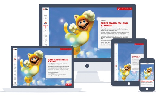
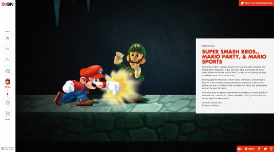
The site is a highly authentic and interactive retrospective, exploring the character's evolution. It begins with a Donkey Kong cabinet and tracks the character's growth right up to the Wii U.
The site was made by the guys over at the HTML5 Hub. To hear their story, insert your coin and press start.
Hello! Why don't you go ahead and introduce yourself?
I'm Kyle Simpson, the lead developer of the Museum of Mario site project and a contributor to HTML5 Hub.
How did the Mario project come about?
We brainstormed about a project that would push the boundaries of HTML5 and JavaScript in browsers and devices, connect with visitors' memories, and would also be super fun.
We all like games, and Mario is the most iconic game character of the last 30-plus years, so it was a no-brainer. He deserved a fitting tribute, and that's what we set out to do. We approached IGN to partner with them on it, and they were instantly hooked, too!

Why do you think even grown adults have such an attachment to Mario?
Most grown adults actually grew up playing Mario across dozens of different games on a wide array of game systems, from consoles to handhelds. Nintendo kept pushing Mario into newer, more immersive experiences, and we all tagged along for the ride.
Some of us can't remember gaming without Mario. He's a part of our collective memories. Mario represents the best ideals in gaming. He exemplifies good, clean fun, but still with plenty of challenge and complexity.
He transports us into his world, where we can escape, rather than making us more aware of the complications of our own world.
How did the site's defining interactions begin and evolve?
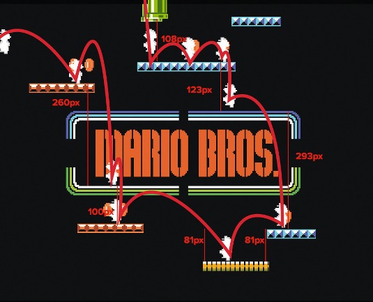
We started out trying to recreate parts of the games we wanted to highlight. We eventually settled on highlighting the most iconic and memorable experience from each game, and tried to weave in at least some interactivity to each one.
We also wanted this to feel like entering the world of a game. Originally, you would have navigated in all four directions, just like on a game map, but complexities of devices landed us at the 'paged-scrolling' vertical experience.

So you prototyped elements individually and then pieced the whole site together?
Initially, various pieces were quite independent. Developers on the team each took one or a few of the pages and worked on them, while I (and others) worked on the overall site architecture.
But the complexities of delivering a consistent experience cross-device required pretty early on in each page's life that it be integrated with the site to make sure interactions made sense and didn't interfere with the site and navigation. It was more of a holistic build and design.
Under the hood, which technologies were most important?
With literally millions of visits so far, a simple custom Node.js server backend is more than capable of handling the load without even breaking a sweat. Along with Node.js, we also heavily use Grunt and various plug-ins to take care of all our build and deploy tasks.
Frontend wise, we relied heavily on responsive design (CSS media-queries with breakpoints), and tools like jQuery (and various plugins) to help us out with the heavy lifting. LABjs (my script loader) does all the script resource loading, and grips (my templating engine) builds all the markup (both server-side in Node, and client-side).
We heavily use Canvas and Three.js for some of the WebGL stuff (like the Donkey Kong arcade). Adobe Edge was essential in the initial builds of many of the sophisticated animations.

Which was the most difficult to build?
The WebGL Donkey Kong arcade was tougher than most because it involved a new technology (to us) and we had to get the video positioned at just the right angle to complete the effect of the arcade screen. Mostly, though, the toughest part of this project was creating a consistent game experience in all devices.
It took lots of trade-offs and compromises to get it right. We were strongly committed to making mobile a first-class experience, rather than some sites which severely limit what you get outside of desktop land. IGN has a huge mobile market share, and the web is increasingly non-desktop, so our focus had to be much broader.
One last game on one last console. What would you choose?
Contra on original Nintendo. Still the most infuriating but most engaging game I ever played.
This article originally appeared in net magazine issue 251.

Thank you for reading 5 articles this month* Join now for unlimited access
Enjoy your first month for just £1 / $1 / €1
*Read 5 free articles per month without a subscription

Join now for unlimited access
Try first month for just £1 / $1 / €1
Get the Creative Bloq Newsletter
Daily design news, reviews, how-tos and more, as picked by the editors.

The Creative Bloq team is made up of a group of art and design enthusiasts, and has changed and evolved since Creative Bloq began back in 2012. The current website team consists of eight full-time members of staff: Editor Georgia Coggan, Deputy Editor Rosie Hilder, Ecommerce Editor Beren Neale, Senior News Editor Daniel Piper, Editor, Digital Art and 3D Ian Dean, Tech Reviews Editor Erlingur Einarsson, Ecommerce Writer Beth Nicholls and Staff Writer Natalie Fear, as well as a roster of freelancers from around the world. The ImagineFX magazine team also pitch in, ensuring that content from leading digital art publication ImagineFX is represented on Creative Bloq.
