Master web typography
Elliot Jay Stocks explains the fundamentals of web typography and introduces some advanced techniques to take your type to the next level
Understanding type – and treating it with the respect it deserves – is no mean feat, but with a solid understanding of the basics, it’s possible to take your typesetting skills up a notch and work typographic wonders on the web. The fundamentals: basic type anatomy Before we can begin to master type on the web, first let’s get back to basics and take a look at what makes up a typeface in the first place – or, more specifically, what makes up each unique letter.
Understanding type – and treating it with the respect it deserves – is no mean feat, but with a solid understanding of the basics, it’s possible to take your typesetting skills up a notch and work typographic wonders on the web.
The fundamentals: basic type anatomy
Before we can begin to master type on the web, first let’s get back to basics and take a look at what makes up a typeface in the first place – or, more specifically, what makes up each unique letter.
Learning the terms used to describe type enables us to talk about it in a more informed manner and express ourselves over the subtleties of type. Warning: once you start appreciating these details, you’ll never be able to look at a letter in the same way ever again!
Size
All typefaces are not created equally. Some are fat and wide, some are thin and narrow, and this variation in size means that words that are set in different types can take up a very different amount of space on the page.
What about the height of each character, known as its ‘x-height’ (so called because it’s based on the ‘x’ character)? It’s generally considered that a typeface with a large x-height improves legibility at small sizes. Of course, made too large, it can have the opposite effect.
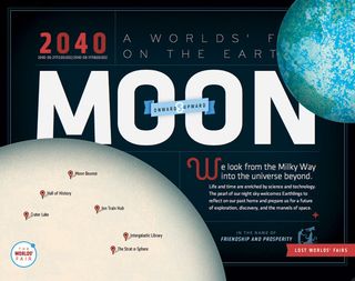
It’s important to keep these inconsistencies in mind. When pairing typefaces – like using a different face to denote an area of attention – it’s generally wise to use those that share a similar x-height. But what of the problem we face on the web, where we have to declare fallback fonts for when our ideal choices can’t be displayed? It’s in these circumstances that the type-savvy web designer should choose their weapons well.
Get the Creative Bloq Newsletter
Daily design news, reviews, how-tos and more, as picked by the editors.
Tracking and kerning
Kerning describes the act of adjusting the space between characters to create a harmonious pairing. The most obvious example would be where an uppercase ‘A’ meets an uppercase ‘V’: their diagonal strokes are usually kerned so that the top left of the ‘V’ sits above the bottom right of the ‘A’. Many people talk about kerning when they actually refer to tracking; the latter is different because it relates to the spacing of all characters and is therefore applied evenly. In CSS, we control this using the letter-spacing property.
In reality, on the web in its current state, we don’t have that much control over kerning; to properly kern certain letters, we need to wrap them in a <span> tag and then apply ‘letter-spacing’ to that area.
Leading
In the world of print, ‘leading’ describes the vertical space between each line of type, so called because strips of lead were used to separate them in the days of metal typesetting. In CSS we have the term ‘line-height’, which is subtly different: whereas leading is the amount of space between lines of text, line-height is that value plus the text size.
Like all things, an ‘ideal’ leading value is subjective and dependent on what you’re setting out to achieve. But for legible body text that’s comfortable to read, a general rule is to have your leading value greater than the font size; anywhere from 1.25 to 1.5 times.
When aligning different blocks of type to a baseline grid, we can run into a problem where those blocks contain type of a different size. For instance, if a pull-quote is considerably larger than the body type, we wouldn’t want to match the pull-quote’s leading – otherwise the text would be squished and unreadable.
Instead we can use incremental leading: a principle that says we should align baselines every other line (or every few lines – it depends on the context but the idea is to achieve some sort of balance by matching the baselines where you can).
Measure
The term ‘measure’ describes the width of a text block, and for the designer seeking to achieve the optimum reading experience on their website, it’s an important consideration – one that can make the difference between a good and a great design.
As a general rule, Bringhurst goes on to say that, “the 66-character line (counting both letters and spaces) is widely regarded as ideal. For multiple column work, a better average is 40 to 50 characters.” However, this should be calculated according to a typeface’s character sizes...
Dashes
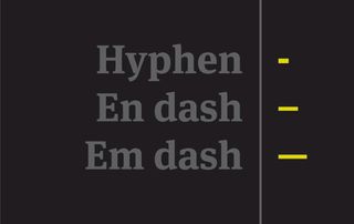
If there’s one area of punctuation and typography that’s regularly misused, it’s when designers employ hyphens, en dashes and em dashes. Like all of these typography basics, each practice could command an article of its own. But to give you as decent an overview as possible, here are the basics:
Hyphen
The hyphen is used to join words together (the hard hyphen) or indicate words that are split across lines (the soft hyphen, admittedly rarely used on the web).
En dash
Slightly longer than a hyphen but half as long as an em dash, the en dash is commonly used between times (e.g: 2001–2005) and places (eg, London–Sydney). In HTML, it can be referenced as &endash, – or –.
Em dash
The em dash can perform the role of parentheses — to indicate a tangent — or when something is not finished, such as a speech being physically interrupted by someone else (eg: “But I thought it —”). The em dash also performs a similar role to a colon, joining two parts of a sentence that are intrinsically linked, although it’s important to note that different style guides each have their own conventions. In HTML, it can be referenced as &emdash, — or —.
Hierarchy and scale
We deal with hierarchy on websites almost without thinking about it: headings are large, sub-headings are smaller, and body type is smaller still. Plus, of course, there are many more variations in size in between.
Hierarchy tells us where to look; what to consider important; how to read. And to help us decide how to size our type appropriately, we have a sliding scale that came into being in the 16th Century.
Of course, size is not the only way to define a typographic hierarchy – we can achieve it with colour, spacing and weight – but size remains the most obvious technique.
Formats
The variety of font formats and their support on the web can potentially seem confusing, but the good news is that we’re in a good place right now, with the increasing support for the new WOFF format: support in terms of browser technology, and support in terms of backing from the type design industry. Here’s a quick run down of the various formats currently in use:
TTF
The TrueType Font format is perhaps the widest known, having been in use for a number of years. It’s one of the standard file formats for fonts installed on a user’s computer; the other being OpenType.
Unfortunately, Like OpenType, the format is unprotected, so that any TrueType Font file placed on the web can be easily downloaded to a user’s computer.
OTF
The introduction of OpenType technology meant that many more glyphs could be stored within a font file, largely negating the need for separate files containing ligatures, small caps, and the like.
As with the TrueType Font format, foundries are reluctant to use the OTF format for commercial web use because it can be pirated, and it remains a file format better suited to the desktop.
EOT
Microsoft’s proprietary EOT format provides protection against illegal downloading and is therefore more appealing to foundries who are keen to protect their intellectual property. It also meant that @font-face was supported in IE since version 4 using this format. Like WOFF, EOT is technically a wrapper rather than a format in itself.
WOFF
Proposed by Jonathan Kew, Tal Leming, and Erik van Blokland, the Web Open Font Format is the most promising yet: if the file is downloaded, just like EOT, it can’t be installed like a regular font (because it is a wrapper for OpenType fonts), but the technology is open and standards-based. The files are also relatively easy to generate, as opposed to the complex process involved with EOT. WOFF is in the process of being standardised as a recommendation by the W3C and fonts are being delivered in this new format by many font delivery services. It is supported in Firefox, Chrome, IE9, and development builds of WebKit.
SVG
Currently SVG is the only format we can use to get web fonts working on Mobile Safari for the iPhone and iPad. It’s relatively basic: letter-spacing is not supported and neither is the basic kerning information we’ve come to expect from font files. As with all cutting-edge technology, use with care.
Anatomy of a font
An adapted version of the type anatomy illustration found in Mark Boulton’s book A Practical Guide to Designing for the Web
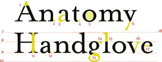
- Apex
- Serif
- Bowl
- Finial
- Counter
- Descender
- Cap height
- X-height
- Baseline
- Descender line
- Stem
- Spur
- Loop
- Ear
- Ascender
- Arm
- Crossbar
- Ascender height
For more info on type terms, check out the What is Typography? post on our sister site Creative Bloq.

Thank you for reading 5 articles this month* Join now for unlimited access
Enjoy your first month for just £1 / $1 / €1
*Read 5 free articles per month without a subscription

Join now for unlimited access
Try first month for just £1 / $1 / €1
The Creative Bloq team is made up of a group of design fans, and has changed and evolved since Creative Bloq began back in 2012. The current website team consists of eight full-time members of staff: Editor Georgia Coggan, Deputy Editor Rosie Hilder, Ecommerce Editor Beren Neale, Senior News Editor Daniel Piper, Editor, Digital Art and 3D Ian Dean, Tech Reviews Editor Erlingur Einarsson and Ecommerce Writer Beth Nicholls and Staff Writer Natalie Fear, as well as a roster of freelancers from around the world. The 3D World and ImagineFX magazine teams also pitch in, ensuring that content from 3D World and ImagineFX is represented on Creative Bloq.
