Localising content for better SEO
For any business operating in or selling to multiple international territories, the ‘localisation’ of your online content is a crucial tool in your attempts to increase traffic, improve rankings and increase conversion rates.
Google, which is still by far the most commonly used search engine in the western world, is constantly refining the algorithms that underpin its searches in order to provide high-quality, relevant, useful results for its users. Several recent Google updates have focused on providing web developers with the opportunity to provide ‘localised’ versions of the same website in different territories.
Mind your language
For example, late in 2011, Google introduced a new markup tag – hreflang. This tag can be used to identify translated content on multinational sites, and helps search engines distinguish between language variations. It enables webmasters not only to increase the quantity of web traffic, but more importantly the quality of that traffic.
A common problem with many multinational sites is that largely identical content, for example in the case of a UK and US version, creates mass duplication across the site. The hreflang tag solves the issue multinational duplication by telling search engines, for example, that 'this US version is essentially a copy of this UK version, intended for a different audience'. Successfully implementing this markup will help ensure that it’s the US version which performs for the US audience.
In April of this year, Google launched an addition to this markup, the x-default hreflang tag, which is intended for use on multinational sites that also have a global page or version of site. The tag ensures users in countries that do not have localised content are sent to a site's ‘default’ version or page.
Let’s presume www.example.com is our global version of our site, which also has versions localised to the UK, US and Canada. Adding this x-default hreflang tag to our global version of a site would ensures that users from say, Australia, would be sent to the global page.
<link rel="alternate" href="http://uk.example.com/en" hreflang="en-uk"/><link rel="alternate" href="http://us.example.com/en" hreflang="en-us"/><link rel="alternate" href="http://ca.example.com/en" hreflang="en-ca"/><link rel="alternate" href="http://example.com/en" hreflang="x-default"/>Rich snippets
Enhanced search results listings – known among SEO practitioners as ‘rich snippets’ – can capture users' attention and encourage them to click through from the search engine results page.
There are multiple different types of rich markup, and it’s becoming an increasingly important feature of SEO. Essentially, it’s a way to structure code on your site in a way that search engines can better use it.
The type of rich markup we always recommend, and is recommended by Google, is that found at schema.org – also known as microdata. Marking up your content with these tags provides users with additional information and makes your content look more interesting on the results page.
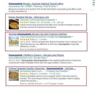
This following example shows how a few results for this popular German dish have additional information, such as star ratings, reviews, cooking time, calorie information, which helps attract the attention of users.

Mobilise for success
As mobile device usage continues to grow across the world, international webmasters have to tailor their strategies to incorporate new means of searching.
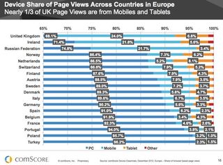
This image below from late last year shows statistics from a comScore UK Digital Future report showing that almost one third of all UK web-based page views were from mobiles and tablets. We can see that this varies widely across countries, with the UK, the Netherlands and Russia being particularly low in this regard.

There is an undeniable global trend in terms of users consuming content on the move, but the recent growth in tablets is particularly interesting.
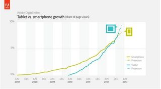
Last year Adobe released a research paper covering tablet sales and traffic to more than 300 brands across North America, Western Europe and Asia-Pacific. The paper predicted that tablet traffic would exceed smartphone traffic in 2013.
Just two months ago, Adobe released its latest Digital Index, confirming its predictions. The report shows that just last month, for the first time tablets are now taking a greater share of page views than smartphones. This growth is particularly impressive, given the first iPad only launched in April 2010.

The overall message is clear: the ever-increasing sophistication of online consumers means that, in the near future, only websites that use responsive design to deliver content optimised to a user’s particular location and device will deliver the desired results for brands.
Get the Creative Bloq Newsletter
Daily design news, reviews, how-tos and more, as picked by the editors.

Thank you for reading 5 articles this month* Join now for unlimited access
Enjoy your first month for just £1 / $1 / €1
*Read 5 free articles per month without a subscription

Join now for unlimited access
Try first month for just £1 / $1 / €1
The Creative Bloq team is made up of a group of design fans, and has changed and evolved since Creative Bloq began back in 2012. The current website team consists of eight full-time members of staff: Editor Georgia Coggan, Deputy Editor Rosie Hilder, Ecommerce Editor Beren Neale, Senior News Editor Daniel Piper, Editor, Digital Art and 3D Ian Dean, Tech Reviews Editor Erlingur Einarsson, Ecommerce Writer Beth Nicholls and Staff Writer Natalie Fear, as well as a roster of freelancers from around the world. The ImagineFX magazine team also pitch in, ensuring that content from leading digital art publication ImagineFX is represented on Creative Bloq.
