Improve your responsive design workflow with Sass
Sass does not just help you maintain your style sheets. It can actually improve your responsive layout workflow and you don't even have to worry about the maths! Here Ryan Taylor explains how to build a reusable framework
Responsive layouts require precise percentage and em values to ensure all of the page elements flow proportionally to each other. This requires simple math with not so simple to translate results. In this tutorial I will show you how to build a reusable framework to harnesses the power of Sass to do all the math and heavy lifting for you.
Working example
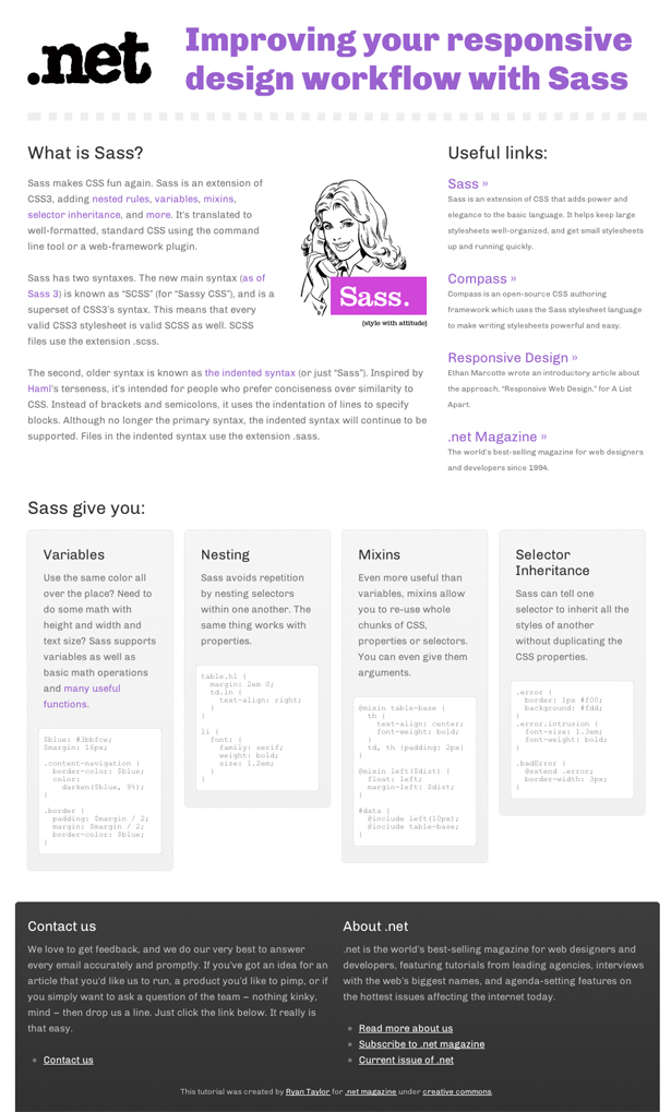
For this tutorial I’ve put together an example page which includes all the styles we’re going to discuss.


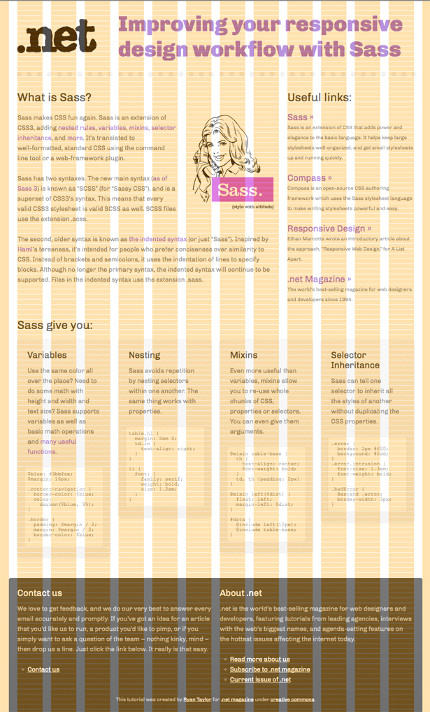
You’ll see from the demo (see View Demo at the top) that the layout of the page is built on a flexible grid with the use of media queries at key widths to adjusts the various page elements when it makes sense to do so.
Obviously we can’t discuss every style here so for brevity we will focus on establishing the flexible grid using Sass to do all our math and heavy lifting. If you want to dig deeper, I’ve made all the files available for download.
Sass and Compass
If you’re not familiar with Sass and Compass, Christopher Eppstein has written an excellent introductory tutorial, “Code smarter CSS with Sass”, that I highly recommend you read before continuing.
Installing Sass and Compass is easy, it’s just three commands from a terminal window on OSX:
sudo gem update --systemsudo gem install sasssudo gem install compassFor other operating systems see the Sass tutorial page for full instructions.
From this point onwards I’m going to assume that you have Sass and Compass installed and you’re familiar with their basic usage.
Variable goodness
For this example we are going to be using a 12 column grid with a maximum width of 960px. We’re also going to set a base font size of 15px and base line-height of 24px. We define these values as variables as they are going to be used throughout our Sass/CSS:
/*=VARIABLES - GRID------------------------------------------------*/$columns: 12;$column-width: 60px;$gutter-width: 20px;$max-width: $columns * ($column-width + $gutter-width);/*=VARIABLES - FONTS------------------------------------------------*/$font-base: 15px;$font-base-line-height: 24px;The math of responsive layouts
To create a responsive layout on a flexible grid we are required to do some math. It’s not complicated math but it can be repetitive and ultimately difficult to read after the fact. For example would you know that 2.127659574468em is 20px of 940px at a glance? Me neither. Pixels are definitely much easier to read and work with, so let's take advantage of Sass’s powerful math functionality to do the calculations for us.
Get the Creative Bloq Newsletter
Daily design news, reviews, how-tos and more, as picked by the editors.
Ems
The formula to convert a target size into an em value is:
target / context = resulte.g.:
21px / 15px = 1.4emHere’s the function that will do this for us:
@function em($target, $context: $font-base) { @if $target == 0 { @return 0 } @return $target / $context + 0em;}One of the great things about Sass is like other programming languages it accepts function parameters but also default parameters. So for our em function the default context is our base font of 15px.
We can now have:
h3 { font-size: em(21px);}which compiles to:
h3 { font-size: 1.4em;}Percentages
To make the page flexible we set percentage values for widths and horizontal padding and margins. Sass already has a built in percentage function that works like this:
percentage(400px / 960px);and results in:
41.666666666667%I want to streamline this a little further. Remember the default parameter for the context value in our em function? I want the default width for our percentage calculations to be the max-width of 960px. So we can wrap this built in percentage function in our own function like so:
@function perc($width, $container-width: $max-width) { @return percentage($width / $container-width);}We can now have:
#content article { width: perc(400px);}which compiles to:
#content article { width: 41.666666666667%;}Vertical Rhythm
To maintain a vertical rhythm - the spacing and arrangement of text as the reader descends the page - we need to ensure that vertical margins or padding are multiples of the base line-height of 24px. Again with Sass we can create a function to do this for us:
@function lh($amount: 1, $context: $font-base) { @return em($font-base-line-height * $amount, $context);}Note that we’re using the previously created em function within this lh function.
We can now have:
#content article { width: perc(400px); padding: lh() perc($font-base-line-height);}which compiles to:
#content article { width: 41.666666666667%; padding: 1em 2.5%;}We can also get half a line-height (12px) by passing 0.5 as a parameter of lh() or even quarter of a line-height (6px) by passing 0.25.
Flexible Grid
Great! So with our maths functions ready to go let's work on our grid. We’re going to create the following mixin:
@mixin col($n, $padding: 0px, $border: 0px, $container-width: $max-width) { float: left; margin-right: percentage($gutter-width / $container-width); width: percentage(($n * ($column-width + $gutter-width) - $gutter-width - ($padding * 2) - ($border * 2)) / $container-width); border-width: $border; padding: em($padding, $font-base) percentage($padding / $container-width);}The equations in this mixin should be pretty self explanatory from what we’ve already covered so far. The most complex being the width which has to take into account the CSS box model. If we wanted an element to be 4 columns wide with 1 line-height’s worth of padding around it and no borders the width calculation would look like this:
((4 * (60px + 20px) - 20px - (24px * 2) - (0px * 2)) / 960px = 26.25%Note that we deduct 1 gutter width of 20px because we are apply a margin-right of 1 gutter width.
Now that we have this mixin it’s insanely simple to layout the page elements on the flexible grid.
He’s the (cut-down) markup:
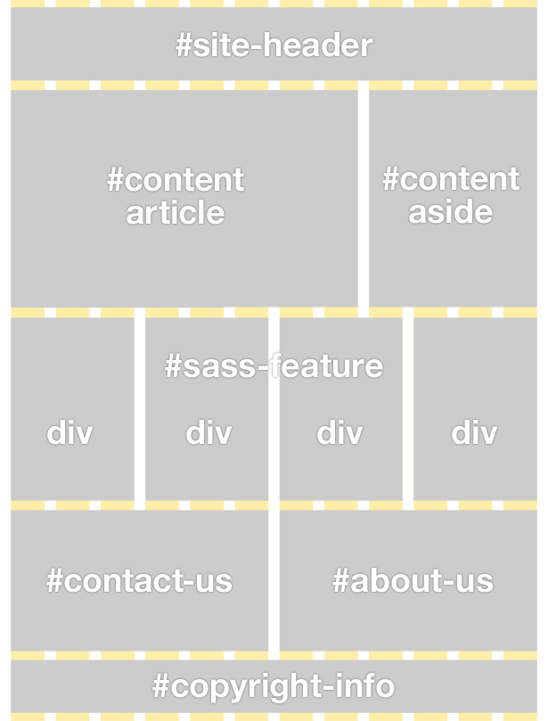
<body> <header id="site-header"> ... </header> <section id="content"> <article> ... </article> <aside> ... </aside> <div id="sass-features"> <div> ... </div> <div> ... </div> <div> ... </div> <div> ... </div> </div> </section> <footer id="site-footer"> <div id="contact-us"> ... </div> <div id="about-us"> ... </div> <p id="copyright-info"> ... </p> </footer></body>
Here’s the (basic) CSS, using our col mixin, that will put our elements in the correct positions:
#site-header { @include col(12);}#content { article { @include col(8); } aside { @include col(4); }}#sass-features { div { @include col(3, $font-base-line-height); }}#site-footer { #contact-us, #about-us { @include col(6); } #copyright-info { @include col(12); }}Media queries
Although the page is flexible and adjusts its width automatically there are points where the widths of the various elements simply become too thin and need some attention. We use media queries to make the adjustments.
A nudge at 955px
Once we get down to 955px width the code in the “Sass features” boxes start to break out of their parent elements so let's nudge them into two rows of two like this:
@media screen and (max-width: 955px) { #sass-features { div { @include col(6, $font-base-line-height); &:nth-of-type(3n) { clear: left; } } }}Really quickly increasing the column count for the #sass-features divs from 3 to 6 using our col mixin.
Tablet layout
Once we get to tablet size the “What is Sass?” article section and the “Useful Links” aside become too squashed so we make both elements full width, the aside drops below the article and like the “Sass features” boxes we adjust each link block into two rows or two like this:
@media screen and (max-width: 768px) { #content { article { @include col(12); } aside { @include col(12); li { @include col(6); &:nth-of-type(3n) { clear: left; } } } }}Smartphone layout
For the smartphone layout we simply remove the margin-right on all the elements and set their widths to 100% as we’re going to have them all drop below each other (see the demo/downloadable files for all the smartphone media query styles).
@media (max-width:500px),(max-device-width:320px) and (orientation:portrait) { #site-container { margin: 0 auto; padding-left: 0; width: 300px; } #site-header { margin-right: 0; width: 100%; }Conclusion
And that’s it. As you can see by handing over the math to Sass you can easily build yourself a reusable framework that will allow you to rapidly build responsive layouts on a flexible grid. For further information and examples of what Sass and Compass are capable of, I recommend you visit the following links:
- Sass Reference (http://sass-lang.com/docs/yardoc/file.SASS_REFERENCE.html)
- Compass Reference (http://compass-style.org/reference/compass/)

Thank you for reading 5 articles this month* Join now for unlimited access
Enjoy your first month for just £1 / $1 / €1
*Read 5 free articles per month without a subscription

Join now for unlimited access
Try first month for just £1 / $1 / €1

The Creative Bloq team is made up of a group of art and design enthusiasts, and has changed and evolved since Creative Bloq began back in 2012. The current website team consists of eight full-time members of staff: Editor Georgia Coggan, Deputy Editor Rosie Hilder, Ecommerce Editor Beren Neale, Senior News Editor Daniel Piper, Editor, Digital Art and 3D Ian Dean, Tech Reviews Editor Erlingur Einarsson, Ecommerce Writer Beth Nicholls and Staff Writer Natalie Fear, as well as a roster of freelancers from around the world. The ImagineFX magazine team also pitch in, ensuring that content from leading digital art publication ImagineFX is represented on Creative Bloq.
