How to plan your website using Mental Models
Understanding the way the visitors to your site discover your content will help you plan its architecture, says Gene Crawford.
Understanding a website visitor's thought process for how they uncover your content, and studying their reasons for doing things on your site, are wonderful ways to start out planning for its architecture.
The main concept behind this type of study is called a Mental Model. It's the profile of what a visitor thinks should be there based on how they think about the subject or content of your website.
Thinking through what your visitors will have in terms of a Mental Model of your website will give you clarity in your design strategy that will then give you a high level of confidence on future decisions you'll be making as you dig into the layout and other visual aspects of it.
Questions
The study and practice of creating Mental Models for websites is quite extensive and there are several different techniques and exercises you can employ to build these out. Generally speaking a simple litmus test against any quick site map you create can be summed up in a question such as: "Do I understand where I should look for the content I should expect on this website?"
It's a loaded question but upon your first draft of a site map or wireframe, if you simply have no idea where content is or how to even begin to start finding it, then you probably need to start the process over.
A lot of this comes down to having empathy with your website visitors. Putting yourself in their shoes first will give you a great central starting point for your design. After all shouldn't your design strategy start with some basics of how your visitors will want to use that website?
Examples, resources, and tips
01. Mental Models: Aligning Design Strategy With Human Behaviour

For me the 'end all' resource for Mental Models is Indie Young's book, produced by Rosenfeld Media.
Get the Creative Bloq Newsletter
Daily design news, reviews, how-tos and more, as picked by the editors.
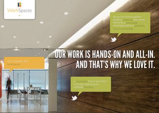
02. Work Spaces, LLC

The website for the now-defunct design/architecture firm was an elegant solution to the idea of a 'content in' strategy. Unfortunately the site does not exist any more but you can get an idea from the image above.
03. Google Ventures

The website for the Google investment fund employs a nice strategy of naming navigation elements to match what you'd want to know about the fund. Again, it has had a revamp since the time of writing but if you click the image above you can see the full homepage.
04. The Nerdery

While being a fine looking design, this site lacks a clearly uncovered Mental Model because I have no concept of what to expect as far as content is concerned.
05. VW Beetle (2011)

The first website for the 2011 new Beetle had an interesting approach: it reveals the expectations of what's here much later in the experience. I think this has a polarising result: it's either rewarding to you to discover what's here or you are bothered by not knowing.
This article first appeared in net magazine - the world's best-selling magazine for web designers and developers.

Thank you for reading 5 articles this month* Join now for unlimited access
Enjoy your first month for just £1 / $1 / €1
*Read 5 free articles per month without a subscription

Join now for unlimited access
Try first month for just £1 / $1 / €1
The Creative Bloq team is made up of a group of design fans, and has changed and evolved since Creative Bloq began back in 2012. The current website team consists of eight full-time members of staff: Editor Georgia Coggan, Deputy Editor Rosie Hilder, Ecommerce Editor Beren Neale, Senior News Editor Daniel Piper, Editor, Digital Art and 3D Ian Dean, Tech Reviews Editor Erlingur Einarsson, Ecommerce Writer Beth Nicholls and Staff Writer Natalie Fear, as well as a roster of freelancers from around the world. The ImagineFX magazine team also pitch in, ensuring that content from leading digital art publication ImagineFX is represented on Creative Bloq.
