How philippagregory.com was built
Better’s Adam Gatenby, Elliot Lings and Ryan Crawford open the book on how they went about preparing a new site for author Philippa Gregory.

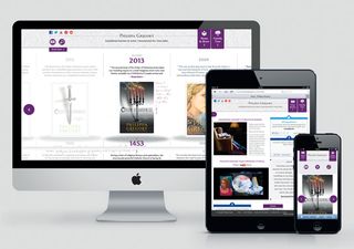
Philippa Gregory is a British historical author, writer of The Other Boleyn Girl and The White Queen. Here, the team from Better Brand Agency explain how they developed a new website for the award-winning author.
Introductions first. Who are you and who is Philippa Gregory?
Adam Gatenby: Better is an award-winning strategic brand agency, founded on Teesside in 2008. We work with a diverse range of local, regional and national clients to help grow their business through branding, marketing, design, web and social media. We also build innovative digital products, including our proprietary private online community platform, which supports brand engagement, market research, and customer/ stakeholder engagement through discussion forums, focus groups, and research surveys.
Philippa Gregory is an internationally renowned, author of historical fiction. Her bestselling series of novels, The Cousins’ War, formed the basis for the BBC One drama The White Queen.
Was there a brief for the project?
AG: Philippa Gregory International provided an initial brief for the website, which outlined the problems with the current site and the main objectives for the new website. The new site had to be more informative and engaging for visitors, which would ultimately lower the overall bounce rate and increase the average visitor duration.

What kinds of research did the team do before fiddling with pixels and code?
Ryan Crawford: From a design perspective, we explored the periods in time that Philippa Gregory writes about in order to generate a mood board for what this site should be visually. This was important: we had to communicate and bring to life the tone of the books through a digital platform, whilst retaining the classic and traditional character of her books. With the books set in different periods of time, we didn’t want to visually place the website design within a certain era. Research led us to develop a design that hinted at history, whilst retaining a modern tone.
AG: Collaboratively, we looked at a range of sites that made good use of responsive design, or provided an experience similar to the one we were aiming towards. The dev team investigated different ways in which we could achieve the functionality portrayed in the wireframes and designs. We then planned the database schema, the CMS and API functionality and protocol.
The site conveys a rich sense of history and of dynasty very well. How did you approach this creatively and technically?
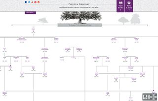
RC: From a creative viewpoint we were aware that visually historic design is often highly detailed and rich in colour. We felt it was important not to duplicate this, since we wanted the website to be a simple, enjoyable experience - we felt cluttering it with unnecessary design touches would overcomplicate it. The approach was to pull inspiration from history and create a design that was effortlessly simple but tipped its hat towards the periods in which Gregory’s books are set.
Elliot Lings: Technically, we wanted the web app to segue between different areas, be as interactive as possible and deliver fully formed HTML on an initial visit, therefore lowering the time waiting for content to download and render and to provide readable content for search engines. Before the main areas of the web app were built, we began by creating a central controller to handle segues, with support for older browsers as there were still a number of users using browsers without the HTML5 pushState API, for example.

What were the biggest challenges you met along the way?
AG: The website holds a lot of editable data and it was a challenge to make this easily manageable through the CMS. For example, a possible 450-plus translated versions of each book had to be organised in a way that was easily selectable. We also integrated Philippa Gregory’s social media activity into the news section of the site. Because of how active these channels are, there was a danger this could clutter the page. We prevented this by writing an algorithm that fetches and arranges posts chronologically, while aggregating Twitter and Facebook statuses as collections.
EL: The performance of the book timeline was another hurdle we came across. The initial designs made more use of different opacities on parts of the books and this made it very difficult for the browser to render this quickly and smoothly enough when moving the timeline left and right. Touch events used for the book timeline to provide the user with feedback as well as a smooth transition when interacting with it were also hard to master.
This article originally appeared in net magazine issue 246.
Liked this? Read these!
- How to build an app: try these great tutorials
- Discover what's next for Augmented Reality
- Our favourite web fonts - and they don't cost a penny

Thank you for reading 5 articles this month* Join now for unlimited access
Enjoy your first month for just £1 / $1 / €1
*Read 5 free articles per month without a subscription

Join now for unlimited access
Try first month for just £1 / $1 / €1
Get the Creative Bloq Newsletter
Daily design news, reviews, how-tos and more, as picked by the editors.
The Creative Bloq team is made up of a group of design fans, and has changed and evolved since Creative Bloq began back in 2012. The current website team consists of eight full-time members of staff: Editor Georgia Coggan, Deputy Editor Rosie Hilder, Ecommerce Editor Beren Neale, Senior News Editor Daniel Piper, Editor, Digital Art and 3D Ian Dean, Tech Reviews Editor Erlingur Einarsson and Ecommerce Writer Beth Nicholls and Staff Writer Natalie Fear, as well as a roster of freelancers from around the world. The 3D World and ImagineFX magazine teams also pitch in, ensuring that content from 3D World and ImagineFX is represented on Creative Bloq.
