How a leading charity's accessible website was built
The team at Precedent discusses the responsive, accessible site they created for the UK's leading sight loss charity.

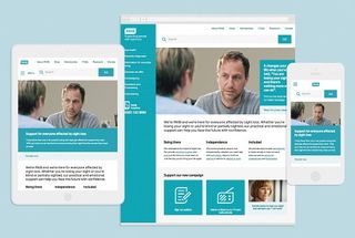
The RNIB is a leading charity offering information and support to almost two million people in the UK suffering from sight loss. Digital agency Precedent won a tender to create a new site for the charity. The team took a 'form follows function' approach to create a highly accessible, streamlined site that caters to users with varying levels of visual impairment. We spoke to the team to find out how they did it...
What was the original brief?
Adam Elleston: To design and build a responsive website in Drupal that delivered the highest standards of accessibility, enabling the RNIB to provide more online services and a better online experience.
Benn Pearson: One of our main challenges was that we needed to adopt and achieve the RNIB's surf right standards: taking the best elements of WCAG across the three levels (A, AA and AAA), while addressing other sight-related accessibility issues for web browsing. We were excited by this, as it offered a chance to push the boundaries of responsive web design to improve the web experience for people with sight loss.
How did you begin the project?
Ed Richards: The majority of site visitors have varying levels of sight-related difficulties, so in the strategy and UX phases of the project we worked with accessibility consultant Léonie Watson. This enabled us to formulate requirements, test statements and implement training.
BP: Gaining insight into how users interact with the website was a crucial starting point. This enabled us to quickly identify specific accessibility issues, and from there we brainstormed ideas and possible solutions. We found the YouTube videos from blind film critic Tommy Edison a great resource.

How did you approach prototyping?
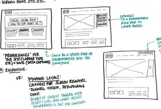
ER: Once we had formulated the modular approach, we were able to paper prototype all the modules. Stacking the modules made it really efficient and even enabled us to paper prototype the mobile, tablet and desktop views, which fed into how we worked in Photoshop by producing all the modules as Smart Objects.
BP: We then created an interactive prototype. Initially we used this to test responsive modules, but it was then used as an interactive style guide to test accessibility. Finally it became a reference for Drupal integration.
AE: The interactive style guide worked really well during Drupal integration, because it enabled us to quickly implement and test ideas outside of Drupal. It was also a good reference to keep HTML consistent and clean up Drupal's HTML.
Talk to us about colour. How did you pick your palette?
ER: For optimum accessibility you have to have contrasting colours – but we didn't want to replicate the old site, which used solid colour everywhere. We produced a palette from the brand colours and used colour contrast tools to meet the WCAG contrast ratios.
What about typography – did you make any clever decisions here?
BP: The typography was part of a wider change in RNIB's branding by The Good Agency, but ensuring we were within the WCAG colour contrast ratio formulas was crucial. This was all designed by mathematical formula, and guided our baseline height, which formed the vertical rhythm of the typography.

Is it possible to have a site that's both accessible and beautiful?
ER: Yes, absolutely. The streamlined design we achieved in conjunction with seamless usability is testament to that.
BP: Brand colours, typography and vertical rhythm were all carefully considered, tested and calculated. I think this 'form follows function' approach can lead to sites which are beautiful on the inside and out.
The site is responsive. Did you find this to be burdensome or liberating?
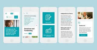
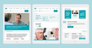
BP: It can be tricky, but I'm passionate about how a responsive approach can take user experience to another level. In this case it was central to creating a site that's intuitive, streamlined and seamless to use. In development, things such as preventing tab focus on the off-canvas navigation were a little extra work, but responsive was crucial for things like maintaining optimal reading text size and page zooming. Plus, it's the fun bit.
How did you manage the need to change the scale of the site inside browser windows?
BP: Page zooming works really well on responsive sites, so this helped. The page looks great at 250 per cent taking on the tablet view, and stays consistent as it moves through the responsive views up to 500 per cent where it takes on the mobile view.

Which assistive technologies did you employ and deploy?
BP: Mixture really helped with workflow during the production of the prototype and interactive style guide. Using this along with BEM and SMACSS methodologies helped formulate structure and kept code maintainable. Our in-house Sass mixin library was used to make sure everything that was added was kept accessible.
AE: We used Git flow and worked on a feature and release workflow, based on user stories and sprints. We also used Jenkins and Drush to automate releases and make deployments quick and reliable.
What's the one single piece of advice you would give to web designers looking to make their sites more accessible?
BP: Once you've got the HTML semantically structured, without any CSS or JS, your page will be accessible, so just test all the styling you add. One way of doing this is by adding WAI-ARIA, but don't overdo it as it will give users too much information, especially when combined with HTML5.
AE: Test in screen readers using only the keyboard – just tabbing through the site to see how it's working really helps.
ER: The ambiguous nature of accessibility means that user testing is crucial. Understanding how the users interacted with the RNIB site and formulating solutions was key to the seamless result we've achieved.
This article originally appeared in net magazine issue 256.

Thank you for reading 5 articles this month* Join now for unlimited access
Enjoy your first month for just £1 / $1 / €1
*Read 5 free articles per month without a subscription

Join now for unlimited access
Try first month for just £1 / $1 / €1
Get the Creative Bloq Newsletter
Daily design news, reviews, how-tos and more, as picked by the editors.
The Creative Bloq team is made up of a group of design fans, and has changed and evolved since Creative Bloq began back in 2012. The current website team consists of eight full-time members of staff: Editor Georgia Coggan, Deputy Editor Rosie Hilder, Ecommerce Editor Beren Neale, Senior News Editor Daniel Piper, Editor, Digital Art and 3D Ian Dean, Tech Reviews Editor Erlingur Einarsson and Ecommerce Writer Beth Nicholls and Staff Writer Natalie Fear, as well as a roster of freelancers from around the world. The 3D World and ImagineFX magazine teams also pitch in, ensuring that content from 3D World and ImagineFX is represented on Creative Bloq.
