How to go beyond the basics with SVG filters
Michael Mullany, CEO at Sencha, demonstrates advanced effects including Instagram-style photo filters and image-free textures.
Sign up to Creative Bloq's daily newsletter, which brings you the latest news and inspiration from the worlds of art, design and technology.
You are now subscribed
Your newsletter sign-up was successful
Want to add more newsletters?

Filter effects apply graphics operations such as blurs, lighting, colour transformations and distortions to content. Today's browsers implement three types of filters:
- CSS filters: a set of simple CSS properties like sepia() and contrast() that can be applied to any HTML content.
- SVG filters: combinations of graphics effects that can be applied to SVG content (and HTML content through a CSS filter cross-reference).
- DX filters are Microsoft's proprietary filter effects. DX filters were deprecated in Internet Explorer (IE) 9 and then removed in IE version 10 (although they can still be reactivated via group policy). Microsoft's DX filters were only ever supported in Internet Explorer.
In this tutorial, we'll start with a simple drop shadow, then customise shadow effects for text, walk through building a texture and finally recreate Gotham, which is a discontinued Instagram filter. By the end of the tutorial, I hope you'll have a solid grasp of filter basics and some useful sample code.
Why filter effects?
When you want to add visual effects to images, graphics, text or video, you can do this in pre-production with tools like Photoshop or Illustrator, or at runtime using canvas, SVG and/or CSS effects.
Runtime effects can be animated, and you can prevent the performance impact of large image downloads (for example, for noise textures). Compared to canvas and CSS effects, SVG filters are particularly useful to:
- Add textures to SVG graphics without downloading large images.
- Embed client-side image editing capabilities in your web app.
- Add lighting, embossing and distortion effects to text, without having to convert the text to an image, retaining accessibility and searchability.
Standardisation and browser support
SVG filters in today's browsers mostly conform to the SVG 1.1 specification, which became a W3C Recommendation in 2003. CSS filters are a work in progress and are being standardised as part of Filter Effects 1.0, which is a spec that combines CSS, SVG and custom filters.
These are supported with a prefix in latest versions of Chrome and Safari. Custom filters are the newest and define vertex and pixel shader effects that can be applied to regular web content. Custom filters are available in alpha behind a flag in recent versions of Chrome.
SVG Filters are supported in all recent desktop and mobile browsers. According to caniuse.com, 73 per cent of the browser installed base has support.
Sign up to Creative Bloq's daily newsletter, which brings you the latest news and inspiration from the worlds of art, design and technology.

A basic filter: Drop Shadow
To start with, we'll show the complete code for a basic filter for an inline SVG fragment. An SVG filter is defined in the <defs> section of an SVG inline fragment or document, and applied to SVG content by adding a filter property to the content.
The filter element is a container for filter 'primitives'. A primitive is a single graphic operation that combines with other primitives to produce the final effect. The drop shadow filter below has four steps:
- Extract the SourceAlpha (a copy of the original content – the SourceGraphic – with its RGB channels set to black).
- Apply a Gaussian blur with a standard deviation of four units.
- Take the blurred text and offset it by 5 units in x and y.
- Take the offset blurred text you previously created and layer it under the original content (the SourceGraphic) using the compositing primitive, feComposite, and the over operator.
<svg width=”600px” height=”200px” viewBox=”0 0 600 200”><defs><filter id=”dropshadow”><feGaussianBlur in=”SourceAlpha” result=”blurOut” stdDeviation=”4”/><feOffset in=”blurOut” result=”dropBlur” dx=”5” dy=”5”/><feComposite operator=”over” in=”SourceGraphic” in2=”dropBlur” result=”final”/></filter></defs><text filter=”url(#dropshadow)” x=”20” y=”100” font- size=”80” width=”550” height=”600”>Shadow This!</text></svg>feComposite has other powerful operators beyond the simple "over" compositing we've shown. Crack open the CodePen for this example and change the "over" to the following values:
- in clips the blur to the area of the original text – producing a blurred fill effect.
- out shows the original text but subtracts the drop shadow, producing a dramatic engraved effect.
- xor combines both inputs but then subtracts any overlap. Here it results in same effect as an out but adds the drop shadow.

Customising drop shadows
Filters have powerful capabilities to customise shadows. If you don't like a Gaussian blur, then you can use the feConvolve primitive to create box-blurs, directional blurs or other non-Gaussian blurs (including Photoshop-style surface blurs).
If you stick with a Gaussian blur, you can customise the intensity and the slope of the shadow using the feComponentTransfer . Shown below is a contour effect that's produced from remapping the alpha channel of the blur.
<filter id=”reMappedAlpha”><feGaussianBlur in=”SourceAlpha” result=”blurOut” stdDeviation=”10”/><feComponentTransfer in=”blurOut” result=”dropBlur”><feFuncA type=”table” tableValues=”0 .5 0 .5 0 .5 0 .5”/></feComponentTransfer><feComposite operator=”over”in=”SourceGraphic” in2=”dropBlur” result=”final”/></filter>The magic here is from the feFuncA primitive, which remaps the alpha channel of the blur (usually a smooth fade) into four separate ranges of 50% alpha to 0% alpha. This generates a contour. You can also remap the alpha channel using the other types within feComponentTransfer. 'Discrete' remaps value ranges to specific values and can be used to produce halo effects. 'Gamma' applies a gamma adjustment. 'Linear' applies a slope and intercept adjustment.
Both gamma and linear adjustments can produce subtle shadow customisations that don’t draw attention to themselves.
Creating texture filters
Filters can generate rich textures. For example, brick, marble, felt, woven cloth, craft paper, sandpaper, film grain, earth and stucco. However, it's not always straightforward. Complex textures can take an eight or 10-step filter. Inkscape (inkscape. org), the open source SVG editor, contains a collection of texture filters with the source available for you to inspect for inspiration.
Here, I'll explain how to create a simplified rough paper texture that I adapted from one of Inkscape's built-in textures.
First, we generate a noise surface using the feTurbulence filter. Then, we shine a light on that surface using a feDiffuseLighting effect, which creates subtle shadows.
<filter id=”roughpaper” x=”0%” y=”0%” width=”100%” height=”100%”><feTurbulence type=”fractalNoise” baseFrequency=”0.04” numOctaves=”5” result=”noise”/><feDiffuseLighting in=”noise” lighting-color=”white” surfaceScale=”2” result=”diffLight”><feDistantLight azimuth=”45” elevation=”35”/></feDiffuseLighting></filter>feTurbulence has three attributes you need to worry about: type, baseFrequency and numOctaves.
- Type can be either fractalNoise or turbulence. fractalNoise generates 'gas-like' noise that's a good base for material and gas-based textures (like clouds). turbulence generates a 'liquid-like' noise, which is a good base for watery effects.
- baseFrequency specifies the 'grain' of the noise. Very low values (such as 0.001) will produce large patterns, and very high values (such as 0.5) will produce tiny patterns. Values in the 0.02 to 0.2 range are useful starting points for most textures.
- numOctaves specifies the number of levels of detail in the noise. Each additional octave adds another layer of detail at a higher frequency (like a higher octave in music). Five octaves is usually the highest you'll need. The effect of a sixth octave is usually not noticeable. The feTurbulence filter by itself generates noise across all channels including the alpha. If you want an opaque texture, you have to adjust the alpha channel to a constant 1. You can do this using a feComponentTransfer with a feFuncA child.

There are two types of lighting available in SVG filters: diffuse and specular. Here we're using diffuse lighting and a distant lightsource. (Specular lighting produces shiny highlights: it's used to simulate plastic, metal or other highly reflective surfaces.)
A filter lightsource treats the alpha value of a pixel in the input as the height of that pixel in z-dimension, and uses that height to calculate a virtual surface, which will reflect a particular amount of light from the light source. Because feTurbulence generates an alpha channel full of noisy values from 0 to 1, it produces a nice variable Z terrain that creates highlights when we shine our light on it.
The surfaceScale value in feDiffuseLighting is the z index
multiplier. Increasing this will create steeper virtual slopes in your texture. A surfaceScale of 20 will create a stucco texture and a surfaceScale of 50 will create crumpled plastic.
Manipulating images
A final area where SVG filters can be used is in bitmap image manipulation. Although canvas has lower level pixel-twiddling capabilities, SVG filters offer a higher level toolbox.
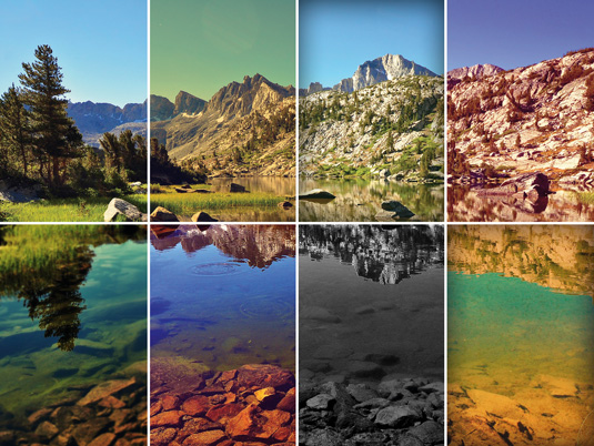
In this example, we'll create a filter inspired by the now defunct Gotham filter from Instagram. In its day, Gotham was known for dramatic black and white images with dark skies. Although the exact Instagram algorithm is unknown, the general consensus seems to be that the Gotham filter consisted of five adjustments:
- A mid-tone contrast boost
- A black and white conversion using red channel
- A small sharpening
- A boost in blue channel for the lower mid-tones
- A decrease in blue channel for the upper midtones
These are all easy to do with the SVG filter toolbox in just a few lines of markup:
<filter id=”Gothamish” color-interpolation-filters=”sRGB”><feComponentTransfer in=”SourceGraphic” result=”midtoneContrast”><feFuncR type=”table” tableValues=”0 0.05 0.1 0.2 0.3 0.5 0.7 0.8 0.9 0.95 1.0”/></feComponentTransfer><feColorMatrix in=”midtoneContrast” result=”redBWandblue” type=”matrix” values=”1 0 0 0 0100001 0 0 0 0.030 0 0 1 0”/><feGaussianBlur in=”redBWandblue” stdDeviation=”1” result=”blurMask”/><feComposite operator=”arithmetic” in=”redBWandblue” in2=”blurMask” k2=”1.3” k3=”-0.3” result=”postsharp”/><feComponentTransfer result=”finalImage” in=”postsharp”><feFuncB type=”table” tableValues=”0 0.047 0.118 0.251 0.318 0.392 0.42 0.439 0.475 0.561 0.58 0.627 0.671 0.733 0.847 0.925 1”/></feComponentTransfer></filter>We start the filter with the feComponentTransfer for the red channel (we’ll be discarding the other channels soon). The ‘table’ mapping is like the curves adjustment control in an image editor. In this
tableValues array, we remap the midtones onto a larger range, and in turn, adjust the highlights upward and shadows downwards.
We then take the result and run it through a feColorMatrix. This takes the red channel and copies it over to the blue and green channels, over-writing their existing values. This gives us a greyscale generated purely from the red channel. While we’re applying the colour matrix, we also adjust the blackpoint by adding 0.03 to the blue channel, giving us a faint blue tint to our blacks.
Next, we do an unsharp mask to sharpen the image by taking a 1 unit blur of our intermediate image and subtracting 30% of it from 130% of the intermediate image. And finally, another feComponentTransfer to boost the blue channel in the lower midtones and decrease it in the upper midtones. This gives the mid to light greys a slight yellow cast, while adding an additional blue tint to the mid to dark greys.
And there you have it: you've created a basic Gotham-style filter.

Filters, CSS and JavaScript
It would be very handy to be able to create and modify filter settings via CSS. Unfortunately, relatively few filter settings are properties that can be specified with CSS; most are SVG attributes. The main SVG filter properties are color-interpolation-filters, flood-color, flood-opacity and lighting-color. Almost everything else is an attribute.
Creating and animating filters can of course be performed with JavaScript (if you're using raw DOM methods remember to use the *NS syntax if you're using the SVG XML namespace). An alternative is to use declarative animation with SMIL. Although IE doesn’t support SMIL, there is a handy library called fakeSMIL that polyfills most common SMIL declarations for IE.
You can add filter effects to shapes that you're drawing using popular libraries. In d3.js, a filter definition looks something like this:
var filter = svg.append(“defs”).append(“filter”).attr(“id”, “blur”).append(“feGaussianBlur”).attr(“stdDeviation”, 5);This will append a <defs> element and a blur filter definition to your d3 visualisation. For complete usage, see Mike Bostock’s full example at bl.ocks.org/ mbostock/1342359. You can also define and apply a filter when creating graphics using Sencha Touch or Ext JS.
Best practice with Ext.Draw is to add a new svgFilter attribute to your draw sprites, which defines the filter to be used on those sprites. Then you need to generate the DOM elements and splice the filter application into Ext.draw’s built-in handling of fill and stroke. You can see a working example at this gist.
Learning more effects
Additional effects that you can create with filters include selective greyscales, iOS 7-style opaque blurs, focus blurs such as tilt-shifts, vignettes, soft-focus, text distortions and posterization. You can see some of them in my CodePen public collections.
Words: Michael Mullany
This article originally appeared in net magazine issue 251.

The Creative Bloq team is made up of a group of art and design enthusiasts, and has changed and evolved since Creative Bloq began back in 2012. The current website team consists of eight full-time members of staff: Editor Georgia Coggan, Deputy Editor Rosie Hilder, Ecommerce Editor Beren Neale, Senior News Editor Daniel Piper, Editor, Digital Art and 3D Ian Dean, Tech Reviews Editor Erlingur Einarsson, Ecommerce Writer Beth Nicholls and Staff Writer Natalie Fear, as well as a roster of freelancers from around the world. The ImagineFX magazine team also pitch in, ensuring that content from leading digital art publication ImagineFX is represented on Creative Bloq.
