How to get started with creative coding
Jamie Kosoy demonstrates that breaking into creative coding isn't as intimidating as it seems.
Creative code is fun but daunting to break into. If you look at a crazy WebGL experiment or a site with complex CSS transitions it's easy to feel like only a coder Jedi could pull off such feats of engineering brilliance.
There's truth that being technically proficient goes a long way, but you don't need to know everything about everything in order to accomplish something beautiful. You just need to have a methodology.
I've built my company around that practice. Arbitrary is at the intersection of art, design and technology. I love using code to be expressive and artistic, but I also love helping people solve problems. That typically translates to mean inventing new user interface paradigms, leveraging motion and transitions as a way to create engaging content and working in close collaboration with like-minded folks to push the limits.
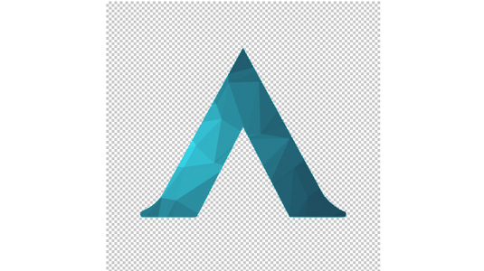
But I'm also not interested in technology for technology's sake – nothing makes me feel worse than working really hard on some crazy WebGL project only to fail basic user goals. I believe there's a balance between the pragmatic and the artistic: That creative code can be more than art and experimentation and that product can be more than the latest design paradigm a big tech company came up with. I set out to showcase all of that by creating a unique, ever-changing logo.
Of course that meant putting my money where my mouth is. I ended up with a dramatic logo I'm pretty proud to show off, and prouder still to tell you how it got made.
The inner workings
The logo is that it isn't just one HTML canvas, but actually a number of canvases each doing a specific job:
- The footer, which drew the triangle/color craziness at the bottom fo the page.
- The logo, which drew the footer inside a mask of the logo.
- The favicon, which scaled the logo down to 16x16.
To get the original mark the way I needed, I started with the vector version and and ran it through a tool called Draw Script, which converted the vector shapes into JavaScript for use in a <canvas> tag.
Get the Creative Bloq Newsletter
Daily design news, reviews, how-tos and more, as picked by the editors.
The colors are the result of a plugin called Flat Surface Shader, made by Matthew Wagerfield and Tobias Schneider. There's no magic to my technique here: I used 'View Source' on their site to copy and paste their effect, then started changing numbers around until I got something that I liked.
The Shader plugin didn't support changing colors dynamically so I discovered another library, Tinycolor, and used that in combination with Tween to yo-yo back and forth between colors. As an extra bonus, I could change the colors to whatever I wanted! In future versions of the portfolio the logo will automatically change to reflect the colors of clients or projects.
Problem statements
Reading all of that might sound daunting to you – just re-reading it myself scares me a bit! Creative code, for me, is more process than know-how. I didn't go into the process knowing I was going to use any of those libraries or techniques – I didn't even have a rough idea of what I wanted!
I work in collaboration with lots of brilliant people, and in this case my friend Jarrod Riddle aided on the branding. Jarrod sent me a text message with an animated GIF of an idea he was thinking about – basically colored shapes floating around and crashing into one another.
From there, I took it one step at a time. I broke it down in my head as such:
- I need a way to draw stuff dynamically. That means I need to use the <canvas> tag.
- More specifically, I need to draw inside of my logo, like a mask. I need to learn how to mask in canvas.
- I need to figure out how to make it look cool.
In other words when I began I had three problem statements, and the third one was far, far out in the distance. The first two were much more achievable, so I started small prototypes using Google as a guide. I tried libraries like CreateJS and KineticJS, drawing a rotating green square as a 'Hello World' of sorts. I also tried drawing in canvas without any library just to compare.
Each of these prototypes was created as a small, isolated demo rather than working toward a bigger thing. My prototypes were meant only to answer a single problem statement; nothing more.
Once I got past the first two problems (with a lot of help from Google!), the third problem statement broke down further:
- I need to figure out how to have lots of shapes that react to one another.
- I need to be able to change the colors of shapes.
And then as I started getting closer to a finished effect:
- Wouldn't it be cool to see the favicon update? I wonder...
If you’d like to see some of the prototypes I made in action, I've written a much more detailed technical writeup on the Arbitrary Blog.
Tool building
The logo on the site looks pretty sharp, but what about social media icons or other marketing materials? For that I created the Arbitrary Logo Generator, a tool which lets me create animated GIF and PNG variations.

The nicest thing about the Logo Generator is that it lets me scrub back and forth through time. That feature lets me choose exactly the frame I think is best for a given moment. I took the GIF output and had lenticular prints made using Gifpop! - a great little gift for clients and partners. For wallpapers and presentations I created a larger variation, the Arbitrary Background Generator. This version removes the logo and just focuses on the effect.
Conclusions
I've seen plenty of coders and designers despair over feeling not good enough - that the reason they'll never do what make what some other person does is because they are somehow "better" or more knowledgeable in a skill. Deep down we know that’s not true… or at least, it's only a part of it.
Syntax doesn't makes a great developer - process does. One trick is to remember what's so cool about the web in the first place - the intersection of design and interactivity.
Collaborate with others. Break a problem down into things you need to learn. Build a million little prototypes. Make stuff with some soul in it. Every time you feel intimidated by a technique or technology, find the time to jump in and teach yourself. The worst that happens is that you learn and grow.
Words: Jamie Kosoy
Jamie Kosoy is founder of @ArbitraryCo and former technology director at Big Spaceship.

Thank you for reading 5 articles this month* Join now for unlimited access
Enjoy your first month for just £1 / $1 / €1
*Read 5 free articles per month without a subscription

Join now for unlimited access
Try first month for just £1 / $1 / €1

The Creative Bloq team is made up of a group of design fans, and has changed and evolved since Creative Bloq began back in 2012. The current website team consists of eight full-time members of staff: Editor Georgia Coggan, Deputy Editor Rosie Hilder, Ecommerce Editor Beren Neale, Senior News Editor Daniel Piper, Editor, Digital Art and 3D Ian Dean, Tech Reviews Editor Erlingur Einarsson, Ecommerce Writer Beth Nicholls and Staff Writer Natalie Fear, as well as a roster of freelancers from around the world. The ImagineFX magazine team also pitch in, ensuring that content from leading digital art publication ImagineFX is represented on Creative Bloq.
