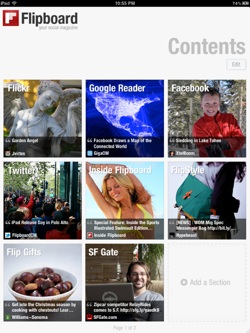
If there was one phrase that dominated SXSWi this year, it was "social media". Every other panel had the phrase in its title, every other attendee seemed to work in the space, and everyone wanted to tell you about how their innovative social media app was going to shake up the industry. But Mike McCue of Flipboard doesn't need to hustle. His news and social media aggregator is already being taken very seriously by a publishing industry going through bad times and looking for a new digital saviour.

Flipboard pulls the links your friends are sharing online into an attractive interface reminiscent of a traditional magazine, with a clean design, print-style layout and large images. Now magazines themselves are getting on board.
Flipboard has launched a trial with a diverse group of publications, including Conde Nast's Bon Appetit, The Washington Post magazine, Wired and Sports Illustrated.
Now if their web content is linked to via Flipboard, rather than just opening a browser window to the magazine's site, that content will be pulled into the app and formatted in a way that fits much more closely with the Flipboard experience.
Framing content
"Making content look great is one of the things I'm personally very passionate about," says McCue. "When you look at an article from a magazine on the web, it just doesn't look anywhere near as good as that same article does in print. The images are squished down, the content has been narrowed into a tight column, it's surrounded by ads and sidebars, and there's just a lot going on that one page. But you look at a magazine in print and it looks amazing, because it's not filled with all that other stuff."
Magazine apps aim to square that circle, of course, and McCue concedes that some of them are pretty good. But there's a disjoin between the information in the article - often sent to the printers weeks before - and the constantly updating nature of the web. "Magazine apps take the printed magazine and basically replicate that experience on the tablet," McCue explains. "But while people are okay with information being a little out of date when they buy a paper product, when they look at content on a digital device, the last thing they expect is for that content to be old.
Flipboard is about marrying the interactiveness of the real-time web to the timeless principles of print design
"Flipboard is about taking the up-to-date information and interactiveness provided by the real-time web and marrying it to the timeless principles of print, the traditions of design typography, the rythmn of storytelling," he explains. "So I think we're seeing something totally new.
The idea itself isn't new, of course, it's the implementation. "A lot of people have thought about this idea before. But there's nothing more powerful than an idea whose time has come. You have the iPad and the whole tablet revolution in terms of how you're presenting content. You have the whole social media realm, which is all about discovering new content in totally new ways. And then you have HTML5, which is incredibly powerful and allows these beautiful pages to be created now.
"Those things have finally hit critical mass. And that combination has allowed us to take this vision of a personalised publication and bring it to life and do it in a way that's fresh and unique. It's not so much about you picking manually what you want, it's about being really inspired by the people you care about: they're the ones that are effectively curating the mag for you. And it works incredibly well."
Media partners
Flipboard hasn't had to seek out media partnerships, he explains: the publishers have come to them. "When we first shipped they really wanted to be able to format their content for Flipboard. So we built a platform that allows them to automatically convert their web content to pages that look like they were from the pages of their main magazine. Those pages load a lot faster and they're beautiful to look at. That's a great thing for them and it's a great thing for readers."
Right now, no money is changing hands, but McCue has ambitious plans that he believes will ultimately change the way publishers monetise their digital content. "We're planning to put in full-page print style ads that will be inserted in between articles or in between pages of a four or five-page article," he explains.
Web content today isn't being well monetised because the banner ads are actually making the content look worse
The distinction between types of ad may sound trivial, but to McCue it's key to the entire proposition. "Web content today isn't being well monetised because the banner ads are actually making the content look worse," he argues. "The content has to make room for those ads; it makes the page load more slowly; and they're kind of blinking at you while you're trying to read an article. What we wanted to do was really to simulate the notion of a magazine where you have the content, it has all the room it needs to breathe and it looks beautiful. And so do the separate, full-page ads.
"Ask people who read Vogue magazine, for example: 'Hey would you like to pay for Vogue with the ads or maybe without the ads?' Almost everybody would say they wanted the ads, because the ads are so specific to that readership. And if the ads are done well - they're not making the content look bad like it usually does on the web - then I think it's a great model and everybody wins."
New features
McCue concedes the Flipboard interface could be easily copied by rivals, and I ask him if any of the technology is patented. "It's not so much about patenting, it's more about leadership," he replies. "It's about really knowing where you're trying to go and why. And if you really focus on that, on what your users care about, what your partners care about, then everyone else who's copying you is just going to be copying your last release, and you can keep moving forward."
Flipboard is certainly moving forward right now, with the latest release adding Instagram integration, social search functionality and a healthy speed boost. McCue is also working on an iPhone version. "Partly that's a pragamtic thing because it's all based on iOS," says McCue. "But won't be shrinking the iPad version, we'll be building from the ground up. If the iPad experience is about sitting back and taking an hour absorbing things, the iPhone app needs to be more about a world where you're quickly scanning information; you're standing in line and want to mark something to read later; or you want to be able to quickly understand what's happening across all your social networks. And they'll sync up with each other."
Other devices will have to wait, though, says McCue. "My little team has just 31 people and if we were all spread out on Android and lots of other programs, it'd be really hard for us to keep moving at the pace we are, with lots of new features. So we've taken the strategic bet that that's the right approach. Each one of those platforms will require some special thinking. But I'm looking forward to ultimately getting there."

Thank you for reading 5 articles this month* Join now for unlimited access
Enjoy your first month for just £1 / $1 / €1
*Read 5 free articles per month without a subscription

Join now for unlimited access
Try first month for just £1 / $1 / €1
Get the Creative Bloq Newsletter
Daily design news, reviews, how-tos and more, as picked by the editors.

Tom May is an award-winning journalist and editor specialising in design, photography and technology. Author of the Amazon #1 bestseller Great TED Talks: Creativity, published by Pavilion Books, Tom was previously editor of Professional Photography magazine, associate editor at Creative Bloq, and deputy editor at net magazine. Today, he is a regular contributor to Creative Bloq and its sister sites Digital Camera World, T3.com and Tech Radar. He also writes for Creative Boom and works on content marketing projects.
