How Costa Coffee's rich parallax website was made
Graphite Digital take us on an interactive tour of the journey from bean to cup for Costa Coffee.

This impressive one paper website, The Costa Experience, is the brainchild of Brighton-based agency Graphite Digital. Having worked previously with Costa Coffee, the team was recently tasked with better communicating its products.
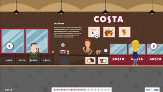
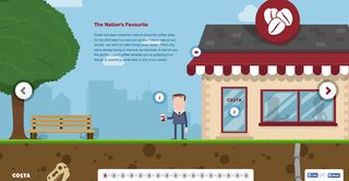
The result was this visually rich, parallax website full of animated illustrations and interactive elements. Here, we speak to senior designer at Graphite Digital Jon Gibson about how it was achieved.
How did the brief come about and what elements did it include?
After a few successful projects with Costa under our belts, they chose us to be their main digital agency in 2013. The company decided it was time to refresh the website to help them better communicate the care and attention they put into their coffee. They also wanted to engage and involve their customers – they have a really loyal fanbase and wanted to build on the great work they’re already doing in social media channels.
Our job was to find a way of showcasing all the great things Costa do
Our job was to find a way of showcasing all the great things Costa do behind the scenes to bring you your coffee, the effort that goes into ensuring quality and how their different products are made, from bean to cup.
How strict was the brief? Did you have a lot of creative freedom?
Costa are a fantastic client - they encourage us to explore ideas and then trust us to run with them. There were clear objectives and messages they wanted to include, but they gave us plenty of freedom to be creative - a designer’s dream.
Having that freedom meant we could make something that we would be proud of and enjoy using ourselves – even those in the office who don’t drink much coffee! We wanted to design beautiful environments and reward users that take the time to explore them, and so built in a number hidden features (look out for the dinosaur and the hanging lights!) and subtle effects.

Talk us through how you approached the project...
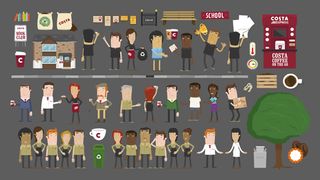
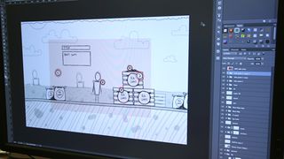
First we had to get an understanding of the journey. After a few workshops and scripting iterations, we had a list of potential scenes and some ideas on how best to visualise them. With those agreed, we sketched out each scene to show Costa what we had in mind, and then illustrated them digitally.
Our first idea was to use a more photographic style, but we quickly moved to an illustrative approach to give us more flexibility compared to relying on photographs, and keep the loading times down for users.

What did you use to build the site?
We built a framework based on jQuery to handle the journey. Each slide has a number of planes which we used to create the parallax effect. By using a ‘Next/Back’ style interaction rather than a continuous scroll, we were able to keep the parallax subtle and smooth, which we find can be lost in sites that try to do everything on one page.
The animations are built entirely using CSS, images, icon fonts or PNG sequences which were turned into sprite sheets for playback with JavaScript. No Flash or video in sight. Our priority was keeping the experience as smooth and beautiful as possible, so we had to make sure the site loaded as little content to the browser at any one time as possible – less is definitely more!

What was the most challenging aspect of the project?
Catering for different browsers, devices and connection speeds was probably the hardest challenge. We didn’t want to compromise the experience, so we had to tailor it for different user specs. We took a lot of care in this project, so we plan to maintain and update it as devices and connections get more powerful. Hopefully one day it will look the same no matter what!
Liked this? Read these!
- Create a perfect mood board with these pro tips
- The ultimate guide to logo design
- Brilliant Wordpress tutorial selection
Have you come across any wonderful websites? Let us know in the comments box below!

Thank you for reading 5 articles this month* Join now for unlimited access
Enjoy your first month for just £1 / $1 / €1
*Read 5 free articles per month without a subscription

Join now for unlimited access
Try first month for just £1 / $1 / €1
Get the Creative Bloq Newsletter
Daily design news, reviews, how-tos and more, as picked by the editors.
The Creative Bloq team is made up of a group of design fans, and has changed and evolved since Creative Bloq began back in 2012. The current website team consists of eight full-time members of staff: Editor Georgia Coggan, Deputy Editor Rosie Hilder, Ecommerce Editor Beren Neale, Senior News Editor Daniel Piper, Editor, Digital Art and 3D Ian Dean, Tech Reviews Editor Erlingur Einarsson and Ecommerce Writer Beth Nicholls and Staff Writer Natalie Fear, as well as a roster of freelancers from around the world. The 3D World and ImagineFX magazine teams also pitch in, ensuring that content from 3D World and ImagineFX is represented on Creative Bloq.
