Has the address bar had its day?
Mobile browsers and pixel-hungry designers are demanding that this interface overhead must go. Is the address bar the navigation element to put on the chopping block? Safari, Chrome, and Firefox have tried it – so is it on its way out?
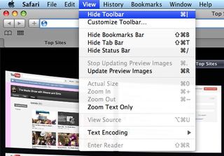
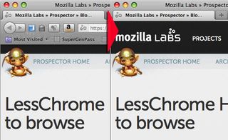
Over the past few years, it has looked like the days of the address bar might be numbered. Designers, under pressure to maximise screen real estate, have toyed with hiding the bar from view. Mobile browsers hide the bar until the user scrolls up to it. Touch interfaces make the text-intensive bar harder to use. Safari has given the users the option to hide the bar for almost a decade, while both Chrome and Firefox offered experimental desktop builds last year in which the bar appears only when the user mouses over or clicks on a window tab.
The dangers
Usability consultant Jakob Nielsen recently threw his support behind temporarily hiding elements of interface "chrome" like the address bar, but warned that "doing so is dangerous... what's out of sight is often out of mind – and you definitely cannot rely on short-term memory in user interface design".
To make hiding work, he recommended simple gestures unlikely to be triggered by accident, and repeatedly exposing users to the element so they know it's there. When it comes to navigation, Nielsen wrote, "Chrome might be overhead in terms of screen pixels, but it's power at the user's fingertips that serves as an immediate escape hatch from obnoxious or useless web pages."
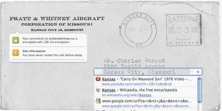
But the address bar isn't just about navigation any more. As browsers have evolved, this slim rectangle of screen has taken on a surprising number of functions; it doesn't just show the address of the page you're on, or take you directly there. The bar increasingly presents history and bookmarks through predictive text results.
Security issues
In some browsers, the address bar has become a central location for security information and warnings, highlighting https connections and flagging potential phishing.
"Those [security] constraints are difficult to achieve with an address bar that isn't shown by default," says engineer Peter Kasting, whose work on Google's Chrome browser has focused on the browser's 'omnibox.' "I would be surprised if someone managed to create an effective prototype along these lines, but I've been surprised before."

And, of course, the address bar is increasingly inextricable from search. Chrome and Firefox have both adjusted to the common use case in which users do not distinguish between search bars and address bars, typing queries into the bar or addresses into Google.
There's great incentive for browsers to capture and shape this traffic. ISPs and browsers have for years redirected badly-written addresses to their own search engines, giving users suggestions instead of just warning that their navigation has failed – and offering an opportunity to sell ads against these results.
Get the Creative Bloq Newsletter
Daily design news, reviews, how-tos and more, as picked by the editors.
Using URLs
Despite all the address bar's features, it is curiously underused. Novice users simply don't touch it. Jessamyn West, a community moderator for MetaFilter and the author of a book about the Digital Divide, says that among her computer skills students in rural Vermont.
"I still see the old 'Type URL into the Google box on the homepage' approach a lot of the time,” she says. “Some users don’t know how to go to a web address. Almost none of them understand that, in some cases, the URL actually represents something like a file structure."
Features like greying out all but the root domain to clarify phishing don't reach these users, she says; many use browsers that are years old.
By contrast, for the librarians with whom West works as a technology advocate, "the URL can be a great tool, a thing you hack around with and mash up to try to figure out how to get the website to give you the data you want. I personally think URLs are mission critical for understanding and assessing what your browser is showing to you."
Advanced users
Jeffrey Zeldman and Kevin Hoffman of design firm Happy Cog agree that more advanced users look to the address bar and features like mouseover previews to ensure they aren't being taken to yet another Rickroll, or worse yet, a phishing site. "Advanced users are sceptical and prefer to look before they leap," notes Zeldman.
Even these use cases, though, only come up sporadically. And who types in a full URL any more? They're long, complicated, and more readable to software than to people. The bar's predictive and bookmarking functions let us type in only a few letters, with the browser filling in the rest. "I've observed users copying and sharing URLs," says Hoffman, "but this is less common in younger users that have become comfortable with various in-page sharing user interfaces."

This, then, is the crux of the problem: between novice and advanced users, and the many things the browser now does, the address bar has to be considered in light of an expanding, diverse set of use cases.
Case by case
"From a mobile standpoint, the gains [of hiding the bar] are obvious – you've got a small screen and you're buying pixels," says Hoffman. "On a more traditional screen size, the gains are more subtle and depend on context of use. Personally, if I'm using Google docs, I love the idea of hiding it for increased focus. Same goes for making presentations from web addresses. But I have found it jarring in more traditional 'search and browse' scenarios, where moving from one website to another presents inconsistencies in both the interface and provided functionality.
Which use cases take priority? How to support many users' needs at once? "You don't want to take away a feature that power users use," says Bob Moore, a Yahoo user researcher. "They may be a small part of your user base, but they're important. Ultimately you want to convert [novice users into] power users. You don't want to prevent them from being able to do that."
For the moment, it looks like the address bar is safe in desktop browsers. Developers at Chrome suggest the disappearing-bar trick is off the table for now, with no current plans to incorporate it permanently. Discussion forums on the change raised many concerns about the security ramifications of hiding the bar. On Firefox, the hidden bar is still only in the LessChrome HD experimental build; on Safari, it's still optional.

Hiding address bars is already the norm on mobile platforms, however. It remains to be seen whether that touch-friendly approach will creep onto other platforms. The tricky task ahead for developers is balancing the demands of simple, clean interfaces with security concerns and diverse use cases.

Thank you for reading 5 articles this month* Join now for unlimited access
Enjoy your first month for just £1 / $1 / €1
*Read 5 free articles per month without a subscription

Join now for unlimited access
Try first month for just £1 / $1 / €1
The Creative Bloq team is made up of a group of design fans, and has changed and evolved since Creative Bloq began back in 2012. The current website team consists of eight full-time members of staff: Editor Georgia Coggan, Deputy Editor Rosie Hilder, Ecommerce Editor Beren Neale, Senior News Editor Daniel Piper, Editor, Digital Art and 3D Ian Dean, Tech Reviews Editor Erlingur Einarsson, Ecommerce Writer Beth Nicholls and Staff Writer Natalie Fear, as well as a roster of freelancers from around the world. The ImagineFX magazine team also pitch in, ensuring that content from leading digital art publication ImagineFX is represented on Creative Bloq.
