The secrets of the Guardian's responsive redesign
Developed by its in-house team, the Guardian's new responsive site presents news to mobile devices in a clean, flexible format.

One of the world's most widely read newspaper websites, the Guardian attracts tens of millions of unique visitors each year. With that audience increasingly migrating to mobile and tablet, the newspaper's in-house team was tasked with rebuilding the site to improve user experience on mobile devices.
As well as making it easier for a mobile audience to discover a wider range of its content, a key objective of the new site was to better integrate display advertising and other commercial offers.
The new design can be seen in beta here. Below, the Guardian's team tells us about their workflow, about maximising performance on such a widely used site – and just what the hell 'swimlaning' means.
What are the challenges of responsive design on such a large scale?
The hardest thing we have found is changing our internal tooling. We've had to create new content-management tools that allow us to create flexible content that can be displayed across many devices.
Most importantly, we have created a shared vocabulary between designers and developers, including typographic scale, colour palettes and a module system. We call this Guss.
How has the information architecture of the site changed?
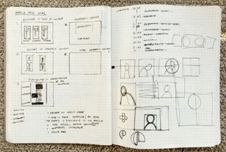
One of the first things we did was look at how we could simplify our information architecture. We saw from analysing user data that once a user gets to a certain point in their journey they stop using the navigation and instead navigate through content.
The old site had multiple levels of depth, and subsections would often have bespoke navigation that was out-of-date, cluttered and poorly used.
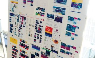
We've stripped back the navigation to two levels: primary and secondary. We also changed some of the groupings we use to categorise our content, which we validated with several card sorts.
This allows people to quickly orientate themselves to the main topic area they're interested in, and dive straight into content from there.
How did the content strategy evolve?
A key part of the strategy for the new site is better discoverability. We publish over 500 articles a day, and we want to make it easy for people to find them.
One of the things we're experimenting with at the moment is the idea of blended content. Rather than a traditional classification system, with homepage areas for news, sport, technology, culture and so on, we've been testing a 'people' zone and a 'reviews' zone which aggregate content from the whole of the Guardian.
Rather than pigeonholing content by how it was commissioned, blending frees it to appear anywhere. We're really excited about it.
What was your wireframing process?
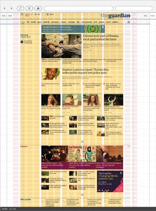
One of the things we did right from the start on the project was to wireframe in HTML rather than using traditional UX software like Axure or OmniGraffle.
For a responsive design project, this has a number of benefits, the strongest being that you can immediately see how an idea will work in a browser and iterate from there. HTML wireframes are also incredibly easy to present and share with others.
Rather than using annotations that no one ever reads to describe an interaction, it's right there on the page.
Give us an outline of your technology stack.
On the server side we're using the Scala flavour of the Play MVC framework to power the site. This is then hosted in production on Amazon's cloud computing ecosystem.
On the client side we harness the power of Sass to write our CSS and keep our JavaScript modular with AMD. Finally we use the Node.js task runner Grunt to tie this all together into a compiled application.
There has been a lot of talk of 'swimlaning' on the project. What is it?
One of the biggest lessons we have learnt from 15 years of software development at the Guardian is that large monolithic applications are a nightmare to maintain.
With that in mind we have spent the last three years separating our entire infrastructure into a service-orientated architecture. Our fantastic content API has meant that our frontend application never has to query a database and is purely responsible for rendering content.
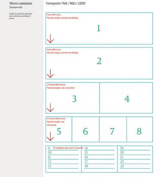
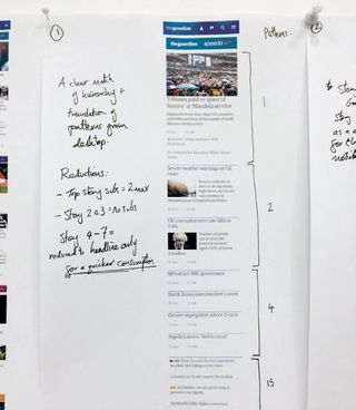
We take this notion of separation one step further with swimlaning: decoupling parts of the rendering tier so that they can be hosted and updated independently.
For example, our articles are served via different servers to our galleries – so if our gallery server crashes and burns, access to articles won't be impeded.
What techniques have you used to maximise performance?
Latency is the biggest performance killer, especially on mobile. The easiest trick is to reduce HTTP requests and round trips. We do this by utilising the browser's localStorage, caching everything from web fonts to CSS in there.
In turn, this prevents requests on subsequent pages. We also inline our critical CSS into the initial HTML payload to trigger instant rendering. All of these techniques make the site more resilient to failure.
Was performance in the minds of the whole team, or just the developers?
Performance needs to be everyone's responsibility. To do this, we've had to educate our designers and product owners about the benefits.
Firstly, you must quantify the impact of speed on user engagement, and then invest in tools which can visualise the site's performance in real time. We have dashboards that are always visible to the team giving constant feedback so we know instantly if a change we shipped has slowed something down.

How often do you deploy updates?
We strive to continuously deliver change to our users, whilst developing and testing in the open. We now deploy to production on average four times a day, and have even been known to do so from an airport in Jersey – or even live on stage from conferences.
This article originally appeared in net magazine issue 254.

Thank you for reading 5 articles this month* Join now for unlimited access
Enjoy your first month for just £1 / $1 / €1
*Read 5 free articles per month without a subscription

Join now for unlimited access
Try first month for just £1 / $1 / €1
Get the Creative Bloq Newsletter
Daily design news, reviews, how-tos and more, as picked by the editors.
The Creative Bloq team is made up of a group of design fans, and has changed and evolved since Creative Bloq began back in 2012. The current website team consists of eight full-time members of staff: Editor Georgia Coggan, Deputy Editor Rosie Hilder, Ecommerce Editor Beren Neale, Senior News Editor Daniel Piper, Editor, Digital Art and 3D Ian Dean, Tech Reviews Editor Erlingur Einarsson and Ecommerce Writer Beth Nicholls and Staff Writer Natalie Fear, as well as a roster of freelancers from around the world. The 3D World and ImagineFX magazine teams also pitch in, ensuring that content from 3D World and ImagineFX is represented on Creative Bloq.


