Flat design vs realism: which side are you on?
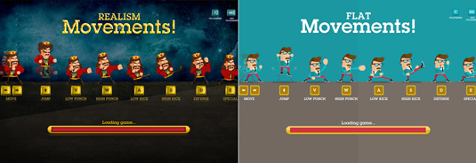
Pick your team and battle it out in this brilliant Flat vs Realism interactive adventure from digital agency inTacto.
Sign up to Creative Bloq's daily newsletter, which brings you the latest news and inspiration from the worlds of art, design and technology.
You are now subscribed
Your newsletter sign-up was successful
Want to add more newsletters?
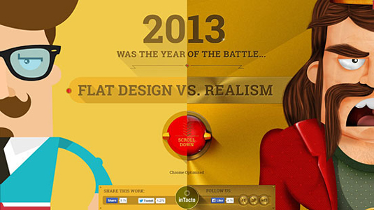
Last year, flat design took over the world of digital design. The hallmarks of skeuomorphic design - embossed and bevel effects, 3D artificial textures, drop shadows and reflective shimmers - all but disappeared and were replaced with minimalist design, bold colours sharp edges and lines, simple typography and very little, if any at all, shadowing.
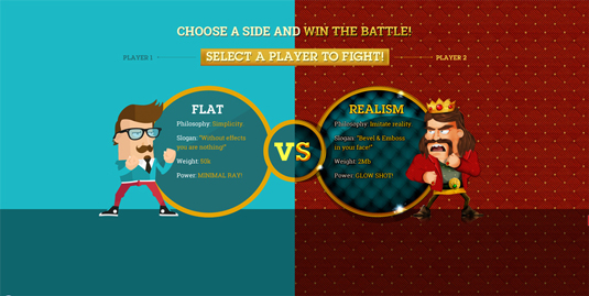
To highlight this design trend, interactive agency inTacto created this brilliant interactive infographic Flat Design vs Realism.The cool project also includes interactive game, in which users pick a side and then battle the enemy. We spoke to inTacto's creative director Alejandro Lazos to find out more about the project.
How did the concept come about?
At the end of each year, we create a self-promotional interactive greeting from the agency, where we like to demonstrate our creativity along with high production values. For each greeting we create, we like to use the most prominent themes from that year in the digital world, and in 2013 we saw in July there was a great debate when Apple finally changed the design of iOS7 in line with flat design, which Windows 8 had already adopted some time before.
Article continues belowThe subject became viral and was being discussed on design blogs everywhere with both supporters and detractors discussing this new style, which was quickly establishing itself as the new design trend for digital media. This sometimes heated discussion gave us the idea for the concept of a struggle between two groups of designers.
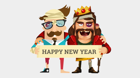
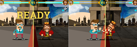
HTML5 games were also becoming popular and gaining a lot of attention, so we wanted to demonstrate our skills in this area. Because of this, the idea of recreating the format of ¨Street Fighter¨ to help depict this design struggle, occurred to us.
We created a story which metaphorically narrated what we felt was taking place in the world of digital design
The game alone wasn't going to suffice though and we felt it was lacking something. Therefore we created a story which metaphorically narrated what we felt was taking place in the world of digital design, and it also brought some background and context to the game. Finally, we added a video greeting from our team.
Tell us about your design approach to this project...
Once we had defined the idea of "Flat design vs Realism or Skeuomorphism", and the personalities of the protagonists, we researched in detail the two design styles, to really discover the particularities of each one. During this stage Pinterest was a great help and source of inspiration.
Sign up to Creative Bloq's daily newsletter, which brings you the latest news and inspiration from the worlds of art, design and technology.
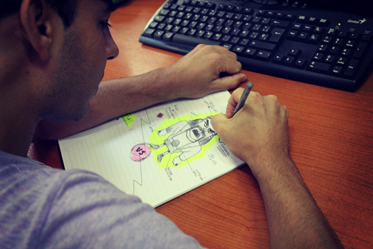
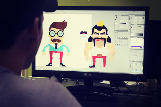
Afterwards we created a storyboard based on our script and created various sketches on paper to define the look of each character. Finally we then searched for a suitable font, and in this case we were very happy with Roboto Slab from Google Fonts, which worked well in both styles.
What did you use to build the project?
We mainly built the site using HTML5, CSS, JQuery, JavaScript, and for the game we used Construct 2.
To bring the game's characters to life, we used the Puppet Warp tool in Photoshop to transform our original drawings, and we then animated them frame by frame.
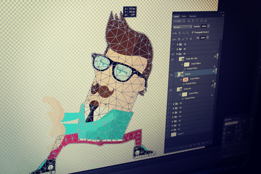
We used the 3D Camera function in After Effects, in the scene with columns moving further away, to give us the exact movement and perspective we needed. We then took this and replicated it using CSS.
Finally, we used a 24-bit PNG compressor (outside of Photoshop) on the images, which allowed us to bring down the number of colours while still maintaining the transparency of the borders with antialias.
What was the most challenging aspect?
We encountered many technical problems and at times we had to have interdisciplinary meetings and brainstorm possible solutions.
One of the principal problems was to insert the HTML5 game in the middle of a parallax scroll. We wanted everything to be continuous and without jumps while scrolling, so the users could at any time go from start to finish without interruptions. To achieve this we utilized Ajax technology to pass parameters to the url, and the game which loads in a div, is in charge of collecting those parameters and display the corresponding loading screen (flat or realism).
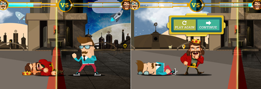
Another problem was the slow performance when displayed at fullscreen. To solve this, we worked with a 960px canvas (50% of the size of the monitor) and then stretched it to double the size using CSS. The images don't appear stretched, because we inserted them into the game at double the size to compensate for this.
A major issue for us was the overall weight and loading time of the site, which resulted in us compressing every PNG using color quantizer, and also loading the site in various stages so it doesn’t all occur at the beginning. An interesting solution was to load the final video while the user is watching the initial story. Also, for this sequence of images, we used 2 different qualities of JPGs. If the user scrolls quickly to the final video they will see it in lower quality, but if they wait the video will then be displayed in higher quality.
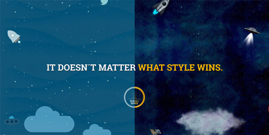
Finally we had an unexpected but positive problem which occurred a couple of days after launching the site. We had to migrate the server which was hosting the site to cope with the high level of traffic we were receiving.

- Creative director: Alejandro Lazos
- Creative, sound design: Sergio Chaile
- Art director, illustrator: Damián Lettiero
- Multimedia designer: Natalia Manterola
- Front end director: Guillermo Vazquez
- Game developer: Lucas Pallares
Liked this? Read these!
- Create a perfect mood board with these pro tips
- The ultimate guide to logo design
- Brilliant Wordpress tutorial selection

The Creative Bloq team is made up of a group of art and design enthusiasts, and has changed and evolved since Creative Bloq began back in 2012. The current website team consists of eight full-time members of staff: Editor Georgia Coggan, Deputy Editor Rosie Hilder, Ecommerce Editor Beren Neale, Senior News Editor Daniel Piper, Editor, Digital Art and 3D Ian Dean, Tech Reviews Editor Erlingur Einarsson, Ecommerce Writer Beth Nicholls and Staff Writer Natalie Fear, as well as a roster of freelancers from around the world. The ImagineFX magazine team also pitch in, ensuring that content from leading digital art publication ImagineFX is represented on Creative Bloq.
