Five top tips for building responsive WordPress sites
Web developer Jesse Friedman explains how you can integrate responsive web design with WordPress and goes over both the advantages and challenges of responsive theming
WordPress is quickly becoming a household name and the gold standard of content management systems. While relying on WordPress is becoming the norm for delivering content, users are increasingly using mobile devices to consume that content. In fact in 2015 over 50 per cent of the internet is expected to be consumed by a mobile device. With 4G downloads and the use of mobile devices in the home or office, these mobile users aren’t always constricted to poor bandwidth either.
So how do we ensure that our WordPress powered website is going to function well while maintaining that beautiful design on mobile devices, desktop computers and even huge wide monitors? Responsive web design (which by now is close to becoming its own household name), coined by Ethan Marcotte, is a way of building websites that adapt to their surroundings ensuring consistent design and functionality for all devices and screen sizes.
Responsive WordPress theming has its advantages but there are also some elements of WordPress that we need to overcome. Below we’ll cover how to harness those abilities and conversely how to overcome some obstacles.
1. Always consider the user admin
As a CMS developer, specifically a WordPress developer, you always have to be thinking about two types of users for the sites that we build. The first is obvious and that’s the typical visitor of the site. The second type of user is the user admin, the person in charge of content changes and managing the WordPress backend.
Handing over the controls to a novice internet user can be tough and no matter how much training you provide things are bound to go wrong, eventually. I’ve had user admins do everything from adding over 50 pages to a single tier drop-down menu to scheduling all their posts for future release and wonder why they 'disappeared' from the site.
It’s very hard to predict what your user admin might do to their shiny new website, but it’s good to try and plan for some of the more easy things to break. Especially when building a responsive site we need to plan ahead. A few good tips include:
- Setting the depth of your menu calls preventing a two tier drop-down menu from turning into a broken six tier drop-down menu.
- Defining image widths and heights so WordPress can do the work of auto resizing and cropping images if necessary.
- Preventing access to plug-ins to prevent installation of conflicting code
- Enqueue Scripts to prevent conflicts later.
2. Harness your menus
I remember when WordPress adopted menus and it was a great day for developers. We no longer had to create complex solutions in order to build dynamic menus. Today we literally drag the pages into the menu, sort them how we want and even have the ability to create a hierarchy with ease. WordPress even provides us with the ability to predefine menus for use throughout the site.
Get the Creative Bloq Newsletter
Daily design news, reviews, how-tos and more, as picked by the editors.
This makes it easy to define two menus, one for desktops and another for mobile devices. If you’re building a large website with many pages, you probably don’t want to sacrifice valuable header space to a large nav menu that a mobile user may not even need.
With a few lines of code we can define a mobile menu and desktop menu to be used accordingly.
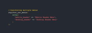
The register_nav_menu function would be placed in the functions.php file in your theme. You can register multiple menus at once. To learn more about this function please refer to the WordPress Codex.
Once we create our menus we can simply define which one to display in the desktop or mobile views.
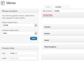
In our theme files we can use a PHP class such as PHP-Mobile-Detect to ask which menu to display or we can simply display both menus and hide one with CSS.
For something as simple as menus I tend to use a class of 'mobile' and a class of 'desktop' then use CSS media queries to display: none the correct class.
Hint: You can add these classes directly to specific nav menus right in the admin area. If you don’t see the option for classes, go to the top of your screen, click screen options and check off classes.
3. Handling media
One of the more complex problems with a CMS and responsive websites is that the developer is no longer in control of the content. The user admin takes over and adds content as necessary. In most cases these users admins don’t know HTML. When we combine this lack of HTML knowledge with WordPress always adding a width and height attribute to every inserted image we can run into a responsive conflict.
I have a solution for overwriting these attributes when images and videos are inserted into the content editor, below. However it’s common to use 'featured images' throughout our themes on the homepage, archive pages, search results and in sidebars. These featured images are still uploaded by the user admin but are considered more of a meta value than a piece of content. In other words we can call the featured image in our theme files outside of the rest of the content.
Not only can we call these images directly in our PHP files but we can define their output sizes and WordPress will auto resize and crop them.
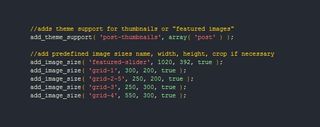
Once we’ve added theme support for post thumbnails, we can add a variety of sizes using the add_image_size function. You can read more about this function in the Codex.
The code snippet above adds theme support for featured images, then defines the thumbnail names and sizes that we need for this theme. The last parameter asks if you want WordPress to crop the image if necessary. In this case I don’t want the images to become distorted so I set it to true.
Predefining our image sizes takes the possibility of error out of our user admins hands. Without these simple function calls user admins could set a 2400x1800px photo as the featured image which in most cases needs to be significantly smaller than that. We can quickly see the benefits of not having to download a huge image like that on a mobile device.
Using a PHP function to determine device type will allow us to serve up significantly smaller images to mobile devices and larger resolution photos to desktops.
4. Master shortcodes
Shortcodes allow for us to create simple calls to functions without having to know any code. We can simply define a short code as [myshortcode] or even have encapsulating shortcodes such as [myshortcode]my content[/myshortcode].
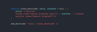
The Shortcode API allows for a variety of functions and added theme support. The API is well documented and a great read.
On my website I use shortcodes to define 'notes' or aside elements. On a wider desktop screen the notes show in the left hand sidebar but on a mobile device the sidebar is integrated into a single column.


This doesn’t exactly blow the roof off in ingenuity but it solves a problem for the user admins. All I’m doing is closing a div, opening another and then closing them again. If you know HTML, this is no big challenge (except for maybe always trying to remember your classes). However for someone who doesn’t know HTML, all they have to do is wrap their content in [note] [/note].
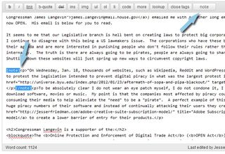
WordPress even gives us the ability to modify the editor bar and add our shortcodes there. The ease of adding shortcodes and their availability to user admins makes them a great solution for:
- Hiding content on mobile devices or showing content on wide desktop screens.
- Serving ads (mobile versus desktop).
- Hard coding links in content.
- and much more ...
5. JavaScript keeps us sane
We’ve mentioned the user admin on several occasions. Since we won’t be their to hold their hands we have to ensure the sites we build don’t break and that we aren’t losing the responsivness we’ve worked so hard to develop.
When a user admin inserts an image into the content area or uses oembed to upload a video we have little control over the inherit HTML attributes that are going to break our responsive sites. JavaScript and more specifically jQuery can help alleviate these woes by overwriting the width attributes associated with media elements.
The below jQuery snippet is a simplified script used to remove the 'style' attribute from a div that was created by a plug-in. On my website there are three social media share buttons added by a simple plug-in that for some reason decided to use in line styles. In an effort to prevent conflicts with future upgrades of the plug-in I didn’t want to edit its files. Instead I can use JavaScript to remove the conflicting attributes.
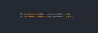
jQuery can be utilised to remove unnecessary but automatically added attributes that conflict with our efforts to remain responsive. The removeAttr() function can be implemented on a globally or specifically depending on how you define it. We can also use JavaScript to make building responsive sites even easier with tools like Modernizr and others that help to detect browser and device type.
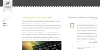
These are just a few tips to help you harness some of WordPress’ inherit functionality and also to overcome some of its complications. The one thing I’d like to leave you with is that Responsive Web Design is not just about mobile. We can do extraordinary things with wide desktops and utilise that extra white space. Especially with WordPress where you usually have content to spare it makes sense to add an additional column on wide browsers. On my site you can see on wide browsers I actually bring up my comments section along side the article. I like this because users who skim articles can get an idea of what’s being commented on at the same time and we fill the screen nicely.
If you’re intersted in discussing WordPress further feel free to catch me on Twitter. I will also be getting more in depth on this topic both in a .net magazine article in the May issue (227) and my book (which is being published by New Riders under their 'Voices That Matter' series) which will be on shelves this summer.

Thank you for reading 5 articles this month* Join now for unlimited access
Enjoy your first month for just £1 / $1 / €1
*Read 5 free articles per month without a subscription

Join now for unlimited access
Try first month for just £1 / $1 / €1
The Creative Bloq team is made up of a group of design fans, and has changed and evolved since Creative Bloq began back in 2012. The current website team consists of eight full-time members of staff: Editor Georgia Coggan, Deputy Editor Rosie Hilder, Ecommerce Editor Beren Neale, Senior News Editor Daniel Piper, Editor, Digital Art and 3D Ian Dean, Tech Reviews Editor Erlingur Einarsson and Ecommerce Writer Beth Nicholls and Staff Writer Natalie Fear, as well as a roster of freelancers from around the world. The 3D World and ImagineFX magazine teams also pitch in, ensuring that content from 3D World and ImagineFX is represented on Creative Bloq.
