fffunction on life, the web and collaborative working
Martin Cooper talks to the fffunction team about user-centred design, working with clients and RWD.
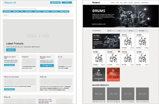
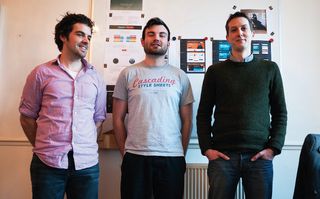
fffunction is a design house with hubs in Bristol and Penryn, Cornwall. Currently the team are collectively sporting five tattoos and 2.8 beards. They've drunk 2844 cups of tea and 1269 coffees (these numbers were correct at the time of publication). The friendly and predominantly clean-shaven bunch has also turned out some cracking work. Projects include creating the 2012 Brooklyn Beta site, and building a new web-front for musical instrument makers, Roland UK. It also produced a website for the conservation minded Global Tree Campaign. We caught up with the fffunction team and discussed life, the web and collaborative working.
So, fffunction. Who are you and why the liberal use of the letter 'f'?
Adam Robertson: Our business is about designing for users and the one thing that always sums that up perfectly is form follows function: fffunction.
You're based in Bristol and Cornwall? Is it easy working on projects from different locations?
Dan Goodwin: Yep, no problems here. When everybody in a team understands how they and the other team members work best, then distance and location isn't a problem. Daily stand-ups, a decent agency-wide IM chat room as well as regular office swaps and get-togethers all really help too.
Have you never been tempted to move the agency to London?
AR: Nope, never. Why do you ask?
What work do you think best summarises your strengths and attitude as a company?
AR: I would say that work we have done with Roland best summarises our user-centred design process. We helped Roland transform from a product-led to a customer-focused business.
Our persona and user journey work became an integral part of their internal processes, which they made into a printed booklet that was distributed around the Roland organisation globally.

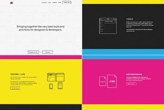
PC: From a more visual design perspective I'd say it's a close call between the work we did for Mixture and HybridCluster. Both were really keen for us to explore interesting solutions and try a few new techniques and ideas. The initial thinking and sketched ideas for Mixture in particular were certainly quite open and free-flowing.
Even if we did end up reining it in for the final version, it was great to explore some ideas.
You worked on the 2012 Brooklyn Beta website. How did that come about?
AR: Chris and Cameron from Fictive Kin asked us if we would like to build this project and we grabbed it with both hands. Initially this was a simple build project from designs by Eli Russo. We turned this into a responsive build. We became friends with the Fictive Kin crew after being involved with the Mild Bunch in Bristol.
Your site trumpets: 'good design is long lasting'. Is long-lasting design achievable in the web ephemeral world?
DG: Everything we do is design. If we can work with clients to help them think about users, that will outlast any project, iteration, app or other deliverable.
AR: Style isn't the only component of good design. Ideally, if we work on a project and then that design changes in the future, we hope the work we produce at each stage of the design process can and will be reused to some degree.

There's a fascinating write up on your site about fffunction's work on GLG's website. What's the key to making the 'discovery phase' in a project work smoothly?
AR: The key to this is to have the client completely involved in the decision-making process within our team. We workshop and generate ideas together. This way there's no client isolation and they've been involved in the process from the start. Clients then trust the decisions that are made, and we lose a lot of the baggage that comes with more traditional methods of going away to do work and coming back to present.
Ben Coleman: We look at their whole business in the initial workshop. They hadn't considered the landscape that their portfolio of magazines were part of, or the similarities and differences to each other rather than the competition. The impact of looking at this was obviously good for the website. It's only by fully understanding the client's business we can start to head in the right direction.
What tools or techniques do you find particularly useful during the early stage of a project? (Do we spy a pack of Stephen P. Anderson's Mental Notes cards?)
AR: We do have some Mental Notes in the studio, but we definitely don't rely on these. Early on in a project is all about talking and working through what the clients sees as problems and then looking to see what their users experience as their problems.
DG: [We use] anything that gets the client thinking and talking about their strategic aims and their users. There are a variety of workshop techniques we'll use (lots of them are described in the Gamestorming book), but most of them will involve a group of people, a wall, Post-its and caffeine. Having the right people in those workshops makes a big difference too; those who talk and work with users bring the best insights.
When it comes to early concept work are you fans of pen and paper, Photoshop or in-browser prototyping?
AR: We use all of the above but in no particular order. We definitely start with sketching and pens and paper, but we never really stop using them either. Rapid prototyping has been an amazing tool for us. We can really quickly test out interactions and present thoughts in front of the client. Mixture has been an absolute game changer for this! We do some Photoshop work but generally start by getting style guides built into the browser and then we design onto prototypes. Generally, it's a revolving door of all of these techniques.

PC: We've also become a fan of the term 'finish in browser' , [which was] first coined by Dan Mall we believe. When we heard that, we finally had a name for a design process we'd been using for ages. We still find visual tools useful for exploring the design and getting those first few wireframes worked up to a high-fidelity, but often that's all that's needed to get a system flowing.
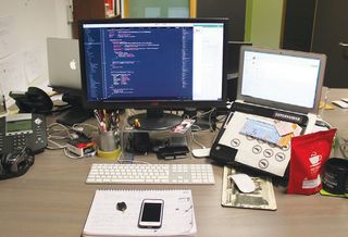
We've also got into the habit recently of creating an SCSS settings file for things like type-sizes, baseline rhythm, suggested design breakpoints and colours as we go.
DG: We still love pen and paper to help us think and play around but we think the power of rapid prototyping in terms of getting our work in front of clients and real users quickly is immense.
We can fling a bunch of frameworks and libraries together with something like Mixture to speed the workflow and then iterate. It's what we've been doing with paper prototyping for years, but with responsive, cross-device and easy remote testing all thrown in. We can usually use some of our code to bootstrap the build.
BC: Post-its, Muji pens, and Whitelines squared paper are our weapons of choice when we start to think about a site's architecture and wireframes. You simply cannot beat sketching for the sheer speed you can capture, visualise and evaluate your designs.
Once we're happy where we are, getting into the browser and rapid prototyping with Mixture is the next step with the aim of testing this on users.
Whose work is impressing you most online, right now?
PC: For design and brand, it's got to be Focus Lab. I'm also a huge fan of Fraser Davidson's logo work.
ALL: Maybe an obvious choice, but we'd say that the work that Government Digital Service does continues to impress and inspire. Bringing user research, content strategy, solid design principles, Agile methodologies and open source into the public sector is to be applauded. They tore up the rulebook and the end products speak for themselves.
DG: Another recent example would be the work, which Sophie Dennis and John Goode (along with a stellar team) did on The University of Surrey. The way they brought the current best industry design and development processes into what must be a highly political and opinionated organisation is admirable.

Do you have any statistic aspirations for 2014 to add to your site?
PC: The amount of different ways fffunction has been pronounced.
DG: We're going to try to notch up at least as many contributions to conferences and networky things as attendances.
BC: We've already added to one statistic with a new team member, Dan Reeves, joining us. We're up to seven now, and if things go to plan, then an eighth would put us in a really good place. I think then we'd be just the right size.
Words: Martin Cooper
This article originally appeared in net magazine issue 252.

Thank you for reading 5 articles this month* Join now for unlimited access
Enjoy your first month for just £1 / $1 / €1
*Read 5 free articles per month without a subscription

Join now for unlimited access
Try first month for just £1 / $1 / €1
Get the Creative Bloq Newsletter
Daily design news, reviews, how-tos and more, as picked by the editors.
The Creative Bloq team is made up of a group of design fans, and has changed and evolved since Creative Bloq began back in 2012. The current website team consists of eight full-time members of staff: Editor Georgia Coggan, Deputy Editor Rosie Hilder, Ecommerce Editor Beren Neale, Senior News Editor Daniel Piper, Editor, Digital Art and 3D Ian Dean, Tech Reviews Editor Erlingur Einarsson, Ecommerce Writer Beth Nicholls and Staff Writer Natalie Fear, as well as a roster of freelancers from around the world. The ImagineFX magazine team also pitch in, ensuring that content from leading digital art publication ImagineFX is represented on Creative Bloq.
