Faster button styling with Sass
Everybody loves a nicely styled CSS button but Ryan Taylor explains how he used Sass and Compass to create a mixin to implement a variety of buttons in no time and also covers browser support fallbacks
Another button tutorial?!? I hear you cry. Well yes, but this one’s a bit different. There’s plenty of tutorials out there on how to style buttons but this is a tutorial less about that and more about implementation.
As a frontend developer I work on lots of different user interfaces for web apps, services and sites and obviously one of the most common elements for all of these are buttons, or more specifically for this tutorial, buttons that allow for different icons and coloured backgrounds. So with the use of Sass and Compass I’ve created the following mixin for quickly implementing different buttons in my projects.
Base variables
We start off by declaring some base variables. Firstly the default button colour:
$background-default: #D5D5D5;We’re going to apply a gradient to the buttons using a shader. This is layered over the top of the default colour using CSS multiple backgrounds. We also declare an inverted shader which we’ll use on the active state for the buttons and for browsers that don’t support CSS gradients we’ll declare a fallback shader image:
$background-shader: linear-gradient(top, rgba(0,0,0,0), rgba(0,0,0,0.25));$background-shader-i: linear-gradient(top, rgba(0,0,0,0.25), rgba(0,0,0,0));$background-shader-f: url(../images/site/button-shader.png) left center repeat-x;There are two other images we’ll be using to style our buttons. A striped texture to give the button some depth and a divider line which is positioned between the icons and the text:
$background-divider: url(../images/site/button-divider.png) 44px top repeat-y;$background-stripe: url(../images/site/button-stripe.png) left top repeat;Finally, we’ll be using a sprite for all the icons. This sprite is divided into 40px segments so we declare this in a variable as well:
$sprite-division: 40px;Default button styles
We want to have a default state for regular buttons that don’t have an icon so let's declare those styles first:
.button { @include background($background-stripe, $background-shader, $background-default); @include border-radius(); @include single-box-shadow(rgba(0,0,0,0.4), 0, 1px, 2px); @include single-text-shadow(rgba(0,0,0,0.2), 0, -1px, 1px); color: #FFF; display: inline-block; font-size: 15px; line-height: 15px; margin-bottom: 24px; padding: 12px 24px; text-align: center; //more styles to go here
Fallback styles
We need to account for browsers that don’t support CSS gradients but do support multiple backgrounds (for example, Internet Explorer 9). We can use the Sass Parent Selector along with Modernizr to apply this easily:
Get the Creative Bloq Newsletter
Daily design news, reviews, how-tos and more, as picked by the editors.
.no-cssgradients & { @include background($background-stripe, $background-shader-f, $background-default); }Here, instead of applying the shader gradient we apply the shader image to achieve the same effect.
The final fallback is for browsers that don’t support CSS multiple backgrounds (for example, Internet Explorer 8 and 7):
.no-multiplebgs & { background-color: $background-default; }Here we’re just applying the default colour of the button.
Pseudo styles
For this example we want the buttons to invert their gradient shader and for the box shadow to disappear on click (:active) to create the illusion of the button being pressed. Here are the styles to achieve this including the fallback styles for no gradients and no mulitple background support:
&:hover, &:focus { color: #FFF; } &:active { @include background($background-stripe, $background-shader-i, $background-default); @include single-box-shadow(none); .no-cssgradients & { @include background($background-stripe, $background-shader-f, darken($background-default, 5%)); } .no-multiplebgs & { background-color: darken($background-default, 5%); border-color: #FFF; } }}Just a note about these styles. On the .no-cssgradients style we’re not inverting the gradient and instead using Sass’s darken function to make the background colour five per cent darker. I opted for this because to invert the gradient we’d need to load in a new background image for the inverted shader which would result in a split second delay in the image loading the first time you click a button. There are ways around this of course but this tutorial is aimed to focus on how Sass can make your life easier so we’re darkening the background colour instead.
With our basic styles we can now turn any anchor into a button by adding a .button class to it.
Buttons with icons
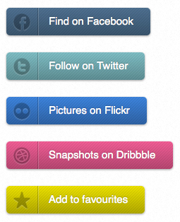
We’re now going to extend these button styles by adding the facility to give them icons and change their colour. Here’s some examples:

Firstly we create a sprite containing the icons. The sprite is split into 40px segments as we declared earlier in our variables. This sprite only has eight icons but we can easily add more by appending them to the bottom:

Here’s an example of the markup for a button with an icon:
<a class="button twitter" href="http://twitter.com/ryanhavoc">Follow on Twitter</a>And the specific style for this button will be:
.twitter { @include button(2, #82BFC5); }The sprite function
We can create a function in Sass to calculate the position of the sprite and return the necessary background layer for our multiple background. We work out the coordinates by multiplying the sprite division of 40px by the position parameter passed which we then offset by one.
@function sprite($position) { $coordinates: $sprite-division * ($position - 1); @return url(../images/site/button-sprite.png) 6px (0 - $coordinates) no-repeat;The mixin
The mixin we’re about to add simply overrides some of the styles we’ve previously set:
@mixin button($position: false, $color: $background-default) { @if $position != false { @include background(sprite($position), $background-divider, $background-stripe, $background-shader, $color); padding-left: 60px; //more styles to go hereThe mixin accepts two parameters, the position of the icon in the sprite, eg two for the second icon and an overriding colour, eg #82BFC5. If no colour parameter is passed, the default colour is used (#D5D5D5). This allows us to have regular grey buttons with icons.
An overriding multiple background is applied to our button which includes the sprite and an additional image for the divider line you can see in the examples. We also add some additional left padding to the button.
As with the styles for the regular button we need to override the fallback styles for no CSS gradients and no multiple background support:
.no-cssgradients & { @include background(sprite($position), $background-divider, $background-stripe, $background-shader-f, $color); } .no-multiplebgs & { background: $color sprite($position); padding-left: 45px; } &:active { @include background(sprite($position), $background-divider, $background-stripe, $background-shader-i, $color); .no-cssgradients & { @include background(sprite($position), $background-divider, $background-stripe, $background-shader-f, darken($color, 5%)); } .no-multiplebgs & { background: darken($color, 10%) sprite($position); padding-left: 45px; } } }}Conclusion
And thats it. Lots of multiple background styles but with it all bundled into a mixin styling new buttons is easy:
.facebook { @include button(1, #507291); }.twitter { @include button(2, #82BFC5); }.flickr { @include button(3, #4287DB); }.dribbble { @include button(4, #F16197); }.favourite { @include button(8, #EDE126); }.add-user { @include button(5); }.upload-file { @include button(6); }.delete { @include button(7); }
Thank you for reading 5 articles this month* Join now for unlimited access
Enjoy your first month for just £1 / $1 / €1
*Read 5 free articles per month without a subscription

Join now for unlimited access
Try first month for just £1 / $1 / €1

The Creative Bloq team is made up of a group of art and design enthusiasts, and has changed and evolved since Creative Bloq began back in 2012. The current website team consists of eight full-time members of staff: Editor Georgia Coggan, Deputy Editor Rosie Hilder, Ecommerce Editor Beren Neale, Senior News Editor Daniel Piper, Editor, Digital Art and 3D Ian Dean, Tech Reviews Editor Erlingur Einarsson, Ecommerce Writer Beth Nicholls and Staff Writer Natalie Fear, as well as a roster of freelancers from around the world. The ImagineFX magazine team also pitch in, ensuring that content from leading digital art publication ImagineFX is represented on Creative Bloq.
