Explore mutant superhero Wolverine in immersive digital experience
Digital agency Soap Creative works alongside 20th Century Fox to take fans inside Hugh Jackman's portrayal of the superhero mutant Wolverine.

Ever wondered what makes a superhero tick? This immersive, digital experience The Wolverine Unleashed lets you get right underneath the superhero mutant's skin.
Created by digital agency Soap Creative, who fully utilised JavaScript, fans can now navigate a full-scale digital version of the character's body, allowing them to explore his mutant powers and psyche. Here, we find out more about the project from Soap Creative art director Dave Weir.
What was the brief?
Twentieth Century Fox Home Entertainment approached us because of our award-winning work on the digital experience Pi’s Epic Journey for the movie Life of Pi, as well as the very successful Wolverine Experience Kiosks we created to promote the theatrical release.
They gave us a very rough idea of what they were looking for, and then let us expand on it in our own way, essentially giving us a blank canvas to make something awesome.
How important was it to make the website work on both tablets and desktop PCs?
Fox was very specific that this was to be a tablet-first build, specifically made to bring out the most from the iPad and iPad Mini devices. From Soap’s standpoint, we wanted to create an interactive experience where anyone can familiarize themselves with not just Wolverine’s surface features, but the deeper causes behind those features - both physiologically and psychologically.
While that kind of intuitive experience is still possible on the desktop, it’s much more effective through a gestural interface. The project itself grew and developed in real time.

Did you come across any challenges during the project?
The iPad, while very powerful, has very few specific limitations which we had to find our way around. In particular, navigating around a huge hi-res image, while running multiple animations at once, proved to be especially challenging.
Our development team worked around the iPad's technical boundaries and eventually settled on a very powerful, extremely useful JavaScript library called pixel.js. Our designer also had to find new and creative ways to make beautiful, hyper-detailed illustrations and animations the smallest file size possible.
Can you explain a bit about the interface and the experience it provides for the user?
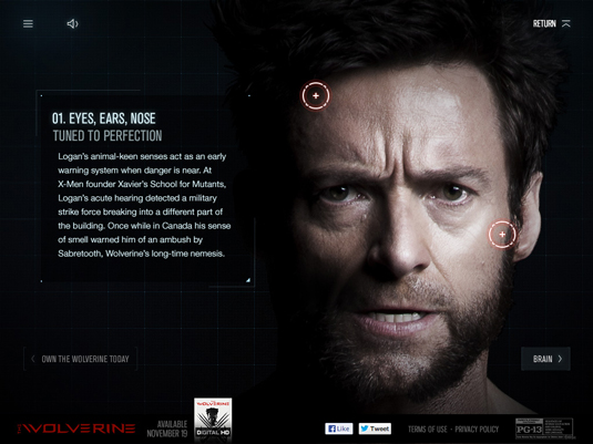
iPad and iPad Mini users will be able to navigate around a full scale digital version of Wolverine's body, interacting with him at three levels. On the surface level, the user can roam around the body and locate hotspots.
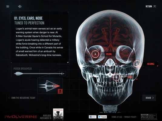
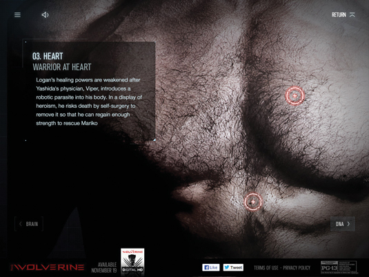
The mid-level appears as a medical scan of Wolverine’s body, introducing the user to one of the seven sections of the site. At the deepest level, we go further inside Wolverine to detail the root causes, motives, and motivations behind each and every aspect of his character.
This was to be a deep, personal, intimate experience unlike any website we had ever done before
Creatively, we wanted to get the user as close as possible to Hugh Jackman and The Wolverine. This was to be a deep, personal, intimate experience unlike any website we had ever done before.
We started with a huge, up-close-and-personal 1:1 scale image of The Wolverine and from there it was up to us to determine how deep we could go. We decided that it would have more impact if the site allowed the viewer to glimpse inside Wolverine physically, but also learn more about him psychologically.

Want to know more? Check out the gallery section in net magazine issue 251 - on sale now!
Liked this? Read these!
- Create a perfect mood board with these pro tips
- The ultimate guide to logo design
- Brilliant Wordpress tutorial selection
Have you come across any wonderful websites? Let us know in the comments box below!

Thank you for reading 5 articles this month* Join now for unlimited access
Enjoy your first month for just £1 / $1 / €1
*Read 5 free articles per month without a subscription

Join now for unlimited access
Try first month for just £1 / $1 / €1
Get the Creative Bloq Newsletter
Daily design news, reviews, how-tos and more, as picked by the editors.
The Creative Bloq team is made up of a group of design fans, and has changed and evolved since Creative Bloq began back in 2012. The current website team consists of eight full-time members of staff: Editor Georgia Coggan, Deputy Editor Rosie Hilder, Ecommerce Editor Beren Neale, Senior News Editor Daniel Piper, Editor, Digital Art and 3D Ian Dean, Tech Reviews Editor Erlingur Einarsson, Ecommerce Writer Beth Nicholls and Staff Writer Natalie Fear, as well as a roster of freelancers from around the world. The ImagineFX magazine team also pitch in, ensuring that content from leading digital art publication ImagineFX is represented on Creative Bloq.
