Delete: making way for the new and possible
Tom Dougherty, Damon Mangos and Kevin Charlton chat to Martin Cooper about the Dada concept, creating digital experiences and deleting things to make way for the new and possible
Tell us about yourselves: how many people work in your office and what do you do?
DM: Delete is a digital agency - our mantra is 'Digital Experience Creation'. We make all the digital 'things' our clients need with love, craft and intelligence, wherever their audiences are.
We've been around for over 12 years, which is not a bad run. We have 75 people spread across three offices: Soho, London - arguably the centre of the universe (and plenty of great coffee shops); Leeds - king of the North; and our technology hub in Russia, Chelyabinsk (meteorite capital of the world). Tom and I have worked together for eight years - that continuity as a blended creative and UX team has enabled us to perfect our craft and processes to deliver high-quality solutions for all our clients. We have ingrained this methodology throughout the business and all the teams.
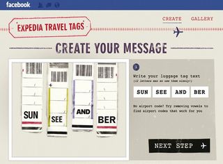
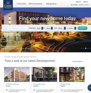
TD: Our work ranges from website and apps to socially driven digital campaigns for the likes of Red Bull and Expedia, right through to business solution products for clients such as Specsavers and Persimmon Homes. At the heart of everything we create is a well-considered user experience focused on delivering value in whatever form that might be.
Delete? Where did the name come from?
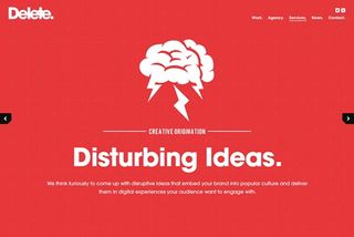
DM: The name came about from staring at a keyboard and picking the coolest key. I'm a big fan of the Dada concept, and we wanted a name that was challenging and subversive - like the digital industry felt back in 2001. The way we explain Delete is that "to delete something is to make way for the new and possible". Delete is the starting point for new ideas, possibilities and solutions.
Expedia Travel Guides: what's the campaign all about and how did it come into being?
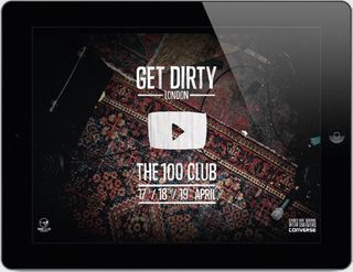
TD: Brands are looking for more dynamic ways of putting their content in front of audiences wherever they are. We've been working with Metro for 12 months now, and through a number of collaborations with Red Bull and Converse to bring to life campaigns within Metro's Digital edition - mobile and tablet.
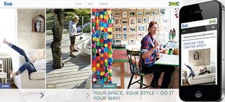
Expedia wanted to exploit this new channel with an exciting campaign that would inspire travellers rather than just a direct offer-based approach. Along with Sam Warriner at Metro we developed the 'Through a Different Lens' city guide campaign - a new way of promoting city breaks to the UK commuter audience.
Partnering with the Metro editorial team and a range of talented photographers, including David Ryle, our solution was a rich, interactive city guide app, embedded in Metro digital editions, where the audience explored the hidden secrets of each destination from the eyes of a local resident - accompanied by inspiring imagery, an itinerary - based interactive map and direct links to exclusive deals. The future of the newspaper lies somewhere between digital editions and websites. More linear tablet and mobile editions of papers allow brands a more structured advertising medium. We expect to see a big growth in this area, as more people digest their dailies in digital editions on the move.
Is there a secret to grabbing attention with a digital campaign?
DM: Let's not be naive and believe it's all down to great design. Unless they are another designer, an audience is there for a reason. Making a campaign engaging is about understanding your audience and their needs. These needs usually range from 'inform me' to 'help me', 'entertain me', or 'reward me'. We talk a lot at Delete about building a culture of relevance between a brand and the audience - 'the space before the brand'. This involves developing a clear content strategy to engage an audience - the more authentic, the better the engagement will be.
TD: Another mistake brands can make is trying to deliver too much in a campaign. It has to be easy to engage with, whether that's quick social connectivity or a clear pathway to action. Make sure the audience quickly understands what they are there for. Of course all of this needs to be wrapped up in an experience that's pleasurable to use, loads fast and looks great.
How does your work with Red Bull typify your approach?
DM: We are fortunate to have worked with Red Bull for the last four years on some fantastic projects such as Bedroom Jam, Music Academy, Mini Drome and now Download. Red Bull is a master at creating culture and rich content around its brand, and that's something we encourage our clients to consider when it comes to digital. Content that resonates authentically with an audience builds relationships, loyalty and drives sales. Our work with Red Bull has allowed us to become experts in this approach and deliver engaging cultural campaigns through all digital touch points.
TD: The projects we work on with Red Bull are always centred on delivering great content through a simplified, well-crafted experience and fully socially integrated in order to engage with its target audiences across multiple channels.
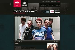
Our most recent project for Red Bull Studios offered amateur rock bands a chance to play at Download festival. It was amazing to see hundreds of bands uploading self-produced music videos within minutes of the site going live. Solid proof that kids are still willing to pick up guitars and thrash them to death!
What advice would you give a smaller agency looking to make it big?
DM: Making it 'big' doesn't always mean growing into a huge agency - that's often the mistake companies make when defining their business plan. We've always tried to maintain a team at a size where excellence can be maintained. Our policy has always been to hire the best people we possibly can and develop them into stars (obviously this does get easier as you become more renowned).
TD: Identifying a hero project early and throwing everything you can behind it to supersize it can transform your agency. You also have to be prepared to work just as hard at the relationships with your clients, beyond just a supplier and towards a partner relationship. That's how you will unlock the bigger opportunities and even create them.
Is there a secret to working smoothly with super demanding clients?
DM: The best work definitely comes from working with clients who respect us, trust us and value the importance of collaboration.
We always strive to establish this type of relationship as early as possible, even when pitching to new clients.
TD: It's important that a client understands the way you intend to work with them and why you work in this way. We start all our projects with an inception meeting to agree a project process that works for both teams. You have to remember you are taking a client on a journey too, often into the unknown, so it's important you guide them along the way.
How closely do you work with your clients? Are you remote consultants or do you become effectively embedded with their teams?
TD: The most effective work comes from forming partnerships with our clients. Clients will always hold invaluable knowledge about their business and customers that we have to extract. We do this by running a series of collaborative workshops in the early stages of projects where we invite stakeholders from a variety of divisions to offer insight and opinion. We do sometimes embed individuals into the client's business to ensure projects run more smoothly and teams work more closely.
DM: I'm a big believer in having members of the creative team mingling wth the client as early as possible, to take briefs first-hand and build an understanding of the problem. The old agency model of client services teams shielding the creative guys is something we actively discourage.
Web standards vs apps: do you see there being a winner?
DM: We come up against this debate frequently these days. Arguably apps enable brands to deliver an experience more on their terms in a more focused manner where they can control the release of content - often in a more linear way.
TD: Websites historically have tended to be geared around delivering information based on a specific need, and therefore need to be structured in a way that satisfies this. I think we are starting to see a big influence from tablet and mobile experiences on desktop interfaces - moving larger sites towards a more focused presentation of content and simplified navigation. Technologies such as PhoneGap are forcing designers to consider how their RWD will perform in a native environment, which is an interesting challenge that can result in the best of both worlds if executed well.
What about prototyping and communicating ideas to a client? Do you use Photoshop or do you prototype in the browser?
TD: Prototyping is a fundamental part of our design process, whether it's creating interactive IA or rapid HTML prototypes to test breakpoints and content reflow on our responsive interfaces. We always encourage our clients to get a feel for the products we are creating, beyond just reviewing the design style. Working with prototypes allows us to trial multiple interaction ideas among ourselves, often with users engaged in the projects.
DM: We're always endeavouring to move away from 'dead assets' (such as full PSD sets) and into the browser quicker. Photoshop is our tool of choice for early concept work, but if the client is willing and progressive we'll evolve and present the solution as a prototype in a live environment.
Who's impressing you?
TD: Always impressed with the quality of work of coming out of North2 Studio.
Tobias Van Schneider's work impresses, especially the recent Mail project he's been posting about.
The latest release of MailChimp is great example of a fully functioning web app delivered responsively. It's insightful to read a designer's thoughts about the design process on the blog.
The opinions of Trent Walton are always good for kicking off a debate among the team, too.
What advice would you give an ambitious young designer or developer looking to join you?
TD: If sending in an email, take time to craft it and spell-check it! If a designer sends a Word document in a badly formatted email we don't open it. We look for individuals who've taken care in the presentation of their CV, examples of work and most importantly in an online portfolio - even if this is student work.
DM: Because of the number of applications we receive, we're not able to respond to everyone. Sometimes it's down to catching us at the right time and standing out with great work.
Words: Martin Cooper
This article originally appeared in net magazine issue 246.
Liked this? Read these!
- How to build an app: try these great tutorials
- Download the best free fonts
- Create a perfect mood board with these pro tips
What agencies should we be talking to? Tell us in the comments!

Thank you for reading 5 articles this month* Join now for unlimited access
Enjoy your first month for just £1 / $1 / €1
*Read 5 free articles per month without a subscription

Join now for unlimited access
Try first month for just £1 / $1 / €1
Get the Creative Bloq Newsletter
Daily design news, reviews, how-tos and more, as picked by the editors.
The Creative Bloq team is made up of a group of design fans, and has changed and evolved since Creative Bloq began back in 2012. The current website team consists of eight full-time members of staff: Editor Georgia Coggan, Deputy Editor Rosie Hilder, Ecommerce Editor Beren Neale, Senior News Editor Daniel Piper, Editor, Digital Art and 3D Ian Dean, Tech Reviews Editor Erlingur Einarsson, Ecommerce Writer Beth Nicholls and Staff Writer Natalie Fear, as well as a roster of freelancers from around the world. The ImagineFX magazine team also pitch in, ensuring that content from leading digital art publication ImagineFX is represented on Creative Bloq.
