Dance-fitness brand shapes up with distinctive redesign
Zumba partners with digital agency Huge to redesign the brand's website and e-commerce experience.

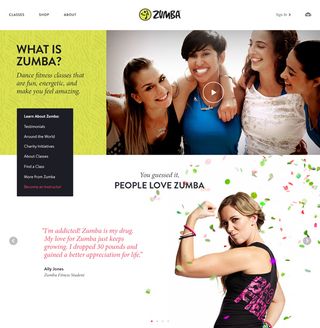
Digital agency Huge recently got its groove on with dance-fitness company Zumba to redesign the brand's website and reimagine its e-commerce experience.
Engagement director at Huge in Brooklyn, Jill Trainor, said: "The goal in redesigning Zumba.com was to make it even easier for consumers to engage with the brand that they know and love, while inspiring people from all age groups and ability levels.
"It has been an incredible, fun opportunity to work in partnership with the Zumba team. Taking a 360-degree approach to Zumba's end-to-end digital experience, the new site captures the energy and excitement of the brand while reaching a growing consumer audience."
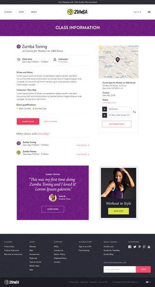
The site focuses on two essential user needs: shopping the Zumba catalogue and helping consumers to locate a Zumba class. We chatted to Huge art director Nicklesh Soni to find out more...
How did Huge become involved with the Zumba redesign?
Zumba had been keeping an eye on Huge's UX work for three years and when the time came to create a new Zumba website, appointed us without a pitch.
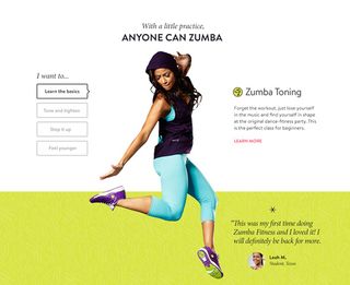
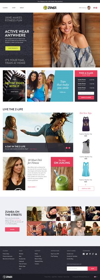
The brief was to re-imagine the brand's shopping experience for a diverse audience of fitness and health-oriented users by simplifying product discovery and incorporating the sense of fun and exuberance that defines Zumba's distinctive brand.

Can you explain your design approach to the project?
We wanted to evolve and refine their existing brand, creating an aesthetic that is more refined and approachable to a larger audience, as well as extremely flexible for the internal design team to utilise in the future.
What was used to build the site?
Huge provided overall strategy, user experience, front-end design and analytics, while the Zumba team built the site internally using proprietary systems. The build is responsive, so scales across all devices.

What was the most challenging aspect of the redesign?
The most challenging aspect of the project was refining and evolving the Zumba brand as it grows from a fitness program into a true fitness brand. The aim is to change the perception of Zumba as a niche dance fitness class to a contemporary, competitive, and approachable brand that involves not only fitness, but a lifestyle and fashion as well.
As part of the discovery process, Huge learned about the many facets to the Zumba brand that stretched beyond just their classes. Huge set out to create an experience that allowed Zumba to feature its lifestyle content in a streamlined editorial experience, while focusing on two essential user needs: shopping the Zumba catalogue and helping consumers to locate a Zumba class.
The new site shows Zumba as a brand for anyone that wants to live a healthier and happier lifestyle
To achieve this, Huge developed a design language that centered around a more approachable photographic style and leveraging patterns and colors directly from the Zumba apparel itself. The new site shows Zumba as a brand that is not only for the ultra-passionate, but for anyone that wants to live a healthier and happier lifestyle.


Thank you for reading 5 articles this month* Join now for unlimited access
Enjoy your first month for just £1 / $1 / €1
*Read 5 free articles per month without a subscription

Join now for unlimited access
Try first month for just £1 / $1 / €1
Get the Creative Bloq Newsletter
Daily design news, reviews, how-tos and more, as picked by the editors.

Kerrie Hughes is a frequent contributor to Creative Bloq, and was once its editor. One of the original CB crew, Kerrie joined the team back in 2013 after moving from her role as staff writer on 3D World. Since then she's written regularly for other creative publications such as ImagineFX, Computer Arts and Digital Camera World. After a stint working for the police, Kerrie is back reviewing creative tech for creative professionals.