CSS3 tips
Craig Grannell takes a peek at what the future of CSS has to offer – and offers his collection of CSS3 tips
Web designers spend quite a lot of time being angry. If they’re not moaning about how some typographic nicety isn’t available yet for online design, they’re rattling on about how Internet Explorer has once again left something nasty and smelly in their cereal. So, as an antidote to all that, this month’s CSS article is chock-full of unbridled optimism. What we’re going to do is take a look at some upcoming features of CSS3, and show how they can be of benefit to web designers.
Note that this isn’t The Complete Guide to CSS3; it’s a quickfire look at some of the handy stuff in CSS3 that you can already play around with. Not everything here is currently of practical use (and IE is still playing catch-up with CSS2, let alone CSS3), but it’s still worth being mindful of CSS3, because some properties can add a wee bit of added sparkle to a site without compromising it for users still surfing with the digital equivalent of a surfboard made of cast iron.
(Note that for this article, we used Safari 3.1, Opera 9.5b2 and Firefox 3 pre – the wonderfully named Minefield – for testing; more compatible browsers may well exist by the time this magazine ends up in your hands.)
The write stuff
One of the major benefits of CSS has been typographic control. Although a CSS ninja still can’t compete from a typography standpoint with someone wielding InDesign for print, things have nonetheless progressed massively
Although part of CSS2, few browsers supported text shadow, but now Safari and Opera both support basic shadows, and Opera supports multiple shadows
With CSS3, a formerly proprietary property has wormed its way into the specifications, and it’s essential in these days of entirely CSS-based layouts. By default, text overflow is shown in browsers, usually with offending copy breaking outside of its container, although some browsers stretch the container to fit the content. CSS-oriented designers will no doubt already be aware of using overflow: hidden to deal with the stretching problem, which typically merely lops off a couple of pixels of text if it’s italicised.
However, sometimes text strings are too long to fit within a box. Although this should be dealt with by a design amendment, that’s not always possible (especially with massive sites that run from a CMS), and so CSS3 offers the answer with the word-wrap property. Initially a Microsoft invention, it currently works in both Internet Explorer and Safari, simply breaking relevant strings as required.
Get the Creative Bloq Newsletter
Daily design news, reviews, how-tos and more, as picked by the editors.
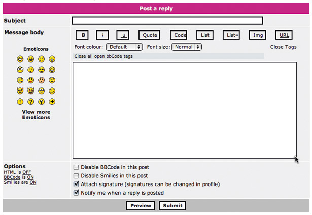
Another handy addition to CSS3 is the ability to define columns. This was touched on in issue 176’s CSS tutorial, where we mentioned that the relevant properties could come in handy for displaying a list of short items over multiple columns. Take for example, the following code:
<ol> <li>Donec porttitor ligula</li> <li>Eu dolor</li> [...] </ol>If the list has a half-dozen or more items, you’ll soon be wasting plenty of space on screen. But apply a class to the list and use the following CSS and the list will display over two columns:
.twoColumnList { width: 40em; -webkit-column-count: 2; -webkit-column-gap: 1em; -moz-column-count: 2; -moz-column-gap: 1em; }A width is defined and the column-count and column-gap properties automatically split up the space and position the list elements. Note that the prefixes -webkit- and -moz- are used here. In the long run, these will be dropped; currently, however, they’re required to make these properties work in Safari and Firefox respectively.

Drop shadows are another recent addition to the arsenal of some browsers, although the text-shadow property is actually part of the CSS2 spec, not CSS3. Nonetheless, it’s worth mentioning here, not least because CSS3 now also provides the ability to define a drop shadow on a box. First, however: text.
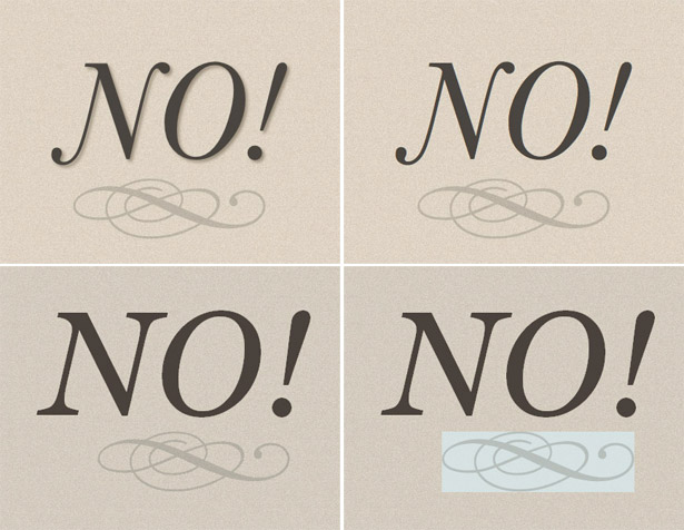
Four values are defined when using the text-shadow property, which is currently supported by Safari and Opera. The first two values define the horizontal and vertical distance of the cast shadow; the third value defines the blur distance in pixels; and the fourth value is the colour of the shadow. Therefore, the following CSS produces a fairly typical drop shadow that you might use to draw attention to a heading:
text-shadow: 2px 2px 5px #888888;However, by reducing the shadow distance to zero and changing the colour from grey to something more vibrant, you can instead emulate a glow effect:
text-shadow: 0 0 10px #ff0000;Opera enables you to take things further. It supports comma-separated value sets for text-shadow, enabling you to define multiple sets for a single element. This means that you can cast a like-coloured shadow in several directions to create a much larger, bolder glow effect.
Alternatively, you can mix colours, as shown in the ‘red and blue blur’ and ‘flaming text’ examples depicted elsewhere. Code for all of these shadows is on this issue’s disc, in the file text-shadows.html.
As mentioned previously, though, CSS3 now enables you to define a drop shadow for a box, negating the requirement to use images. Currently, only Safari supports this, although we suspect other browsers will follow suit shortly.
The de-facto property is box-shadow, and this is currently applied in Safari using -webkit-box-shadow; the values to define are as per the text-shadow rule.
Smoothing the edges
Shadows are all very well, but we think border-radius is likely to appeal most to web designers – at least those infatuated by the current trend for all things curvy. What this property enables you to do is set a radius for a box’s corners, thereby enabling you to do away with JavaScript or image-based ‘hacks’. Currently, this works in Firefox and Safari, and requires the -moz- and -webkit- prefixes. Because content still reaches the edges of the box in question, it makes sense to define a padding value that’s at least equal to the border radius, as shown in the following code block:
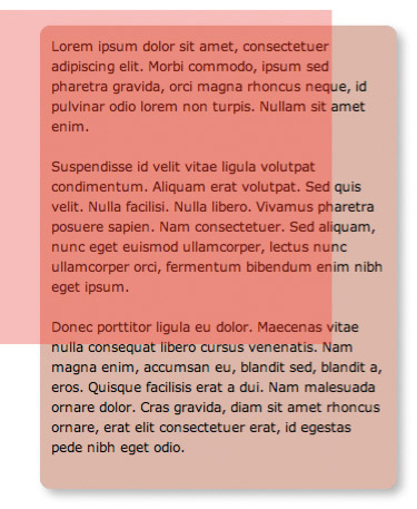
.roundedCorners { width: 300px; background-color: #d3aa9c; margin-bottom: 20px; padding: 10px; -webkit-border-radius: 10px; -moz-border-radius: 10px; }Of course, the various properties mentioned so far for boxes can be combined, so it’s easy enough to create a rounded box with a drop shadow. Usefully, the drop shadow conforms to the rounded corners, as you’d expect. An example can be seen in the snappily named box-with-corners-and-shadow.html document on this issue’s disc, which also highlights another addition to CSS3: opacity. If you open the document in Safari, Firefox or Opera, you’ll see a red semi-transparent rectangle overlaying the page’s other div. The opacity is defined by the cunningly named opacity property; the value range is from 0 to 1 and affects all content within the element it’s applied to. Safari and Firefox also enable you to define opacity by using RGBA values (the ‘A’ standing for alpha), and so you can, for example, define the value rgba(255, 0, 0, 0.3) for background to create a semi-transparent red background on an object.

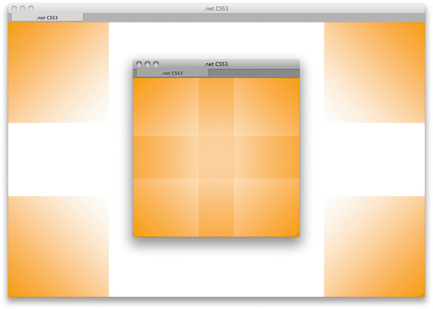
While on the subject of backgrounds, one of our favourite additions to CSS3 is the ability to define multiple backgrounds for an element. It’s common for web designers to use ugly (from a coding standpoint) hacks to define multiple backgrounds for a web page or a content area, but in CSS3 you can comma-separate background values, thereby enabling you to add and position as many background images as you please. For example, to position four images, one at each corner of the page’s body, you could use the following rule:
body { margin: 0; padding: 0; background: url(bkg-tl.png) 0 0 no-repeat, url(bkg-tr.png) 100% 0 no-repeat, url(bkg-br.png) 100% 100% no-repeat, url(bkg-bl.png) 0 100% no-repeat; }Currently, only Safari supports this means of adding backgrounds and an example, multiple-backgrounds.html, is on this issue’s disc (it requires the four PNG background images referred to in the previous rule).

Perfect positioning
The final property we’ll look at is box-sizing, which dredges up an age-old argument about the CSS box model. Understanding this model is integral to CSS layouts. If you’re not entirely familiar with it, it works something like this: in CSS, you define the dimensions of an element’s content area; you can then add to that padding and borders. Therefore, a 100-pixel-wide element with a 10-pixel border will actually take up 120 pixels of horizontal space.
Before version 6, Internet Explorer disagreed, and instead placed borders and padding within the defined dimensions. Eventually, Microsoft relented and the box model was ‘fixed’ for IE6. The thing is, Microsoft’s old way of doing things was actually pretty useful in certain circumstances. For example, create a page with two divs, each with a width of 50 per cent, and float them both left. Now add some padding and a border of a fixed size to each. They’ll stack underneath each other, because the combined content width now exceeds 100 per cent.

Various workarounds exist: you can define padding and borders in percentages and ensure the sum of all the width values doesn’t exceed 100 per cent; you can ensure your div widths don’t add to anywhere near 100 per cent (providing space for padding and borders); or you can create nested divs and apply borders and padding to them. However, CSS3 enables you to use the border-box property value box-sizing to, for specific elements, emulate the box model used by IE 5.5 and before. Currently, Opera uses the property as-is, but Safari and Firefox need the -webkit- and -mox- prefixes. Ironically, versions 6 and 7 of Internet Explorer don’t support this property, although the current beta of 8 at the time of writing accepts -ms-box-sizing. (See other-boxes.html for an example of this property in action.)

And that’s not everything CSS3 has to offer. We’ve mentioned just a subset of the extras you’ll (hopefully) soon be able to integrate into websites. As well as the properties mentioned there are, among others, resize, which is currently unsupported, but which will enable you to define whether an element’s box can be resized by the user; border-image, which enables you to define images for element borders, rather than being restricted to a small set of lines and patterns; and the ability to size background images (in Opera and Safari) via background-size (using the -o- prefix for Opera and -webkit- for Safari) and define their point of origin as relative to the edge of an item’s padding or content via background-origin (which accepts the values content, padding and border).
It may seem premature to look at these properties now – as we’ve said, certain properties only currently work in certain browsers, often also requiring prefixes. However, it pays to know where things are likely to head in the world of web design, and even if you don’t consider dabbling in CSS3 getting yourself ahead of the game, it’s still fun to experiment and know that you’ll be able to bin a whole slew of hacks in the not-too-distant future.

Thank you for reading 5 articles this month* Join now for unlimited access
Enjoy your first month for just £1 / $1 / €1
*Read 5 free articles per month without a subscription

Join now for unlimited access
Try first month for just £1 / $1 / €1

The Creative Bloq team is made up of a group of design fans, and has changed and evolved since Creative Bloq began back in 2012. The current website team consists of eight full-time members of staff: Editor Georgia Coggan, Deputy Editor Rosie Hilder, Ecommerce Editor Beren Neale, Senior News Editor Daniel Piper, Editor, Digital Art and 3D Ian Dean, Tech Reviews Editor Erlingur Einarsson, Ecommerce Writer Beth Nicholls and Staff Writer Natalie Fear, as well as a roster of freelancers from around the world. The ImagineFX magazine team also pitch in, ensuring that content from leading digital art publication ImagineFX is represented on Creative Bloq.
