The CSS3 Flexible Box model explained
Say goodbye to all those layout hacks. Developer Peter Gasston explains how to design a simple web page using the new CSS3 Flexible Box model

The way we lay out web pages at the moment is kind of hacky. Whether you work by using floats, positioning or a combination of techniques, there’s always extra work involved in making everything look the way you want – and usually a lot of calculation of margin, height and width. That’s mainly due to the fact that we’re using those CSS properties for tasks they weren’t originally envisioned for. We’ve worked them hard and got some great results, but it really is an awful lot of trouble to go to for something that should be much simpler.
Enter what the W3C calls the ‘CSS3 Flexible Box Layout Module’, which many designers have dubbed the Flexible Box model. For the sake of brevity, I’m going to refer to it as Flex Box for the rest of this article. This is the first module that has any kind of real-world implementation to be specifically designed for laying out page elements relative to each other. I’m going to show you how you can use it to make a simple, adaptable and responsive web page.
The method
Before I move on to the practical demonstration, let me try to explain what the Flex Box method actually does.
I should reiterate that much of what is possible with Flex Box can already be achieved with existing CSS properties such as float, margin and position. The difference is that Flex Box has been created with the express intent of laying out web pages so it makes that task much, much easier.
Here’s a quick summary of what it does: equally distributes space between elements without the need for you to make complex calculations; enables you to make equal-height columns and to vertically align elements within their parent; enables you to change the order in which elements are displayed, regardless of their order in the DOM tree; removes the need to use the float property for layouts. In short, it enables you to do all of the stuff that you’ve had to hack around in the past. Sounds perfect!
The biggest drawback is currently browser support. Firefox and WebKit browsers (including Safari and Chrome) support this right now, but it’s still uncertain as to whether or not IE9 will follow suit.
The technology previews showed rudimentary support, but that was removed in the Beta. Cross your fingers that it will be restored in time for the final release, whenever that may be. In the meantime, you’ll have to create fallback style sheets for non-supporting browsers.
Get the Creative Bloq Newsletter
Daily design news, reviews, how-tos and more, as picked by the editors.
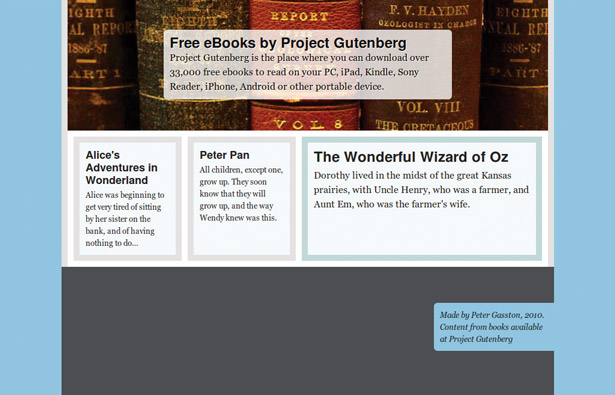
To best show off the capabilities of Flex Box, I’m going to build a small promotional website. It’s a very simple site – a header with title and intro copy, three sections of promoted content, and a footer. You’ll no doubt have built sites far more complex than this before, but not in the way I’m going to show you – what’s important in this article is not the destination, but the journey. You can see the finished web page, flexbox-complete.html, in our downloadable tutorial files. You’ll have to use Firefox, Chrome or Safari (or other Gecko or WebKit browsers) to view it as I’ve purposely not created any fallback styles for this example.

There are three things to take note of in the example: first, the vertical alignment of the title and intro copy in the header; second, the distribution of the three promotional boxes; and third, the equal-height columns of the promotional boxes. All of these were achieved with a minimum of effort using Flex Box. Let’s take a look at each area in detail, starting with the header.
Aligning elements
The markup for the header is extremely simple; note that I’m using some HTML5 structural elements here and throughout the article, but there’s absolutely no requirement for you to do so in your own pages:
<header> <div> <h1>...</h1> <p>...</p> </div> </header>To get the internal div element to centrally align inside the header both horizontally and vertically requires the use of three properties: one CSS2.1 property with a new value, and two properties that are new to CSS3 and probably unfamiliar to you. The existing property is display; we currently use it with values such as block or inline, but in Flex Box we get a new option: box.
header { display: box; }In fact, as the module is still not considered fully stable just yet (some of the finer points are still being iterated on by the working group) we must use prefixed property keywords for each of the supporting layout engines, so our full code requirement is:
header { display: -moz-box; display: -webkit-box; }However, to avoid repetition and to make the code examples clearer, I’ll only be referring to the non-prefixed properties and values in this article; you can see the actual required values in the tutorial files. Oh, and be aware that if Flex Box does get implemented in IE9 it will also be prefixed, so you’ll have to add -ms-box to the code above, and likewise all of the other new properties.

So what the new box value actually does is it instructs the element to use box layout algorithms to render its children, which we need to do before being able to use any of the new Flex Box properties.
Now that we’ve triggered box layout rendering, let’s look at how we make our element centrally align inside its parent. The header element in my example is 800px wide and 220px high, but the div element inside it is 480px wide and 116px high. That means there’s quite a lot of extra space (320px horizontally and 104px vertically) between the two elements. With CSS2.1 I can use margin: auto to centrally align the div horizontally, but to do the same vertically would involve some calculation and the use of negative margins, which isn’t really practical at all when dealing with dynamic content.
It’s much easier to resolve with Flex Box, and needs the use of the two new properties I mentioned: box-align and box-pack.
header { display: box; box-align: center; box-pack: center; }The first, box-align, positions the child element (the div in our example) by distributing the extra space on an axis perpendicular to the element’s orientation – that is, if the element is oriented horizontally the space will be distributed vertically, and vice-versa. By default the orientation of a child element is horizontal, so box-align acts on the vertical. As we’ve given the value of center, box-align distributes the empty space equally above and below the element, and therefore positions it centrally.

The second property, box-pack, works in a similar way but distributes the space along the same axis that the element is oriented along (as we’ve just seen, that’s the horizontal axis by default). We’ve once again provided the value of center, so the extra space along the horizontal axis is equally distributed between the left and right of the element, positioning it centrally once more. The combination of both properties having a value of center makes our header copy sit neatly in the middle of the parent element both horizontally and vertically, and we haven’t had to concern ourselves with margins, positions or percentages. Easy!
Changing alignment values
By changing the values of one or both of these properties I can position my element anywhere within the parent.
To see this illustrated, take a look at my page footer:
<footer> <p>...</p> </footer>The p element is positioned on the right and vertical centre of the parent, as I’ve given a box-align value of center and a box-pack value of end:
footer { display: box; box-align: center; box-pack: end; height: 200px; }Other values for box-align are start, baseline and stretch; and for box-pack, start and justify – this latter value doesn’t work in Firefox, however.
The box-flex property
If you’ve been following this article by looking at the code used in the example files you’ll have spotted that there’s another property that I haven’t mentioned yet. This is the box-flex property and, unlike the properties we’ve seen so far, this is applied to the child element rather than the parent:
header div, footer p { box-flex: 0; }Giving box-flex a value of 0 means the element will retain its original dimensions and not be subject to dynamic resizing. To explain what that means and to see what effect different values have, let’s take a look at the main content area of the page.
Below the header there are three section elements promoting different titles available at Project Gutenberg (bonus geek points if you know the connection between the titles):
<article> <section> <h2>...</h2> <p>...</p> </section> <!-- (repeated twice) --> </article>If you take a look at the style sheet, you’ll notice that all three have the same assigned width – 180px – yet in the page itself the one on the right is much wider. How is this so? It’s because of this code:
section { box-flex: 0; width: 180px; } section:first-of-type { box-flex: 1; }Each of the section elements has a box-flex value of 0 which, as I just mentioned, means they’re not subject to dynamic sizing. The section that has the first-of-type selector applied to it, however, has a box-flex value of 1. When elements have a box-flex value of greater than 0 they become flexible, and their dimensions will be increased until they fill their parent element. That increase is regulated by the value of the box-flex property, which acts as a kind of ratio.
Imagine for a moment that you have a parent that’s 90px wide and two children that are 30px wide, meaning there’s 30px difference (extra space) along the horizontal.
If the first child has a box-flex value of 1, and the second a value of 2, the extra space would be distributed to the width of each in the ratio 1:2 – so the first child would be made 10px wider, the second, 20px.
In the case of our three-section layout here, the extra space is distributed in the ratio 1:0:0 – that is, all of it is distributed to the first section, meaning it expands to fill the empty space while the other two keep their original size.
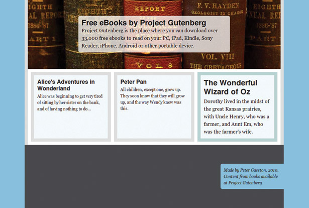
If all three of the section elements had the same box-flex value (greater than 0) they would all be expanded to the same width. You can see this alternative approach in the tutorial file flexbox-alternate.html; each section has the value of 1 (one), so they all receive an equal share of the distribution and are resized to 213px wide. But you’re not limited to 0 or 1; any number value is permitted, and the empty space will be distributed in that ratio.
By the way, note that each of the section elements is the same height. This is an inherent bonus of using Flex Box – all elements on the same axis will be given equal dimensions along the opposite axis to their orientation (in this case, horizontally). Equal-height columns by default!
Content order
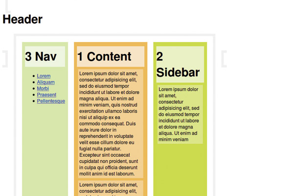
You’ve probably noticed that in my code the first section element in my markup (the one with id #section-1) actually appears on the right of the three when displayed – that is, out of the order in which it appears in the DOM.
Doing this before Flex Box would have meant either calculating widths for floats or positioning, or using JavaScript. Neither is optimal compared to how I’ve achieved it here.
There are actually two ways I could have approached this with Flex Box. The first would be to use the box-direction property; this is applied to the parent and sets the order in which the flexible child elements are displayed (I’ve given them unique ids to make this easier to follow). By default the value is normal, so my elements would display in the DOM order – that is, 1-2-3 – but using the value of reverse would mean my elements displayed 3-2-1:
section { box-direction: reverse; }However, the order my elements are actually displayed in is 2-3-1, which I achieved by using the box-ordinal-group property. With this you can create groups of elements by assigning an integer value (a whole number) to the property. Elements with the same value will form a group; all elements within a group will display in DOM order, but groups will display in ascending order of their box-ordinal-group value. By default the value is 1 (one), but in my code I’ve specified that the first section element has a value of 2:
section:first-of-type { box-ordinal-group: 2; }As the second and third section elements are in the group with the value of 1 they will display first, in DOM order (2-3). The first element is in the group with the value of 2, so that will display next. The result is my final order of 2-3-1.
Summary
So that’s it! I didn’t get the opportunity to mention the box-flex-group, box-lines or box-orient properties, but I hope that this article has made you curious enough to find out more yourself.
I also hope that I’ve shown you that Flex Box makes dynamic layouts easy, but really I’ve barely touched on the potential of the new module. Where it really comes into its own is when you combine it with media queries to make layouts that respond to the dimensions of the page.
WebKit browsers currently have a good, stable implementation of Flex Box, so although this module has a lack of desktop browser support (*cough* Internet Explorer *cough*) there’s one area in which it’s quite ready to be exploited – iOS Web App development.
It shouldn’t be too much of a stretch to imagine an app that’s optimised for the capabilities of the two different screen sizes. That, however, is a tutorial for another day …

Thank you for reading 5 articles this month* Join now for unlimited access
Enjoy your first month for just £1 / $1 / €1
*Read 5 free articles per month without a subscription

Join now for unlimited access
Try first month for just £1 / $1 / €1

The Creative Bloq team is made up of a group of art and design enthusiasts, and has changed and evolved since Creative Bloq began back in 2012. The current website team consists of eight full-time members of staff: Editor Georgia Coggan, Deputy Editor Rosie Hilder, Ecommerce Editor Beren Neale, Senior News Editor Daniel Piper, Editor, Digital Art and 3D Ian Dean, Tech Reviews Editor Erlingur Einarsson, Ecommerce Writer Beth Nicholls and Staff Writer Natalie Fear, as well as a roster of freelancers from around the world. The ImagineFX magazine team also pitch in, ensuring that content from leading digital art publication ImagineFX is represented on Creative Bloq.
