CSS3 animations: four stunning examples
As an across-the-board shift towards open standards continues, Craig Grannell asks designers at the cutting edge how best to animate web pages using CSS3
Animate a sign-up page
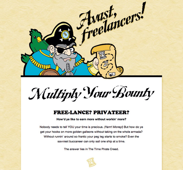
“Animation and motion catch your eye. Boring text doesn’t,” says Thomas Fuchs, explaining why Slash7 created an animated cartoon pirate for timebemoney.com, a mini-site that promotes time tracking. “Most mailing list sign-ups are boring – not ours!”
Slash7 was keen to create a lightweight implementation that most people who visited the site would see. “With no external libraries required, the site loads ultra-fast,” Fuchs explains. “The majority of our target audience is on Safari or Chrome and will see the animation.”

After an illustrator provided a vector image, Slash7 coloured and rasterised it, then cut it into pieces, separating the arm and clock handles. “We used WebKit to animate the clock handles and arm, and threw in an old-school animated GIF to make the eye blink,” explains Fuchs. “Now, when you visit the site, Captain Track greets you, waving his freelancing treasure map, and there’s no JavaScript required.”
Fuchs says the animation works really well in Chrome, and even better in Safari, where it’s hardware-accelerated. Apparently, it also fares well on mobile devices. “Many people view the site on the iPhone, iPad, Android phones and Palm webOS phones, and you can see the animation just fine,” Fuchs says. “On iPhones, you actually get 60fps, buttery-smooth performance. Funnily, though, animated GIFs are not supported on Android phones, but CSS animations are. Go figure!”
For details on the code behind the animation, take a look at Fuchs’s article ‘Creating Awesome CSS3 Animations’.

Thomas Fuchs
Job title: Co-founder
Get the Creative Bloq Newsletter
Daily design news, reviews, how-tos and more, as picked by the editors.
Company: Slash7
Troubleshoot CSS3 animations
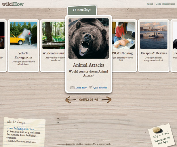
When working on apps.wikihow.com/survivalkit, Ryan ran into CSS3 animation limitations. “Some properties animate better than others: margin-left isn’t as smooth as left, which is less smooth than transform: translate,” he says. “The best animations are done via transform because it’s hardware-accelerated in most browsers.”

Another roadblock he found was matching animation timings to JavaScript events. “In theory, you could attach event handlers to transitionStart and transitionEnd, but they’re buggy, often firing at the same time,” says Ryan. He therefore created a function, getElementTransitionDuration, to assist.
“Different properties can have different durations, so we must match the property we want to its duration,” he explains. “If you don’t specify a property to look for, the function will return the longest duration it finds.” If a property is specified but the element doesn’t have a duration for it, the function returns 0, so you always have an integer value to use in things like setTimeout. “To see this in action, see apps.wikihow.com/survivalkit/#/categories. To get the cards to slide out from the centre one at a time, we couldn’t rely on -webkit-transition-delay, since each card would need a different delay and we potentially have dozens of cards to work with. The right thing would be to trigger the next card to move by attaching an event to transitionEnd, but in practice, that event wasn’t firing at the correct time. So we used setTimeout, passing in the value we got back from getElementTransitionDuration() to delay the next action.”

Daniel Ryan
Job title: Web developer
Company: Easy Designs
Improve your forms
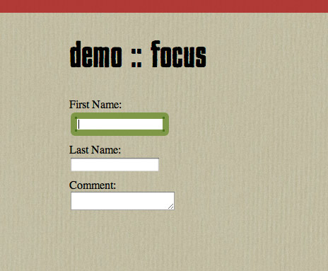
Many CSS3 transitions are applied to hover states, but Rewis notes that there are practical applications as well. “Form usability is hit-or-miss, and knowing which field is active can be difficult,” he says. “This can be solved by using a CSS transition to change the background colour and provide a border around the input.”

His technique centres around the pseudo-class :focus, triggered when a user activates a form field, and the CSS3 transition property. “Many browsers provide an outline to focused fields, so that’s removed by setting outline to 0,” Rewis says. “Next, a background and border are added. To draw attention to the change, you can animate the transition between states by adding transition: all .5s to the input rule.” For production sites, also use -webkit, -moz and -o.
“I think textarea elements are some of the most unsightly on the web, but you can style them to match other form elements, only expanding them on focus,” says Rewis. Define a height for textarea in CSS, and then a more desirable height for textarea:focus, removing the default outline and adding the border and background styles applied to the input fields.
“Finally, add the transition, remembering to include vendor-specific prefixes,” says Rewis. The input example transitions all properties, but this one only affects the defined ones:
textarea { height: 20px; transition: height .5s, border .5s, background- color .5s; } textarea:focus { outline: 0; height: 250px; background-color: rgb(246,255,100); border: rgba(72, 107, 11, .7) 9px solid; border-radius: 6px; }
Greg Rewis
Job title: Principle evangelist
Company: Web Tools, Adobe Systemcs, Inc
URL: AssortedGarbage
Build a lightsaber
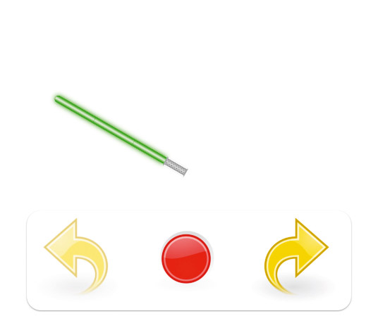
Davis hacked together a lightsaber demo to experiment with CSS3 animations. The result showcases several properties, and shows how JavaScript can enhance projects. "I started with a static lightsaber – a couple of divs and icons for the controls," he says. "The blade and handle have repeated background images and fixed widths and heights. The blade also uses border-radius and box-shadow for the glow effect. I then created styles for the active and inactive states, using the CSS3 transform property as well as scale, translate and rotate values, remembering to include vendor prefixes."

With JavaScript, Davis set click and mouseover event listeners to the buttons: "These trigger functions that play audio and change the class names of the buttons and lightsaber. When the class names change, the new CSS values take effect, resulting in a change of appearance." The animation was made by adding a transition-duration property to the lightsaber and buttons. "Whenever any of their CSS values change, they animate over a set period of time, in this case half a second."

Daniel Davis
Job title: Web evangelist
Company: Opera Software

Thank you for reading 5 articles this month* Join now for unlimited access
Enjoy your first month for just £1 / $1 / €1
*Read 5 free articles per month without a subscription

Join now for unlimited access
Try first month for just £1 / $1 / €1
The Creative Bloq team is made up of a group of design fans, and has changed and evolved since Creative Bloq began back in 2012. The current website team consists of eight full-time members of staff: Editor Georgia Coggan, Deputy Editor Rosie Hilder, Ecommerce Editor Beren Neale, Senior News Editor Daniel Piper, Editor, Digital Art and 3D Ian Dean, Tech Reviews Editor Erlingur Einarsson, Ecommerce Writer Beth Nicholls and Staff Writer Natalie Fear, as well as a roster of freelancers from around the world. The ImagineFX magazine team also pitch in, ensuring that content from leading digital art publication ImagineFX is represented on Creative Bloq.
