Create slick CSS layouts with Flexbox
The Flexible Box Layout Module aims to revolutionise UI layouts. Stephen Hay shows how to create a layout for a fictional app.
We've all had to do various workarounds for layout. We've used tables, which were intended for tabular/relational data. We've used floats, which were traditionally used so that text can wrap around floated figures. We've used positioning, which is arguably layout, but doesn't provide the power and flexibility we need to create complex layouts quickly and easily. We now have Flexbox.
- Download the support files for this tutorial
Flexbox, the nickname for CSS Flexible Box Layout Module, provides us with a way to quickly and easily lay out user interfaces and the various elements within them. The Grid Layout spec is a better solution for page layout, but is still being developed.
Flexbox, on the contrary, is quickly being supported in newer browsers. To find out which browsers those are exactly and what syntax is supported (this tutorial focuses solely on the new syntax) and with which prefixes, I refer you to Can I Use…, which provides a more thorough compatibility overview than I can here.
What problems does Flexbox solve?
Flexbox enables us to determine how we use the available space within an element relating to that element's children. For example, if you have a The Flexible Box Layout Module, aka Flexbox, is the new CSS spec on the block, promising to revolutionise UI layouts. Stephen Hay shows how to create a layout for a fictional app 600px-wide container that in turn has three children, each 100px wide, then you have 300px extra space available to you.
Flexbox gives you the tools to deal with this space. Do you want to split it evenly among the children, making them all wider to fill that space? Would you prefer to allow one child to receive all of the available space? Or would you rather place that space evenly between the elements?
These problems are trivial to solve with Flexbox, both horizontally and vertically. Yes, that does mean that it's finally possible to perfectly centre an element along both the horizontal and vertical axes. Flexbox also offers more goodies, such as altering presentation order versus source order.
Owing to the nature of the layout problems Flexbox solves, it's easy to see how it can lend itself to creating UI layouts. Toolbars, tabs, forms, and similar components are easily laid out with it.
Get the Creative Bloq Newsletter
Daily design news, reviews, how-tos and more, as picked by the editors.
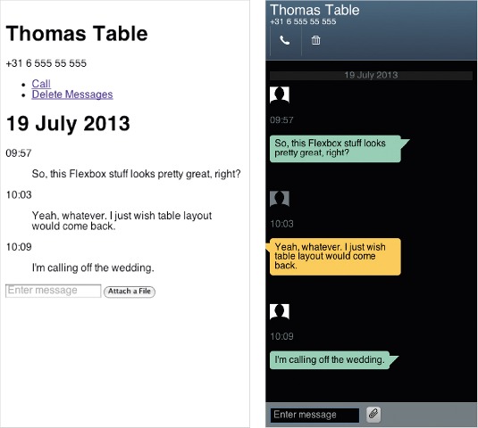
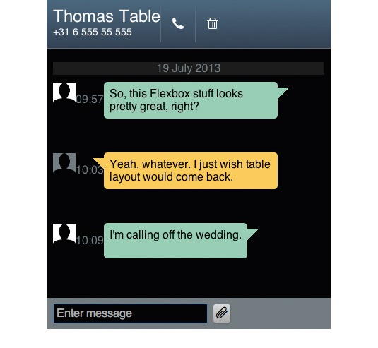
To get a feel for what you can do with Flexbox, so you can try it out in your own projects, we're going to create a layout for a fictional text-messaging app, similar to the UI you might find on a typical Android phone. While this serves no practical purpose (you won't have a working app), it demonstrates how quickly, once you have all your basic styles done, you can create such a layout.
Dive in!
Choose a browser that supports the newest Flexbox spec. Whatever browser you choose, you'll have to use the appropriate vendor prefixes. The examples here are presented without them (the downloadable code for this tutorial uses WebKit prefixes).
Let's try something simple first. Type the following skeleton document in your text editor and open it in your browser:
<!DOCTYPE html>
<html>
<head>
<meta charset="utf-8">
<title>Flexbox tutorial</title>
<meta name="viewport" content="width=device-width, initial-scale=1">
<style>
section {
border: 1px solid gray;
padding: 1em;
}
div {
width: 50px;
height: 50px;
border: 1px solid steelblue;
}
</style>
</head>
<body>
<section>
<div></div>
<div></div>
<div></div>
<div></div>
<div></div>
</section>
</body>
</html>
We've got five divs here, each 50px square. They are block-level elements and display as such. In the style element in the document's head, add an additional declaration to the section rule:
display: flex;Remember to add a vendor prefix to the flex property if necessary for your browser. In my case, I'm using display: -webkit-flex;.
We've turned the section into a 'flex container'. The elements in a flex container are flex items and adhere to the rules of Flexbox, unless pulled out of that world by, for example, being absolutely positioned.
Note what happens when you view the page in the browser. The elements look as if they have been floated, without the nastiness of a collapsed parent container. Flexbox's default is to display with the flex-direction property set to row, which means horizontal. flex-direction: column would display the elements vertically, much as they were displayed as display: block. As the default for flex-direction is already row, we needn't specify it here.
Now that we've got this simple example in place, you can play around a bit.
Horizontal and vertical centring
Set the height of section to 400px, so you can better see what's going on. Even better, let's centre the items by adding the following to the section style:
height: 400px;
justify-content: center;
align-items: center;
When the flex-direction is row, then the horizontal axis is called the 'main axis'. The vertical axis is called the 'cross axis'. This is reversed when flex-direction is column. justify-content handles alignment (justification) along the main axis, while align-items handles alignment along the cross axis. By centring both, we finally get true centring.
Auto margins
Let's see how auto margins work. Add the following rule:
div:last-child { margin-left: auto; }Dealing with available space
Refresh. When you see this, you can imagine how various menu and tab-related layouts can easily be solved without the need for extra markup. Now how about some 'flex'? Remove the div:last-child rule and add the following to the div rule:
flex: 1;This takes the remaining space in the flex container and gives one equal part to each div. But what if we want the centremost div to receive two parts of the available space, and the others to each receive one part?
div:nth-child(3) { flex: 2; }You could also change the above rule to give flex: 1 to that div, and completely remove flex from the others. This enables all of the divs to be 50px, except for the centremost one – which will then take up all of the available space.
You can place the available space between items instead of adding it to their widths. Remove flex from the divs and change the value for justify-content on the section element:
justify-content: space-between;Display order vs source order
How about messing with display order vs source order? Add the letters A, B, C, D and E to each of the divs respectively, so you can follow what happens with the display order.
All items have a default order of 0, which means they follow source order. Adjusting that value changes the display order of the flex item relative to the source order. Try this:
div:nth-child(4) { order: -1; }Again, don't forget to use a prefix if needed. See how the div containing the letter D, which should be fourth, is now the first item displayed? How about this instead:
div:nth-child(2),
div:nth-child(4) { -webkit-order: 1; }
Since source order defaults to 0, order: 1 places B and D at the end. Once placed, they continue to follow their own source order (B before D).
If you're new to Flexbox, this is a lot of new information. And to think, these are only a few of the possibilities! I'd strongly recommend reading the spec to learn even more.
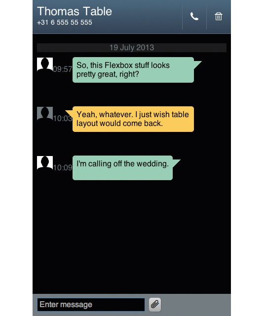
A simple app UI
Now let's take a look at how Flexbox could potentially help us in a real-world UI layout situation. Just for kicks, we're throwing together a little messaging app UI. By looking at the end result, you can quickly devise the tactics you would normally employ to accomplish this layout.
In the following exercise, you'll see that by focusing on structured content and basic UI styling first, you can 'tack on' some Flexbox afterwards and be done with it. While these types of UIs always involve a reasonable amount of CSS, you'll see that with Flexbox only a small portion of it is used for layout.
First, start off with a skeleton again. This time, I've populated it with the basic structure and content of this particular app screen:
<!DOCTYPE html>
<html>
<head>
<meta charset="utf-8">
<title>Flexbox tutorial</title>
<meta name="viewport" content="width=device-width, initial-scale=1">
<link rel="stylesheet" href="normalize.css">
<link rel="stylesheet" href="style.css">
</head>
<body>
<header>
<div class="contact">
<h1>Thomas Table</h1>
<p class="tel">+31 6 555 55 555</p>
</div>
<ul class="toolbar">
<li class="call"><a href="#"><span class="visuallyhidden">Call</
span></a></li>
<li class="delete"><a href="#"><span class="visuallyhidden">
Delete Messages</span></a></li>
</ul>
</header>
<section class="messages">
<section class="day">
<h1>19 July 2013</h1>
<div class="message from-me">
<div class="avatar"></div>
<p class="time">09:57</p>
<blockquote>So, this Flexbox stuff looks pretty great, right?</
blockquote>
</div>
<div class="message from-them">
<div class="avatar"></div>
<p class="time">10:03</p>
<blockquote>Yeah, whatever. I just wish table layout would
come back.</blockquote>
</div>
<div class="message from-me">
<div class="avatar"></div>
<p class="time">10:09</p>
<blockquote>I'm calling off the wedding.</blockquote>
</div>
</section>
</section>
<form>
<input type="text" placeholder="Enter message">
<button><span class="attach"></span><span class="visuallyhidden">
Attach a File</span></button>
</form>
</body>
</html>
Note that I'm linking to normalize.css, which is indeed Nicolas Gallagher's project and uses some sensible rules to create a more predictable playing field across browsers. Don't worry too much if your element choices are different; they just serve as a vehicle for the example Flexbox code.
However, do pause and take a look at this page in the browser. This is what the user would see if we were only able to provide this app screen with plain HTML. It's not pretty, but if the backend were in place, it would be perfectly usable.
Also, we'll be using an icon font that contains just a small number of glyphs, which I made using IcoMoon. I would encourage you to type various pieces of code in yourself, but all the files I used are available for download.
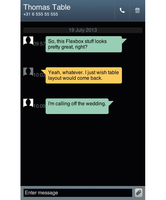
I won't walk you through all of the non-layout styling of the UI itself; I've provided a file for you in the tutorial download: style-01.css. Simply add ...
<link rel="stylesheet" href="styles/style-01.css">… to the head of your document, and then check it out in your browser. You can see that the styles appear correct – but we haven't really done anything with layout.
Almost everything except for the two icons in the toolbar, which are now displayed as inline-block, simply uses the browser's default. In most cases, they are just block-level elements.
By adding a relatively small amount of CSS, we can complete the layout as intended. I'm going to walk you through each new rule, which you can then add to the bottom of style-01.css. In order to really see what's happening, you may want to save and refresh the page at each step.
body, header, .message, .toolbar, form {
display: flex;
}
This turns each of these five elements into flex containers, which, in most cases, already begins the process of solving layout problems for us.
However, the layout is now all over the place, as a result of flex-direction defaulting to row. We want that outcome for some of our elements, but not for the screen as a whole – which should be displayed vertically. Let's sort that issue out:
body { flex-direction: column; }There we go! This is starting to look like what we want to achieve. We'd like to have the text input field at the bottom to take up all of the extra available space horizontally:
input { flex: 1; }Next, we use Flexbox's magnificent auto margin to move the two icons to the right. We centre them vertically:
.toolbar {
margin-left: auto;
-webkit-align-items:center;
}
In this case, our body is a flex container with a height of 100%. We can take advantage of this since we want the messages section of the UI to take up any extra vertical space:
.messages { flex: 1; overflow: auto; }The overflow will allow the user to scroll this section if there are more messages than fit in the messages area.
.time { position: absolute; }We're stripping the times of typical flex characteristics by absolutely positioning them, which is simply the easier route for these elements. You aren't limited to Flexbox; you can use the best positioning model for your particular situation.
.from-me {
justify-content: flex-end;
}
.from-me blockquote {
order: -1;
margin-right: 2em;
}
.from-me .time {
bottom: -2.5em;
right: 4em;
}
The above rules use Flexbox to change the display order of elements on messages from the app user as opposed to the person they are messaging, and then places these elements to the right of the screen. Finally, the time is positioned accordingly.
The only thing left to do is fix the positioning of elements used for the contact's messages, which doesn't even require Flexbox:
.from-them blockquote {
margin-left: 2em;
}
.from-them .time {
bottom: -2.5em;
left: 4em;
}
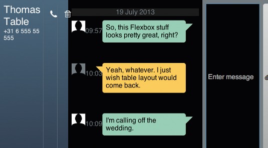
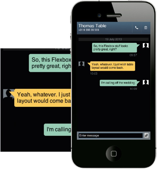
And that's it! There are only eight Flexbox-specific properties or values used here, and in combination with very basic CSS, they allow us to create this screen in a fairly simple manner. The layout is fluid, so it works at a variety of viewport widths.
Fallbacks and compatibility
You may or may not be aware of the fact that Flexbox has seen a few syntax changes through the years. You may be wondering how you can combine all those syntaxes into a mess of CSS that works in most browsers while using floats and display:table as fallbacks.
You have my blessing if you want to try; I won't advocate cross-syntax pollination here. However, please don't simply throw in the towel and exclaim that 'it's too bad we can't use Flexbox because of lack of browser support'. Browser support is growing rapidly.
I suggest that you use only the new syntax – it's the only one that is truly relevant unless you have legacy Flexbox-based UIs (which I suggest you simply rewrite). Where the effects you want to achieve with Flexbox are mission critical, I recommend creating them without Flexbox first, and then implement the Flexbox solution underneath those rules in your CSS. This way, you're falling forwards rather than falling back. But it's your web, and you're the boss, so do what makes sense for your workflow, your client and your users.
Go forth and flex!
Flexbox is a giant leap forward for web layout. While it doesn't solve all layout problems (such as page layout and grids), it turns many previously frustrating layout issues into trivial exercises. I encourage you to play around with Flexbox and use it where you can!
Words: Stephen Hay
Native Californian Stephen Hay lives and works in The Netherlands as web design and development strategist, through his own user experience consultancy Zero Interface. This article was originally published in net magazine issue 246.

Thank you for reading 5 articles this month* Join now for unlimited access
Enjoy your first month for just £1 / $1 / €1
*Read 5 free articles per month without a subscription

Join now for unlimited access
Try first month for just £1 / $1 / €1

The Creative Bloq team is made up of a group of art and design enthusiasts, and has changed and evolved since Creative Bloq began back in 2012. The current website team consists of eight full-time members of staff: Editor Georgia Coggan, Deputy Editor Rosie Hilder, Ecommerce Editor Beren Neale, Senior News Editor Daniel Piper, Editor, Digital Art and 3D Ian Dean, Tech Reviews Editor Erlingur Einarsson, Ecommerce Writer Beth Nicholls and Staff Writer Natalie Fear, as well as a roster of freelancers from around the world. The ImagineFX magazine team also pitch in, ensuring that content from leading digital art publication ImagineFX is represented on Creative Bloq.
