Create the perfect website redesign
Dan Mall shares tips and experiences from the industry pros on how to do a website redesign, the right way.
A redesign is a matter of course for websites. Software platform Hubspot's survey of hundreds of consumers, marketers and agencies found that 68 per cent completed a website redesign within the last 12 months. There are currently over 739 million existing websites (which increased 22 million compared to the previous month according to internet services firm Netcraft). So, if we apply Hubspot's sample data to the entire spectrum, over 500 million websites were redesigned in the last year. This leads us to a (scientific) conclusion: website redesigns are massively important.
However, we don't always treat them as such. Redesigns often suffer from poor planning and preparation, and lack clear project goals. For instance, Hubspot reveals 37 per cent of those surveyed didn't measure any metrics for their last website redesign. So how do you know whether to redesign or realign your existing site? And how do you get it right?

Author, entrepreneur and speaker Seth Godin says on his blog, "The only reason to build a website is to change someone. If you can't tell me the change and you can't tell me the someone, then you're wasting your time." He elaborates, "The web is a direct marketing medium, something that can be measured and a tool that works best when the person who builds the page has a point of view. Instead of a committee deciding everything that ought to be on the page, and compromising at every step, an effective website is created by someone who knows what they want the user to do."
Redesign and realign
In 2005, designer, speaker and author Cameron Moll wrote a wonderful article for web design magazine A List Apart called 'Good Designers Redesign, Great Designers Realign'. In the article, Moll presents a simple framework: "The desire to redesign is aesthetic-driven, while the desire to realign is purpose-driven."

Almost a decade later and the sands have shifted. While there are still a lot of aesthetic-driven redesigns, the definitions for 'redesign' and 'realign' are converging. More and more of us are able to champion balanced and purpose-driven evaluations as well as the aesthetics of our web presences.
Skeptical? I sat down with a few friends to ask them about some of their recent redesign experiences. Here are their stories.
A complete overhaul
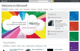
Last year, web design and branding shop Paravel helped Microsoft conceptualise, create and launch a new homepage.
Former Microsoft evangelist and strategist Nishant Kothary had worked with Paravel on a handful of small projects in the past, and, when the opportunity came up, he knew where to turn. "In my early discussions with the team, I'd outlined a model that involved bringing in some outside talent and integrating them carefully into the Microsoft team. I was certain that they had the right skill set, but more importantly, the right attitudes, " he says.
So far, Microsoft had a few great ingredients for a great redesign: the right people internally and externally, the right circumstances and the right amount of luck to bring them together. What now? How did they decide what to do?

Here's the prior version of Microsoft.com before the Paravel redesign. Here's the new one that exists today. It would've been possible to take the old homepage and tweak it to achieve something similar to the new version. So why start from scratch?
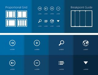
"Obviously, Microsoft has a lot of things happening all at once, " says Trent Walton, founder and one-third of Paravel. "They needed something that could be expanded to feature multiple pieces simultaneously. We needed to build a system that could allow them to talk about Xbox as well as new phones and computers and software at the same time. They kinda had that before, but they wanted to do a better job of it. Starting from scratch allowed us to give them a better system."
The goal of the redesign was to improve the site's aesthetics and purpose, but it would have been incredibly difficult to realign the site because the system wasn't yet in place for that to be possible. The real magic of this project was that, together, Paravel and Microsoft created something both aspirational and practical. Perhaps Kothary puts it best: "The team built a bleeding-edge site in the real world."
Read more about the Microsoft redesign in Walton's post, 'A New Microsoft.com' and in Paravel's case study of the project.
Constant improvement
Like Microsoft, the Four Seasons group of hotels and resorts completely redesigned its website rather than attempting to improve its existing site.
"We probably could have optimised the old site, but a polished turd is still a turd, " says Chris Cocca, global ecommerce manager for Four Seasons Hotels and Resorts. "As much as it is a website, it's also a platform for us to extend beyond. It wasn't just about what you see on the frontend; we were really designing a platform underneath to influence and react to the ways people interact with travel brands. [The redesign] was bigger than just the site, " he adds.
So why start from scratch with a redesign rather than realigning the previous site? "We looked at where we were when we started and realised that the systems we had in place - the design, the content, all the pieces - weren't going to be enough to even tweak, " adds Cocca. "We were far enough behind that we needed to redesign first and then move into that realignment phase. We knew we weren't going to nail it in the first pass, but we knew we needed to make significant gains. We needed a new baseline."
If this baseline doesn't exist, perhaps a redesign the perfect opportunity to create it. Maybe, the point of a big redesign is to enable you to realign.

Cocca sums it up nicely: "You have to set up a budget beyond the project to maintain and improve the site. If you don't, that's how you get into situations where you need to do a massive, pain-in-the-butt redesign every five years because everything's outdated and nothing is right. My whole mission is that if we do another redesign while I'm still here, then I haven't done my job properly."
A solid baseline
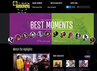
Even where a project demands constant redesigning, the aim seems to be in creating a solid baseline. For the past three years, web design, development and user experience consultancy Happy Cog partnered with entertainment network MTV to create an online presence for the annual O Music Awards (OMA), an event that celebrates the best in digital music.
When the awards show first started, each year was intentionally unique in its visually identity, forcing the Happy Cog team to frequently start from scratch. Yesenia Perez-Cruz, senior interactive designer at Happy Cog recalls Happy Cog's kickoff meeting for the most recent OMA started with questions: 'What works here and what doesn't?'
Despite the constant redesigns, the team worked towards building more consistency. The new version now contains lots of realignment in the voting and sharing experiences. "A lot of our work with the most current [version] was focused on setting up a solid foundation to build on top of. We'd be in a much better place to make subtle changes and enhancements and, honestly, just do things that we wanted to try and do, " says Perez-Cruz.
When platforms exist
It's easier to make incremental changes as you go along once you've built a suitable platform to work on. Modern companies like social network Facebook are often optimised for iteration and have existing platforms that support experimentation and provide ways to adapt quickly.
One example of this is the new Graph Search feature of Facebook. As Fast Company Design reported, the initial interface that Facebook launched was a few steps different than the one live on the site today. In fact, there were about four or five different iterations that went live before the current one stuck.
"We ended up with this design that was just white text on the Facebook blue. Very simple, very reductionist," says Russ Maschmeyer, lead designer on the product. "We were really excited to launch it; we have lots of early adopters, and not too many people had trouble finding or interacting with it. But, over time, as we released it to more and more people, we found that a lot of people were really confused by it. A lot of people complained that they couldn't find the search field. And, for those who found it, it wasn't really clear what you could do with it. We realised it was a significant problem.

"This elegant design solution that we were really excited about was actually making it really difficult for people to use it effectively or get any value out of the new product.
"So we started with baby steps. We added a slightly darker rectangle behind the text. We tried changing the search prompt text. We didn't really want to give up on the idea because we were excited about it, but we ran all of these tests side by side. We also ran the extreme option with the drop-dead, basic, white-field search box.
"At the end of the day, the white field performed far and away better for our users than any of the incremental steps back. I was pretty crestfallen since I was so excited about the initial design direction, but in the end, I realised that changing the design of a search field actually didn't add any value to the product (aside from pure aesthetics). It didn't make the product more valuable; it certainly didn't make it easier for people to use. Our job as designers isn't only to create beautiful products, but also to make products usable and powerful. Graph search is really powerful... when you can actually find the search box, " Maschmeyer laughs.
But why not completely redesign Graph Search when it wasn't performing well, as opposed to incrementally optimising?
"We actually shipped the crazy, bold, new design approach, rather than trying to move towards it. We had no problem with wanting to see how it played and then testing it against other things. That's the thing that makes me most excited to be at Facebook. With products of such size and scale, you almost never know how people are going to react to big design changes.
"The best way to understand what's happening is to isolate the elements of a design change and understand how each of them contributes to a design direction," says Maschmeyer.
Maschmeyer outlines the value of having each version out there in the open so that they that could learn from how people used each one. But what happens when the entire process is done in the open?
Redesigning in public
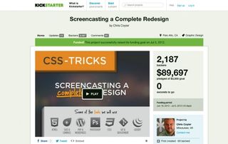
Designer and writer Chris Coyier wrote about this idea of 'Working in Public' and put it to the test by redesigning his blog CSS-Tricks (css-tricks.com) in this very way.
Coyier also wanted to raise some funds to be able to screencast the entire process. He launched a meagre Kickstarter campaign to raise $3,500 and ended up raising just shy of $90,000.

"I called it v10, " he says, "which is to say that this isn't the first time I've redesigned my site. Sometimes I redesigned because I felt like it. I don't know that you always need a super good reason all the time. It's just what I do anyways. Some people collect bottle caps. That said, you usually [do need a reason] when there's money on the line.
"This was the first time CSS-Tricks was redesigned with a real business case. It happened during a time when I quit my job, so I wanted to turn it from a little side project and hobby into a real thing. So the whole redesign had that looming over it.
"I was going to do all of this work - rethinking advertising, deciding on a new aesthetics - and I realised this was the stuff I already write about. People come to the site for that stuff anyway, so why do that in a vacuum? I was gonna make all of this new content, so it was a no-brainer. I decided I might as well flip the switch on. I've done hundreds of screencasts, so it felt natural. I could just talk it out while doing it."
Certainly, working in public adds an extra layer of complexity, everything from the time it takes to document articulately to the risk of people publicly criticising your hard work. "I tried to be super objective about it, " Coyier explains. "That's the key to beating haters and trolls, and even my own self-doubt. If I can be as objective as I can, then I win.
"Does the site make more money than before? If yes, then win! Do people spend more time on the site? Does the site load faster? Those are all objective, hard numbers that I can choose to make better.
"Every objective I could measure: that was the goal. In the end, if someone said, 'I hate the new redesign' , I could say, 'I don't care!'"
Frontend designer Brad Frost and designer Melissa Frost also decided to redesign in public when redesigning a website for the Greater Pittsburgh Community Food Bank. In a blog post, Frost breaks down the components of what it means to design in public. He concludes, "It took me a while to realise that it's not about the work that I do, but rather what that work enables others to do. By sharing your thoughts, your successes, your failures, your techniques, your process, your resources, you're able to have a much greater impact on the world than whatever happens to be in your project's scope."

A public redesign
Last year, my company SuperFriendly was fortunate to do some work with non-profit organisation, Reading Is Fundamental. Its mission is simple: to give books to kids who need them. We proposed that we design the site in public, and the client was probably more excited about it than we were. The team wrote posts along the way about the discovery and design process, starting with a kickoff meeting, and we made our password-protected client landing page publicly accessible to anyone to follow along. It kept me sharp. The accountability I had created with both the client and the public made me think more deeply about the project than I probably would have otherwise. When I'm working on a project, I'm often way too close to it to be able to think objectively. Strangely and wonderfully, communicating your thoughts to a separate audience at a higher level gives you a more balanced perspective on what you're doing and how you're handling things. It's actually pretty amazing.
How do you begin?
I've shared some amazing stories of how incredibly smart people approached redesigns. How do you go about redesigns? Surprisingly, everyone I talked to says just about the same thing: start small. Here's some advice: in her wonderful book, Bird by Bird: Some Instructions about Writing and Life, novelist Anne Lamott tells a story about her family. When her brother was ten-years-old, he procrastinated on writing a paper about ornithology until the last possible day. In desperation, he sat at the table, close to tears due to the daunting task ahead of him. His father put his arm around him and quietly said, "Bird by bird, buddy. Just take it bird by bird."
Words: Dan Mall
Dan is an art director, designer and advisor from Philadelphia. He’s founder and design director at agency SuperFriendly.
This article originally appeared in net magazine issue 248.
Liked this? Read these!
- Create a perfect mood board with these pro tips and tools
- The ultimate guide to logo design
- Our favourite web fonts - and they don't cost a penny
Worked on an amazing redesign? Tell us in the comments!

Thank you for reading 5 articles this month* Join now for unlimited access
Enjoy your first month for just £1 / $1 / €1
*Read 5 free articles per month without a subscription

Join now for unlimited access
Try first month for just £1 / $1 / €1
Get the Creative Bloq Newsletter
Daily design news, reviews, how-tos and more, as picked by the editors.
The Creative Bloq team is made up of a group of design fans, and has changed and evolved since Creative Bloq began back in 2012. The current website team consists of eight full-time members of staff: Editor Georgia Coggan, Deputy Editor Rosie Hilder, Ecommerce Editor Beren Neale, Senior News Editor Daniel Piper, Editor, Digital Art and 3D Ian Dean, Tech Reviews Editor Erlingur Einarsson and Ecommerce Writer Beth Nicholls and Staff Writer Natalie Fear, as well as a roster of freelancers from around the world. The 3D World and ImagineFX magazine teams also pitch in, ensuring that content from 3D World and ImagineFX is represented on Creative Bloq.
