Create faster fluid layouts with LESS
Paul Mist explains how to code dynamic CSS with LESS and how we can make use of variables, mixins and functions to speed up the creation of fluid layouts
This article first appeared in issue 225 of .net magazine – the world's best-selling magazine for web designers and developers.
Responsive web design is hot. Hotter than slapped sunburn. Despite the winter it’s throwing caution to the wind and nipping down the local wearing last season’s Speedos. There’s a new blog post or Twitter debate on the subject popping out every minute – and we should be embracing its methods and taking charge of the new options currently opening up to us as web designers.
Every new web technology or school of thought comes with a learning curve, but responsive web design is based in familiar territory – CSS. Luckily for us there’s some new kids in town with some new toys to help us out.
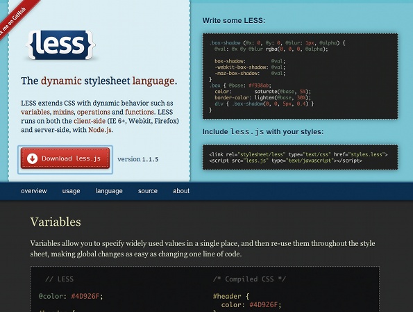
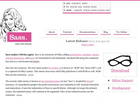
CSS preprocessors such as LESS and SASS are taking a front seat and showing that there is room for a more dynamic stylesheet language. Variables, mixins and functions are now available to us and, as the web becomes a more fluid and device-agnostic place, we couldn’t be in better company.

In this tutorial I’m going to show you some of the basics of the LESS dynamic stylesheet language and finally, how we can harness some of its greater potential into speeding up the creation of fluid layouts. We’ll do this by using some standard mathematical operators within our stylesheets and letting LESS do the hard work of giving us the solutions. After all, nobody wants to compromise their coffee hand with a calculator, right?
Setting up
We’re going to skip breakfast and go straight to dessert with this tutorial – after all, we’re here for the LESS. To get us ready, I’ve made up a nice simple HTML page with a standard CSS stylesheet to accompany it. In the files you’ll also find associated images and fonts.
First we need to include the LESS JavaScript file in our HTML page. The latest version (at time of writing) is contained in the tutorial files, but be sure to check lesscss.org for updates. We’ve chosen this method since it’s the most simple, but there are some other, more robust options worth considering too.
To include the file add the following line of code to the HTML inside the <head> tags:
<script src="js/less-1.1.5.min.js" type="text/javascript"></script>We’ll also need to update the link to our stylesheet to show that we’ll now be using a .less file. So, being sure to reflect your file structure, go ahead and edit the stylesheet link with something like this:
<link rel="stylesheet/less" href="less/styles.less" />Now, clearly that’s a dead link. We need to create our styles.less file. To do this simply duplicate and rename our styles.css file accordingly. Hey presto, our page should open and render exactly the same as it did before.
Mixins
Let’s get stuck into making our code a little more interesting with some LESS additions. First up, and possibly the most important of LESS’s assets, are mixins. To explain, let’s look at the following two CSS declarations.
Get the Creative Bloq Newsletter
Daily design news, reviews, how-tos and more, as picked by the editors.
.meta{ width: 130px; padding: 10px 10px 15px 10px; margin: 0 20px 10px 0; clear: left; float: left;}.profile{ width: 150px; margin: 0 20px 10px 0; clear: left; float: left;}It’s apparent these elements share some of the same properties, and who’s to say we won’t be creating more of these elements in our layout? I don’t know about you, but I’d like to make myself a nice mixin to package these up. Let’s give it a semantically obvious name too.
.float-box{ margin: 0 20px 10px 0px; clear: left; float: left;}Ta-da! So how do we use this fancy new mixin? Let’s revisit our previous two styles and I’ll show you.
.meta{ ... .float-box;}.profile{ ... .float-box}All we had to do was remove those properties now contained in our mixin and add the selector, namely .float-box, in their place. Easy.

Variables
This is getting good, but you need more power, right? Here’s the great stuff: LESS enables us to use variables in our stylesheets. They’re a piece of cake to set up, so let’s make one or two. Actually I’m feeling saucy. Let’s go for three.
@fonts-serif: 'Times New Roman', Georgia, serif;@fonts-sans: 'BebasNeueRegular', Helvetica, Arial, sans-serif;@thick-black: 3px solid #000;In order, I’ve defined: one variable for my serif font stack, one for my sansserif fonts and, finally, one for a style of border used throughout the layout. As you can see, all we’ve had to do to define a variable is name it with a preceding @ symbol and follow it with a colon and the value we want to assign it. We can now replace any of the matching long form declarations with our variables like so.
.story h1{ ... font-family: @fonts-serif; border-bottom: @thick-black;}Parametric Mixins
Hold on to your hats, it’s finally time to combine everything we’ve learned into something called ‘parametric mixins’. If you’ve created functions in JavaScript, ActionScript or PHP before then the premise here won’t be foreign. What’s unusual is being able to create these reusable, dynamic pieces of magic in CSS. LESS, you are truly great!
We started this tutorial by briefly mentioning that LESS can aid in the maths of creating a fluid layout. Readers of Ethan Marcotte’s work will recognise the equation width ÷ context = result. This small chunk of maths enables us to turn pixel-based widths into the percentage-based measurements we need for a fluid web page. Here’s a brief example of some HTML and its CSS, to which we’ll apply the maths to make it fluid:
<section class="parent"> <article class="child"> </article></section>.parent{width: 200px;}.child{width: 110px;}For the sake of simplicity we’ll tell our parent section to fill whatever it’s contained in like so:
.parent{width: 100%;}So how about our child article? For this we need to bring in our fancy equation, and the first value we need to establish is our child element’s context. We’re after the width of the element our child article sits inside – or, indeed, its parent. Here it’s the section .parent and the value (before we changed it to a percentage) is 200px. Next we need the pixel value that our child article would have if it were to be a fixed layout – 110px according to our CSS. Here’s the maths:
110px ÷ 200px = 0.55Very nice, but we need to take one last step to use it as a percentage in our CSS, and that’s to multiply it by 100:
0.55 x 100 = 55Let’s plug it into our stylesheet and see what we get:
.parent{width: 100%;}.child{width: 55%;}Great, this will work a treat. However, we’re using LESS and calculators are for geeks, right? So, let’s have a look at making a nice parametric mixin to sort it all out for us. I’m just going to throw it out there first, and then we’ll step through it for an explanation.
.width(@context, @target){ @percent: (@target/@context)*100; width: `@{percent} + "%"`;}Let’s start at the top. First we need to define our mixin name. We’ve chosen .width since it’s semantic, and extends the standard width property in CSS. Then, as arguments, we’ve declared two variables that are familiar based on our equation. Inside our mixin the first thing that we’ve done is to declare another variable – @percent – and then assign the full equation as its value. The equation will be solved whenever the LESS file is compiled – and this is accomplished using the variables we pass into the mixin. The @percent variable will then be replaced wherever it’s used in the following lines of the mixin by the answer to the maths, in this case the percentage calculated from our arguments.

The last thing we do is to declare the standard width CSS property followed by a short piece of code that will ‘print’ out our percentage value in its correct format with an appended ‘%’ sign. The syntax of this final line, namely preceding tilde, surrounding back ticks and curly braces around the variable name, are important since they allow the variable to be parsed correctly as a string of text in our CSS.
Now, deep breath, all we need to do to use our fancy code is declare it inside another CSS class as we did with our mixins. We’ll do it with the width values of our previous example.
.parent{width: 100%;}.child{.width(200, 110);}Now, when we load our HTML and the page is compiled, the resulting CSS (which will be placed in the <head> of our document) would resemble this:
.parent{width: 100%;}.child{width: 55%;}Fantastic. To see this in action let’s apply it somewhere in our project. The first thing we need to do is take the .width mixin and put it somewhere safe. Since it’s a highly reusable piece of code, let’s make a new LESS file alongside our others and give it a name. I’m calling mine responsive_mixins.less. To use this inside my other LESS project stylesheets, all I have to do is use the following line of code:
@import "responsive_mixins.less";Stick it at the top of your LESS file for this project and you’ll be good to go. Let’s now put it to use on one of our elements. My vote is the profile image. All in favour? Good. Our pixel width for the image element is 150px, and its context is the page element, which has a width of 600px, so our code will look something like this:
.profile{ .width(600, 150); ...}That’s pretty simple, and we can roll it out on the other elements in our markup, but what about margins? I think we’d like them to flex with our layout too, so let’s make a mixin for that.
.margin(@context, @top, @right, @bottom, @left){ @top-percent: (@top/@context)*100; @right-percent: (@right/@context)*100; @bottom-percent: (@bottom/@context)*100; @left-percent: (@left/@context)*100; margin: `@{top-percent} + "% " + @{right-percent} + "% " + @{bottompercent}+ "% " + @{left-percent} + "%"`;}A bit more to look at here, but it should make sense given our previous mixin. This time we’re passing in the values for margins on each side of our element. We use the same equation to do the maths, and then spit out a standard CSS property with the results. Let’s try it by calculating the margins declared in our .float-box mixin. That’s right, a mixin in a mixin. Here goes:
.float-box{ .margin(600, 0, 20, 10, 0); ...}Good work! Now, last of all, padding. This is easy enough; we’ll just take our margins mixin, and substitute in the word padding. Job done! There’s more to be had here, since we know that standard vanilla CSS enables us to declare margins and paddings as separate properties for each side of an element. I’ll let you work this out though – or you can peek in the finished project files and find the solution there. Either way, you’re now well on the road to faster fluid layouts with LESS.

Thank you for reading 5 articles this month* Join now for unlimited access
Enjoy your first month for just £1 / $1 / €1
*Read 5 free articles per month without a subscription

Join now for unlimited access
Try first month for just £1 / $1 / €1

The Creative Bloq team is made up of a group of art and design enthusiasts, and has changed and evolved since Creative Bloq began back in 2012. The current website team consists of eight full-time members of staff: Editor Georgia Coggan, Deputy Editor Rosie Hilder, Ecommerce Editor Beren Neale, Senior News Editor Daniel Piper, Editor, Digital Art and 3D Ian Dean, Tech Reviews Editor Erlingur Einarsson, Ecommerce Writer Beth Nicholls and Staff Writer Natalie Fear, as well as a roster of freelancers from around the world. The ImagineFX magazine team also pitch in, ensuring that content from leading digital art publication ImagineFX is represented on Creative Bloq.
