The 7 secrets for creating balanced page layouts
Apply these essential tips whether you’re designing page layouts for print, web or app UIs.
A good page layout can have a massive impact on how any print or digital design is perceived. Whether you're creating a printed brochure or a web app, a balanced page layout can ensure you communicate clearly and effectively to the reader and get the key messages across. And while it might seem that page layout is just about aesthetics, it can also have big practical consequences for usability, bounce rates and conversions.
Page layout design involves the placement, arrangement and formatting of different elements, which may include text of different kinds, images and videos, buttons, widgets and more. Some designers approach the process of page layout organically, feeling their way towards a pleasing end result. This can sometimes lead to happy accidents, but such a freeform approach can result in a lack of visual balance on the page.
A good page composition should be pleasing to the eye, but it should also clearly communicate key messages to the intended audience in a way that can easily be interpreted and navigated. We've gathered some essential page layout tips from designers that can help ensure that regardless of the medium you're working with.
For web-specific advice, see our guide to creating perfect website layouts (you might also want a good website builder if you don't have web design experience). Meanwhile, if you want to learn about creating page layouts for UI, make sure you sign up for our online UX design course, UX Design Foundations. It's a convenient, flexible way to learn all of the fundamentals of UX design and UI, from UX flows to UI layouts. Complete our quick survey for a chance to win a place on the course.
How to create page layouts: 7 essential tips
01. Use a grid to create your page layout
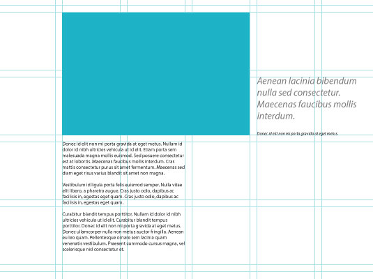
One of the easiest ways to make sure your page layout has a degree of balance is to use a grid system. Grids used to be the sole preserve of the printed page, but much work has been done online to help migrate the concept of the grid across to the digital medium.
By using a grid to guide the position of different elements, you'll create a connection between the different elements that make up your page. This can help lend a sense of order to your layout, giving the reader a clear structural reference to fall back on, and increasing the success of your page.
This is important because when all the elements on the page have a feeling of connectivity, the overall impact is more comfortable for the reader. This puts the reader at ease and facilitates their access to the important stuff: the content. For more details, see our designer's guide to grid theory.
Get the Creative Bloq Newsletter
Daily design news, reviews, how-tos and more, as picked by the editors.
02. Choose a single focal point for the page layout
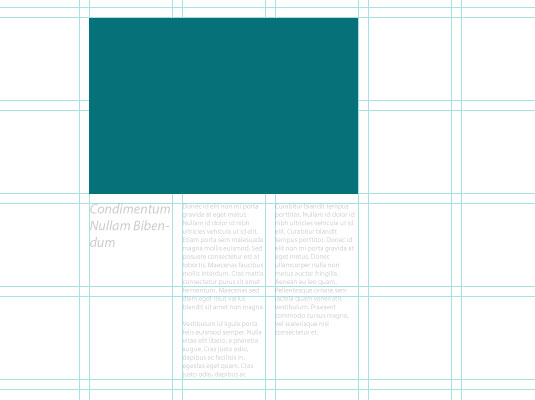
One of the most effective ways to create a balanced page layout is to choose a single focal point for your design. A good example of this in practice is the use of a large image as the main element on a page.
A strong visual as the main focus in the page layout can provide a powerful way to lead the reader into your page. It also supplies a useful structural element around which to arrange the rest of the content. If you have multiple visual elements, the proximity principle of Gestalt Theory can be used to group them together, aligning them in the same way.
It's worth bearing in mind that you can also use a headline or pull quote in the same way. A good display headline can offer just as much visual interest as an image while continuing to provide the structure that helps ensure a balanced layout (if you have lots of assets to store for your site, check out these cloud storage options).
03. Use the rule of thirds
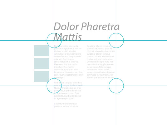
Another important way to provide a sense of balance in page layout design is by using the classic rule of thirds, also known as the golden ratio. Put very simply, the rule of thirds says that if you divide your page into thirds both vertically and horizontally, the points at which the grid lines intersect provide the natural focal points in a composition. By aligning key elements to these four points, you can achieve a much more pleasing composition than if you perfectly centre elements on your page, for example.
Of course, the rule of thirds alone won't magically provide your layout with balance, but by using the principle, it's easy to use this tendency towards a natural focal point to help guide the balance of your layout. A common approach is to place the most important elements of your page in the upper (or lower) third of the page, with the primary focal point aligned to match one of the intersections.
04. Use white space in your page design
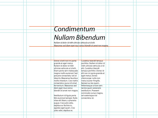
It's common for novice designers to want to use all the space available in a page design, piling in content until every gap has been filled. The more experienced designers know that sometimes it's better to leave some elements out, rather than shoehorning them in, which can cause a cluttered look.
In the printed medium, the most common way to make use of white space is by enlarging the page margins and gutters. On web pages, simply providing plenty of breathing room around elements can help make your layout design feel composed and balanced.
Using negative space works best when you have a clear structure that anchors content together (such as that provided by a grid) since white space also carries the risk of creating a sense of disconnect between page elements if it's introduced haphazardly.
05. Repeat page design elements
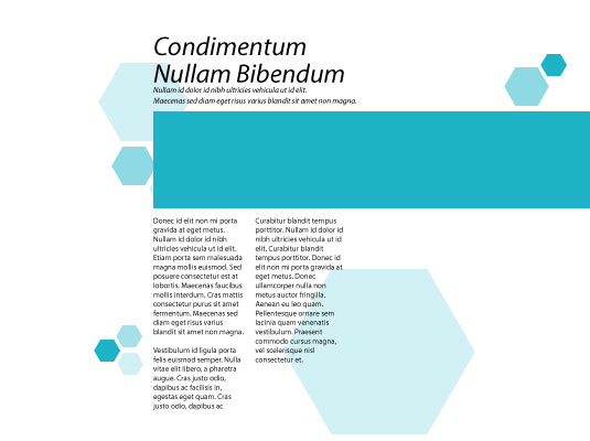
Repetition is another technique that can provide a strong sense of balance to a page layout, creating connection in a composition. By identifying and re-using a motif or design treatment throughout your page design, you can provide a reference for the reader so that disparate areas feel connected to each other and part of the same overall composition.
You can use this technique to provide a focal point in your design. This can be achieved by intentionally breaking the pattern of similarity introduced through repetition while retaining an overall balance.
06. Use hierarchy in your page design
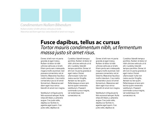
One of the key factors involved in achieving page layout nirvana is a clear sense of structure and hierarchy. We've already touched on structure, but it's important to also convey the relative importance of different elements of content on your page. A headline, for example, should almost always have more visual importance than body text.
Look at the different elements that make up your page layout and decide which element is the most important. Use this element to provide a structural hook for the remaining elements on the page while retaining it as the most important.
07. Use scale, contrast, and harmony in page layouts
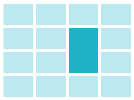
Finally, one other important aspect of page design is the use of scale. This can be a very effective method for achieving good visual balance. By making some elements larger than others, you can create a sense of order and hierarchy. This helps to create a comfortable page layout because the viewer will automatically look at the larger elements in the layout first before progressing to the smaller elements as they read.
The principle also applies to contrast. By increasing contrast, you can isolate an element on the page to make the eye focus on that point first. This presents a way in to the page and again provides a useful structural point from which to develop your layout.
Both scale and contrast work best when they apply to a single element, making it stand out from other parts of your layout. You can then use the principles of harmony to make the other elements feel connected while accentuating the focal point.
Related articles:
- The best graphic design software
- The best graphic design books
- 8 of the most controversial magazine covers of all time
Learn more about the future of UX and UI on our 100% online UX Design Foundations course.

Thank you for reading 5 articles this month* Join now for unlimited access
Enjoy your first month for just £1 / $1 / €1
*Read 5 free articles per month without a subscription

Join now for unlimited access
Try first month for just £1 / $1 / €1

Sam is a designer and illustrator based in Scotland, UK. He splits his time between art and design, motion and video and writing for various creative titles. He has written a book about web design, Pro CSS3 Layout Techniques and contributed to typography book, Fonts and Typefaces Made Easy.
