The complete web design toolkit, part 1
In the first of a two-part series, Adam Simpson and Neil Renicker explore curing frontend development pain and staying ahead of the curve.
It would be impossible to document every frontend tool and workflow in an article... and even if we did, it would be overwhelming and a bit discouraging. We decided to outline a comprehensive tool belt, kitted out with some of the best equipment, and share a workflow that gives the tools meaning and context. These are definitely not the only right answers, but we've found them invaluable.
As a frontend developer, a huge percentage of your time is spent in your editor. Since we take pride in the code we author, configuring a proper editor is the first step.
The big two
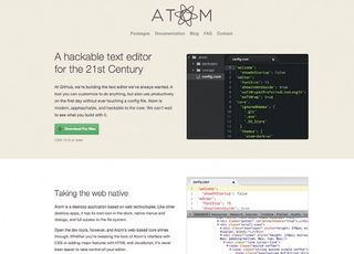
There are dozens of text editors to choose from, but we want to focus in on two: Sublime Text and Vim. Before you protest that we left off your favourite editor, hear us out. Our hope is that you take the time to learn the dark corners of your editor. Only then will you begin to alleviate pain points and become more productive.
Let's take a look at sublime
Sublime Text, our first recommendation, is available on all three major operating systems, and it's blazing fast. Better yet, it has a thriving plugin ecosystem, so it's infinitely customisable. Here are a few essential Sublime plug-ins:
Vim, Sublime's Ugly Cousin
Vim is our second choice because it has a much steeper learning curve than Sublime: you might think of it as being the next level up.
The power of Vim lies in its system of movements and macros. If you want to dive in and start understanding Vim's craziness, head over to your local command line and run vimtutor .
After you've progressed through vimtutor, you can start cultivating your own .vimrc file. The .vimrc is the configuration file for Vim, and is the place where you define all of your plug-ins and customisations. A couple well worth checking out are github.com/amix/vimrc and github.com/mutewinter/dot_vim, which just so happens to be from our co-worker, Jeremy Mack.
Get the Creative Bloq Newsletter
Daily design news, reviews, how-tos and more, as picked by the editors.
Pick the right tool
If neither Sublime nor Vim makes sense for you, here's a list of perfectly acceptable alternatives:
As always, be ready to defend your decision, but be willing to admit it if you run into a superior tool. Find more great text editors for web designers here.
Protect your code with version control
Writing code is hard enough. Collaboration with other developers is harder yet. Typical collaboration tools fail when applied to code: email, USB drives, mounted network drives, and Dropbox shares are all great for sharing pictures, movies, or presentations. However, these tools offer no solution to the problem of multiple developers modifying the same codebase at the same time. There has to be a better way!
Version control to the rescue
Version control is "a system that records changes to a file or set of files over time so that you can recall specific versions later".
Git, Mercurial and Subversion are all version control systems (VCS). They enable a group of devs to seamlessly contribute to the same codebase.
Let's learn some terminology
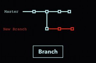
'Pull' is a download from a remote version control server. 'Push' is an upload to a remote server. 'Branch' is a complete duplicate of the main code line. 'Merge' is taking a branch and merging its changes into another branch. A 'conflict' is when the software cannot automatically merge two changesets together and you have to manually complete the merge. Now that we're all speaking the same language, let's dive in!
The perfect source control workflow
We use Git and a remote Git server such as GitHub or Bitbucket. We love Git's effortless branching, blazing speed and superb reliability. We use GitHub or Bitbucket because they offer incredible features such as issue tracking, a place for discussions about the code, wiki hosting, and a Git remote server.
Our workflow involves creating a branch for every change to the codebase. These are commonly called 'feature branches'. If you want to contribute code to a project, clone the Git repository and create a new branch off the master branch. This new branch is your sandbox: your changes do not have any effect on the master branch. This enables you to experiment with the code – you can break things as much as you like. This feature branch is your own little version of the project!
Once you are ready to share your hard work with the rest of your team, create a 'pull request' on GitHub. A pull request is a GitHub feature for merging code into master. We typically take this moment as an opportunity to peer review the work before merging in the new code. To recap, our workflow boils down to these steps:
- Create a new branch from master
- Make changes to that branch
- Push to GitHub/Bitbucket and create a pull request
- Review the pull request with a co-worker
- Merge the branch into master
This workflow will make you more productive and safeguard your code. Go branch crazy; enjoy the flow!

Static design tools
As frontend devs, we're often involved in the design of the projects we build. Let's look at the design tool landscape! We can't write about design tools without talking about Adobe. Many designers still love the feel of Photoshop and Illustrator for their design work – and that's perfectly fine!
There are some great newcomers worthy of your consideration (see here for more on new tools for your workflow). Our favourite new tool for web and UI design is Sketch. It's a vector-based design tool akin to Illustrator, but lighter, and intended for the web. Common UI design tasks such as rounding corners or adding drop shadows are instantly accessible, and exporting your work is effortless.

Keep your eye on these too: Froont, Macaw and Adobe Edge Reflow. These apps all let designers work in an environment closer to the code. A tool that generates code is a great place to start for creating design mockups, and might give you a head start on projects. But be careful: don't let your tools generate all your code under the covers. You're responsible for what you create, so you'll feel better if you know what it's doing!
Preprocessing: end manual labour!
Computer languages have always evolved. This constant evolution is why we love our industry. Change is exciting, but HTML, CSS and JavaScript have remained static for years. Consider this:
- HTML is an often redundant markup language
- CSS has a 'flat' styling syntax
- JavaScript is weird
That's where preprocessing comes in – if you've been holding off, there's never been a better time to jump in. Preprocessors are high-level languages that improve upon those we already have, adding better syntax and missing features. The code then gets compiled into its native language. Preprocessors let us live in a fantasy world where we can augment these native languages as we see fit.
The important ones to focus on as a frontend developer are CSS and JavaScript preprocessors. Here's what's available to you:
CSS Preprocessors
The choice of which CSS preprocessor you use is entirely up to you. It's worth spending some time in the documentation of each of the projects and determining which one fits your requirements. You can also try all these flavours through such services as CodePen or jsBin.
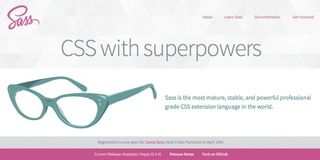
We prefer Sass (the .scss variant), mostly because it has gained broad appeal, and it still feels a lot like CSS! Sass has always felt like CSS 2.0 to us: it's comfortable and familiar, but it has superpowers that CSS can't even fathom.
JavaScript preprocessors
In the realm of JavaScript preprocessors, CoffeeScript is the most popular. In CoffeeScript, functions are clean and beautiful, most punctuation is optional, and conditional statements can be written in plain English.
How do I get started with preprocessing?
You may want to consider applications such as CodeKit for Mac or Prepros for Windows and Mac. These are third party applications aimed at making preprocessing dead simple. If you're working on your own, or on a really small team, they might be all you need.
It's challenging, however, to work on a distributed team using a third party application. Dealing with versioning and environments becomes a real pain point. That's where open source software comes in.
Open source task runners
Open source task runners can run local servers, minify/concat/lint our code, condense images, and even refresh our browser when we save new code! Here's the best part about open source task runners: they include text-based configuration files that can be checked into source control. This ensures that every developer working on the code has the same environment and third party libraries.
Getting started with task runners
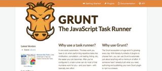
There are several open source task runners that could do the job. Grunt is the most popular. Gulp is a promising newbie, and some folks (gist.github.com/toolmantim/6200029 and algorithms.rdio.com/post/make) are using established software such as Make for asset compilation and task running.
We recommend starting with Grunt: the getting started guide should have you up and running. For a thorough, beginner-friendly approach, try Chris Coyier's piece 'Grunt for People Who Think Things Like Grunt are Weird and Hard'.
Using a tool such as Grunt will be a big boost to your workflow. There's a lot of power in it, and once you have mastered the basics, you'll find you never want to go back!
Modular markup and styles
What's wrong with HTML?
Learning to write HTML isn't a daunting task: you only need to know a few HTML tags to get started. But as time goes on, your once-simple markup can become difficult to manage. Approaching markup from a modular perspective is a huge step forward. Fortunately, we have tooling to make this possible!
Get modular with static site generator
Writing modular markup isn't a new concept. Content management systems such as WordPress, Drupal and ExpressionEngine have this idea built in: write boilerplate code once, and then repeat it in the future as often as you need.
Static site generators are intended to help developers automate the management of sites without the overhead of a database. The frontend development community has co-opted them as a tool for creating static templates (HTML, CSS, and JavaScript) even if the final destination is a web app or complex CMS.
How do you choose your static site generator?
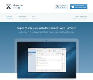
If you want minimal set-up time, and you work solo or on a small team, you might be interested in a proprietary static site generator. Hammer is a Mac application that will enable you to get started quickly in a friendly native environment. Cactus (cactusformac.com) is a brand new Mac app promising similar benefits. These applications are essentially good-looking wrappers around a templating language.
A few open source projects worth consideration are Jekyll and Middleman. We're smitten with a newcomer to the party, Assemble, which is flexible enough to facilitate making decisions about the way we want to structure our project, but opinionated enough to keep us from spinning our wheels.
Getting started with Assemble
We've created a demo project exploring how Assemble works.
Assemble enables you to separate your site into three major components: layouts, data, and partials. Layouts are like themes, or page types. Data is your content: stuff that can change regularly. Partials are markup snippets, reused across your pages
Most static site generators have these notions, with different ways of handling and naming them. In the above demo, you can see this separation. We consign layouts, partials and data to their own special homes.

Living the dream: modularise all the things
This finely tuned structure facilitates working efficiently. Instead of repeating the same code, we can iterate over each piece of data in our data file:
{{#each data-item }}
  {{> _partial }}
{{/each}}
There! We have programming power with our markup! Better yet, no content is written in the markup. It's all generated from a separate data file.
Let's make our CSS modular too! We can now give our CSS files the same name as our HTML module names. Take a look at the the /scss directory in the demo project, and compare it with the markup files in templates/partials. We've modularised our markup into bite-sized chunks, and our styles match them. You can imagine the long-term organisation and maintainability benefits this structure gives you.
What now?
Using Assemble isn't the Holy Grail. We've found it useful, but these same principles also apply to your preferred static site generator. Remember, we're looking for these three elements of separation:
- Layouts
- Partials
- Data
If you adopt this modular mindset, your projects will become more organised and scalable.
Let's wrap this up
That's a lot to digest: once you get serious about tooling, it can seem you've taken a step towards complexity. There's no need to bite all of this off at once. Next time we'll explore local servers, productivity, device testing, browser testing, and automated deployment. Stay tuned!
These tools aren't magical; exploring them is crucial. If one doesn't fit your team, discard it and keep looking. If you see room for a tool that doesn't exist, stand on the shoulders of the open source giants and make one to share with the community!
Words: Adam Simpson and Neil Renicker Illustration: Tobias Hall
Thanks to Jody Thornburg for her advice and assistance. This article originally appeared in net magazine issue 255.

Thank you for reading 5 articles this month* Join now for unlimited access
Enjoy your first month for just £1 / $1 / €1
*Read 5 free articles per month without a subscription

Join now for unlimited access
Try first month for just £1 / $1 / €1
The Creative Bloq team is made up of a group of design fans, and has changed and evolved since Creative Bloq began back in 2012. The current website team consists of eight full-time members of staff: Editor Georgia Coggan, Deputy Editor Rosie Hilder, Ecommerce Editor Beren Neale, Senior News Editor Daniel Piper, Editor, Digital Art and 3D Ian Dean, Tech Reviews Editor Erlingur Einarsson and Ecommerce Writer Beth Nicholls and Staff Writer Natalie Fear, as well as a roster of freelancers from around the world. The 3D World and ImagineFX magazine teams also pitch in, ensuring that content from 3D World and ImagineFX is represented on Creative Bloq.


