Cody Small on making animation feel natural
Cody Small on incorporating parallax functions and scrolling animation in a way that feels natural and supports the design.
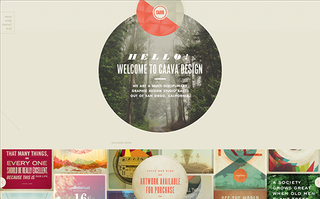
Cody Small is one of 10 nominees for Best Online Portfolio in the 2014 net Awards for the portfolio site of his design studio, Caava. We spoke to him about how he put the site together, what he's been working on recently and finding success through hard work and a commitment to mastering the craft.
Give us a summary of your career so far.
I started as a production designer at Bulldog Drummond and my passion for design eventually earned me a spot in the creative department within the company. There, I gained branding experience working for clients such as World Vision, Starbucks, Diageo, Easton, WD-40 and Westfield.
Caava began as an umbrella for my freelance work. While I worked with large, multinational corporations during the day, I discovered the best part of my Caava work was the intimacy of working with passionate small businesses and individuals.
When things picked up for Caava, I left my full time job to pursue the ideal of working with smaller, more nimble groups. My career has been an incredible learning and growth experience. I've found that the majority of success is achieved through hard work, trusting your instincts, and a commitment to mastering the craft. I wouldn't say I'm naturally talented or gifted. Everything I know is from trying things, being persistent, and learning from my mistakes.

What have you been working on over the last year?
One of my favorite projects of 2013 was creating the visual identity for San Diego based Old Harbor Distilling Company. They are one of the only distilleries in San Diego, at present, and are smartly establishing themselves before a huge distilling boom hits southern California. Still an active client, we've already completed their branding, bottle design, and holding page. Their website and various other collateral pieces are still to come. We've really had the opportunity to just go crazy on this project and the result has been awesome.
For the business, we’ve been pushing ourselves to become be the solid, creative, problem-solving branding studio we know we’re capable of being. We spent the last year directing our energy towards web interactivity. Giving our clientele relevant and cutting-edge websites is our top priority.
Tell us about the process of designing your portfolio site.
We tried to provide a fresh and unique linear experience without taking away from the main point of the site: to show our best client work. This was achieved by using hints of scrolling animation and parallax functions, which draw the user into the main focus of portfolio work. Scrolling through the site, arrows that tie the different sections together animate top and left positions, keeping the experience cohesive. Since we have a lot of animated flare going on, it took some time to make it feel natural and supportive to the design.
We also wanted to have each project case study subtly reflect the flavor of work we did for each client. This was achieved by having unique colour schemes with CSS properties to match for each case study. So when the user clicks on a prospective project, they are immersed in that experience without there being a huge disconnect from the main Caava website.

Who and what influences and inspires your work?
Early in my career, I was heavily influenced by the Bauhaus movement, El Lissitzky, and Fred Woodward. Now, what inspires me is more general rather than particular individuals. I'm very active on Behance Network. It provides an incredible platform to view where design is going, new trends, as well as what's becoming exhausted. Watching the design feed on Behance is like watching a living, breathing evolution of communication through design. The assortment of styles and different approaches to solving problems inspire me continually. In a small way, I strive to contribute to that evolution.
Outside of being inspired by actual design(ers), travel, architecture, and photography play inadvertent roles in the aesthetic world in my head. This is something beyond words for me to describe, but nonetheless, I know my work would be a lesser thing without them. Perhaps it's because deep down, every human has a desire for a good story and the imagination and adventure that couples with that. Those influences are all rooted in telling stories. Design is just storytelling, so perhaps that's the connection.
Name an 'unsung hero', someone you admire who deserves more recognition for their work.
Kristian Hay (@kristianhay), graphic designer from Vancouver. I'm continually impressed with what he creates and think he has a very well-curated sense of style. I'm excited to see where he goes!
Vote in the net Awards!

Celebrating the best in web design and development, the 15th net Awards is open for public voting until 24 March. With a record breaking number of nominations this year, it's set to be the biggest and best yet. Have your say by casting your votes here.

Thank you for reading 5 articles this month* Join now for unlimited access
Enjoy your first month for just £1 / $1 / €1
*Read 5 free articles per month without a subscription

Join now for unlimited access
Try first month for just £1 / $1 / €1
Get the Creative Bloq Newsletter
Daily design news, reviews, how-tos and more, as picked by the editors.

Tanya is a writer covering art, design, and visual effects. She has 16 years of experience as a magazine journalist and has written for numerous publications including ImagineFX, 3D World, 3D Artist, Computer Arts, net magazine, and Creative Bloq. For Creative Bloq, she mostly writes about digital art and VFX.