Carole Guevin on archiving the web
Carole Guevin explains why we should be inspired by the early web
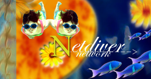
Carole Guevin is a Canadian-born designer and web pioneer who's been involved with AIGA, the Adobe Design Achievement Awards, the Art Directors Club, SXSW, and London's Royal College of Arts. But she's best known for the design inspiration portal Netdiver Magazine, which she founded together with Jean-Francois Simard in 1995.
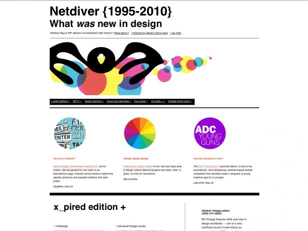
Netdiver was one of the top go-to sites for inspiration alongside K10k, Surfstation and Design Is Kinky. But recently she announced that Netdiver would cease to exist in its original form and be replaced by the Netdiver Vintage edition, an archive of what the most inspirational websites used to look like from 1998 onwards.
ALP: 'Vintage' and 'retro' have become quite fashionable concepts over the last couple of years. Was that the reason behind your idea to transform Netdiver into an archive?
CG: The original Netdiver was becoming impossible to administer. It was quite frustrating to maintain and weed out 'live' links from the 'dead' ones and I personally hate landing on a parked domain, I can only imagine what the audience was experiencing. In the end there were close to 12,000 links.
Projects go live and projects go off-line in a blink. I often fantasise that the world wide web is a cosmic-proportioned canvas with little LED lights flickering constantly. No one can keep track, no one is capable of really grasping what is still relevant, or not. Sometimes, within a matter of months it can all be engulfed in a virtual black hole, with hundreds and thousands of man hours lost. To this day, I don't know of any other media that is so short-lived, leaving no remnant of what was once. As if, in fact, it never happened.
Netdiver is now a sub-atomic, non-official museum of what was new in design on the web. So far there are over 2,000 ex-projects showing in the x_pired directory. A number to increase as I revisit the news archive.

The name, Netdiver, was really cool in '95. We came up with it in opposition to 'net surfer': you know, 'net diver', going deep to find the pearls. But in 2011, the name is no longer relevant as a current 'in the know' design mag for the new-new kids on the block to run to. The coolness factor has evaporated. But, as for what was new in design, it still has some bangs to a byte.
In other words, the brand did not have the value required to build my next-next new project.
So instead of fully disappearing it's been reinvented with exciting content, (re)published.
ALP: What are your thoughts about how sites were back then and are now? Are you pleased with the evolution and how things have developed from HTML to Flash, JavaScript, CSS and now HTML5? Do you think websites today are as original and as inspirational as they were 10 or 15 years ago considering the technology available?
CG: That's one of my pet peeves. One that is constantly fuelled by what I see. My gosh, the state of the web and all the fuss about how today it is supposedly infinitely better and more evolved is, in my opinion, another variation on the new-newness syndrome. In the field of technology and its derivatives, today is always better than yesterday and not even close to tomorrow. I don't believe this for a minute.
I started publishing on a 386 with 2MB of RAM and on a 7,2kbs connection. Even with current mobile devices, which are probably equivalent in crunching power, everyone I know working the field is still scrambling to keep up daily. We're not talking about semi-annual revisions or updates, we're talking about daily changes that will affect how you design and program.
That's pretty insane. As I've said time and time again: "technology ain't my God". Don't worship it. It's only a tool that is increasingly more costly and sluggish.
I could very well tell ugly stories. Oh yes, CSS separation of presentation from content. Today there are email newsletters that have up to a hundred nested tables or use a full-size plain image because Outlook and other mail clients don't support CSS well enough. So there are very able and knowledgeable programmers out there that need to pull out what is left of their hair to make these circa 1995-98 sites all over again for the sake of clients and therefore proving our lack of influence over the makers of technology.
Another one? The hype around JavaScript and HTML5, which now leads to having up to 90 nested DIVs so that a website delivers all the 'new-new' bells and whistles that clients now want and are sold. On so many levels, it's very much about appearance and being better than the next-door Joneses and not actually about the 'content' delivery.
I never was a fan of Jakob Nielsen. But i respect that although he doesn't really know about design, he does know about usability and has a point in reference to building nimble websites. If you keep in mind all the 'SEO offer' spam received and the overshadowing threat of being cut off by the behemoth internet-ruling Google, this prevents a good portion of what the www can afford as content distribution. We still have a long way to go before we come close to being what it could be.
While I was revisiting the archives and integrating the expired content I was increasingly upset, sometimes even angry. Because a lot of these ageing interface designs are really no different from what is today - and some were even better. But because there are no comparisons left to go to, to validate the concepts, everyone is reinventing the same old wheel - or should I say the same rectangular grid.
It's been a number of years since I've lost interest in web design but I've not lost interest in the world wide web as a medium. The only thing I am really interested in is finding talent and supporting it any way I can. That's my passion! Embarking on new ventures, my goal is to fill a void that I've identified. Maybe the proposition is ambitious. Perhaps my detractors will rejoice in having ample time to prepare their hate-mail attacks if I don't deliver upon my words. Time will tell. But I'm betting my bank on it.

ALP: Netdiver was known for bringing together inspirational websites that were truly original. How did you find them?
CG: Curation is a very demanding activity. It requires discipline and deep-rooted values that you are willing to defend and fight for any given day. If content published is submissions-based only then one can quickly fall prey to whatever your perceived value is as an editor.
There's always been a submit form on Netdiver, with strict guidelines; no nudity, no violence, no sexploitation and no foul language. In later years, we made a form that limited characters in the content field to block press releases of non-related projects or boring ones with the budget to hire a PR firm. It has always surprised me how these guidelines were mostly ignored or not even read, because the volume was there but the quality was not.
On a hundred websites visited, no more than two or three would be featured. So yes, most of there was a lot of effort put into finding the pearls. It was intensive, time wise, but I have no regrets. I love to do research and who can boast having visited over 150,000 websites from top to bottom? That affords me a unique point of view, a vast library of visual references that will directly affect my performance in the upcoming projects I'm pursuing.
ALP: Is the new look Netdiver and Caroleguevin.com based around a theme?
CG: Netdiver and now Featured by Carole Guevin are based on an original interface design we did back in 2000, before blogs and themes and templates existed... Because so many others use similar grids now, we're perceived as template users. Honey, we're the originals, they are the copy.
I am an ardent defender of 'if it ain't broke - don't fix it'. Since I have always been on the Content is King side, it matters immensely that if I am to show a myriad of different colour palette projects, resized in thumbnails, then using a lot of negative space and loads of white with black accents is the only route to go. This follows after the models of what I call awesome magazines, which use loads and loads of negative white space. It leaves breathing space instead of cluttering things in big pile of perceived value. The key is not to be in competition with the content. The interface serves as a nice presenting space, whereas your eyes focus on what matters most; the projects presented - the content.
ALP: What do you think of all the CSS showcasing websites that have sprung up like wild mushrooms all over the web during the last couple of years?
CG: Are you actually visiting these? I gave up a long time ago. I'm always left perplexed, frustrated and questioning: is this really getting traffic from a trusting and interested audience? To me it's like a huge virtual shopping mall. Got a client, with the usual limited budget, because they have no clue as of yet on how to really use the web? Of course he wants it yesterday, so best find some already existing 'designs' that you can mark up quickly and clear just enough leftover money to pay your next rent.
However, it's not surprising considering that when we started there were something like 35,000 websites, and now there are something like 2.5billion. I like the mushroom analogy because it is a fungus, a kind of parasite and parasites usually feed on their host. I won't go any further with the analogy.
I'm not saying CSS can't bring good design: maybe the problem is that few real designers are reluctant to learn it and use it, as well as there are programmers who proclaim themselves designers.
I think that with the disenfranchisement of publishing and content circulation what we see today was bound to happen for the better and the worse. Everyone knows that if you want serious news you go to the New York Times, which also coexists with The (infamous) Inquirer. You get the idea: spanning in-between those two extremes is a full spectrum of the good, bad and ugly. Now multiply that by countries the world over. There have always been mediocrity wildfires raging around oasis of intellectually sound havens. While the fire burns, hiding behind huge smoke screens lay the worthier but somewhat hidden content hubs.
ALP: How did you finance Netdiver?
CG: Through advertisers! We always favoured an advertorial approach, shunning the blink-blink, click-me, way-too-obvious ads. Our audience represents our quintessential asset and from the very beginning, our commitment was to only offer high quality, low noise content, something I'm proud to say we've never compromised on.
At one point, Google was writing sequentially to get us to use their ads. Ad networks contacted us to be part of theirs and we turned them down. Needless to say I have turned down more than I have accepted but to me it was a matter of 'better to eat peanut butter with jelly and make my audience happy rather than eat a months worth of champagne with caviar toasts and burn my audience away'.
In fact, in respect to delivering click-through, we have delivered one of the highest in the industry. How? Certainly not because we had Yahoo-like gazillion pageviews, nothing of the sort. We were always small: sizable, but small with a hardcore loyal audience, just that.
Remember when browsers started affording 'ad blocker' add-ons? Well I figured out a way to defeat the 'ad blockers', a secret recipe to this day, and eureka! We delivered one of the highest click-through coming from a quality, hypertargeted audience that was genuinely interested in their products.
My vision is about the long-term effect. It's about reputation being worth more than money.
ALP: How much time did you dedicate to it daily, weekly or monthly on average?
CG: You really want to know? How about 14-16 hours a day, seven days a week for 12 years. Now I have one day off and limit working days to only 12 hours. In the early years, we did client work. But it always amounted to the same-old-same-old, and so we decided that was not the avenue to pursue. The most rewarding and craziest adventure ever was doing the Adobe Design Achievement Awards 2008 website and media outreach. But that's probably worthy of yet another never to be published book.
ALP: What advice would you give to web designers and artists who want to make an impression and get their work noticed?
CG: Be different - you are different but it needs to show instantly. You've got five seconds and less to make that first impression to information-overloaded visitors.
Capitalise on this. Only display very good projects and visuals. As Josh Davis once said: "Show only what you want to redo". Good work is hard work.
Talent, real talent is your uber asset and secret weapon. Average talent doesn't get noticed: look at the kind of quality that makes it into museums. As I said before, curation is a very demanding task. Ask others to edit your portfolio and that's neither your mom, girlfriend/boyfriend or best friend. Ask someone you admire who owes you nothing but perhaps the best advice will be a good kick in your ego. Overall, forget about being extreme, if not extremely good at what you do.
For the record, I don't really care what a creative person uses as a tool on the web as long as they make it a top priority to have an online portfolio. How else can I find you?

ALP: What is next for Carole Guevin?
CG: The first step was to reclaim my own voice under the guise of Featured by Carole Guevin. No longer under the gun of producing and finding web wonders, I am free to distantiate myself from web design content, embracing all design disciplines in my coverage which in fact, truly reflects my interests.
I can say that I've embarked on producing what I consider my long awaited life project, it has been over 10 years in preparation, years in research and now is in forward mode. Very exciting! There is no firm due date or deadline since after waiting so long, I'm not about to rush it because I would feel the pressure to deliver in order to prove something, or myself, to the ether. Anything worthwhile takes time and lots of time to grow.

Thank you for reading 5 articles this month* Join now for unlimited access
Enjoy your first month for just £1 / $1 / €1
*Read 5 free articles per month without a subscription

Join now for unlimited access
Try first month for just £1 / $1 / €1
Get the Creative Bloq Newsletter
Daily design news, reviews, how-tos and more, as picked by the editors.

The Creative Bloq team is made up of a group of art and design enthusiasts, and has changed and evolved since Creative Bloq began back in 2012. The current website team consists of eight full-time members of staff: Editor Georgia Coggan, Deputy Editor Rosie Hilder, Ecommerce Editor Beren Neale, Senior News Editor Daniel Piper, Editor, Digital Art and 3D Ian Dean, Tech Reviews Editor Erlingur Einarsson, Ecommerce Writer Beth Nicholls and Staff Writer Natalie Fear, as well as a roster of freelancers from around the world. The ImagineFX magazine team also pitch in, ensuring that content from leading digital art publication ImagineFX is represented on Creative Bloq.
