Better web typography in a few simple steps
The knowledge necessary to achieve refined typography on the web is not as daunting as you may think. One can go a long way with a few basic tips
Now that web fonts are natively supported in most browsers and more and more typographic features are implemented in the latest versions of HTML and CSS, a bright new era of increasingly sophisticated typography on the web is upon us. This means web designers need to get (re)acquainted with the rules of classic typesetting, but it doesn’t end there.
Whereas typography for print is static, web typography is a fluid and malleable medium. More than simply learning how to achieve a specific look, designers now have to be able to predict the end result across different browsers and end users. Instead of simply knowing the rules they also need to understand the reasoning behind them. Here are some of the basic dos and don’ts of typography, specifically applied to the web.

Find out what your fonts can do
The very first thing you must do is check the capabilities of the fonts you are going to use. All fonts are created equal, but some fonts are more equal than the others. Unicode encoding offers the possibility for fonts to hold literally tens of thousands of glyphs, and the OpenType font format supports numerous features like small caps, oldstyle numerals, discretionary ligatures and contextual alternates.
Yet any font is only as good as the type designer built it. What use are all those typographic niceties if the type designer neglected to draw the necessary characters or failed to code the relevant features? Creating professional fonts takes an enormous amount of time and effort, and some designers are not prepared to go all the way. This is why it is very important to check the character set and the features of a font before incorporating it in your web design. A font is like a toolbox. Sometimes the toolbox is almost empty and of little use, just like when fonts only have capitals, lowercase, numerals and some basic punctuation. Sometimes a crucial tool can be missing – if there is a screwdriver, a saw and pliers but no hammer not a lot of hammering will get done.
Subset cleverly
Font fallbacks happen on a character basis. As soon as character is missing in the specified font the fallback system will use the corresponding character from the next font in the list, then switch back to the original font. This technique can be used in an unconventional way with surprising results. If for example the character set of a font has no oldstyle figures, find a corresponding font that has them. Subset it, leaving only the desired numerals and put it first in the fallback list. All numerals in the text will then be set in that oldstyle figure subset, and the rest of the text in the regular font. This prevents you from having to format numerals separately and keeps your text file clear of unnecessary HTML tags.

Figuring out numerals
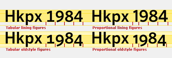
With regards to figures, most professional quality fonts have several sets of numerals. Each set has its specific use. Tabular figures all occupy the same amount of space, which makes them line up in vertical columns, while the widths of proportional figures correspond with their design – the figure four is wider than the figure one. On the one hand the design of oldstyle figures mimics the lowercase characters with an x-height, ascenders and descenders, making them blend perfectly with mixed-case text. Lining figures on the other hand are meant to be used in numerical matter or in combination with all caps text.
More about figure styles in Figuring Out Numerals and its sequel.
Get the Creative Bloq Newsletter
Daily design news, reviews, how-tos and more, as picked by the editors.
Don’t fake styles …
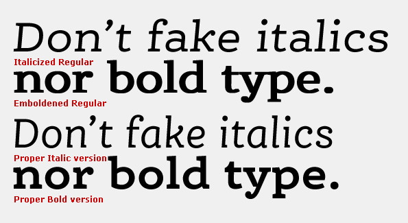
CSS enables you to fake a number of things. If there is no bold variant of your font the <b> tag will artificially embolden the text by rendering it double with a slight lateral translation. Applying the <i> tag to a font without an italic style will digitally slant the characters. The resulting distorted letters invariably look dismal.
More importantly avoid the <b> and <i> tags, and instead use <strong> and <em>. The former merely relate to the appearance of the text, namely 'bold' and 'italic'. But maybe you want to emphasise text by changing its colour or size. This is why it is much more worthwhile to define your intention – rendering the text strong or emphasising it. Using the latter leaves you the freedom to change the appearance at any moment simply by changing the CSS file. Generally speaking define all your text formatting in the CSS file, and avoid local character formatting as much as possible.

… but when you do, fake well
Faking small caps when they are missing in the character set always makes them look too thin by comparison with the surrounding text. When the type family has a semi-bold variant, or the difference between the regular and bold weight is moderate, use that bolder weight for the small caps to adjust the darkness of the text. Don’t forget to give the small caps a little extra character space.
Be careful with copy-pasting text
You can sometimes find words in web pages with illegible character strings where there should have been an accented or other special character. This occurs when text is copied from text editing software using a character encoding other than UTF-8. Character encoding systems map all glyphs in a given character set to facilitate the transmission of data (generally numbers or text) through telecommunication networks or for data storage.
As HTML works with UTF-8 it will misinterpret copy-pasted text from any other encoding system, turning specific characters into bizarre combinations of random letters and signs. Furthermore certain content management systems will not only copy the text but also the formatting, causing unpredictable results. The best way to avoid this is to convert the copied text to text-only format in a simple text editor, then copy it from there and paste it into the CMS.
Learn your HTML entities
Looking at your keyboard, you may not realise what a wealth of characters is available. Many of them are defined by HTML entities, so it is a good idea to memorise the most common ones and have an overview handy when typesetting for the web. You cannot use the lowercase x for a multiplication sign, the trademark sign is not simply a raised capital T and M, and a floating acute accent will not do for an apostrophe.

Quote correctly
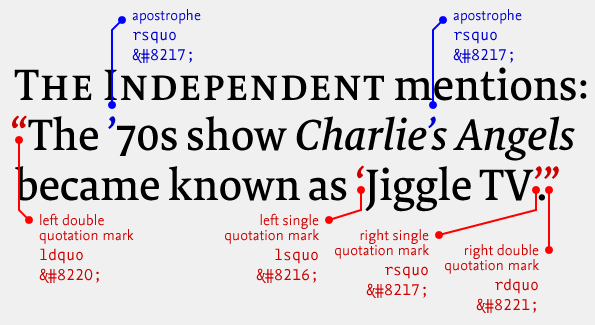
Talking about apostrophes, the correct sign for them is the right single quotation mark. A dead give-away for amateur typography is the presence of straight quotation marks, also called 'dumb quotes' by type-savvy designers. Yet using the proper curly single or double quotes isn’t enough. Quotation marks differ from one language to another. French for example uses guillemets – outward pointing triangular marks – and the quotation marks point outwards in German.
Know your dashes
The hyphen is meant to connect adjacent words or to hyphenate longer words over line breaks, among other uses. There are two other types of horizontal dashes. The en dash is traditionally half the width of an em dash. It is commonly used to indicate a closed range of value, to contrast values, or illustrate a relationship between two things. The em dash is as wide as the type size, and often demarcates a break of thought, a separate entity integrated within a sentence. However their specific usage is often cause for debate. Some substitute en dashes for em dashes, and although both are supposed to be used without surrounding spaces, many typographers prefer to add hair spaces or thin spaces to avoid them touching the adjacent characters.
More about punctuation in The Sweet Sound of Punctuation.
Define relationships, not absolute dimensions
A big advantage of text on the web is that it can be resized by the user. If text is defined in pixels, resizing a web page may cause discrepancies in the relative sizes of the different text styles and, for example, body text may end up bigger than the headlines. It is crucial for all text sizes to be defined in ems in relation to the standard body text size. This ensures that all text in a web page is resized accordingly, respecting the relationships between the different text sizes.
Take control over line breaks
Resizing the browser window makes text columns go narrower or wider, and end-users can also alter text sizes. This could make you believe that you have no control over line breaks. Yet when you look beyond the desired end result and understand what exactly you want to achieve there are certain aspects that can be steered.
Line breaks occur at the end of paragraphs that are wrapped with a p or div tag. In all other cases, line breaks are very seldom inserted solely for the purpose of having the next word start at the beginning of the next line, so use the br tag sparingly. The most common reason is to keep two or more words together. A non-breaking space will ensure that adjacent words will always be on the same line. Unfortunately the non-breaking hyphen hasn’t been defined yet as an HTML character entity. The soft hyphen or discretionary hyphen on the other hand will only appear when necessary, and can come in handy if you want extra long words need to be hyphenated when the text column becomes too narrow.

Space with care
The non-breaking space is not the only special space character available in HTML. An em space is as wide as the type size, creating a perfectly square separator. The en space is half its width. Very useful in tabular material is the figure space, which takes up as much room as the numerals in the font, while the punctuation space is as wide as the dot or comma. Thin spaces can be used between the dot and the next letter in abbreviated names, and hair spaces to detach em dashes from the neighboring characters. And then there’s the three-per-em space, the four-per-em space, the six-per-em space …
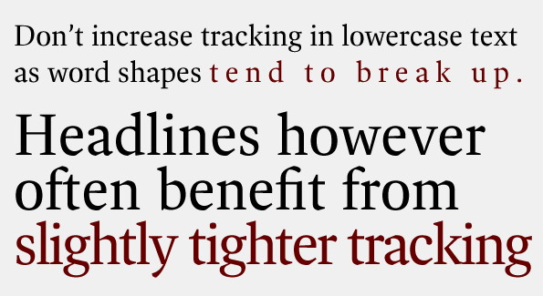
Reading is as much about the space within and between letters as it is about the black of the letters themselves. The correct hierarchy is that the space between letters is smaller than the space between words is smaller than the space between lines of text. Avoid adding space between letters as this causes words to break up and hinders legibility. Judiciously increasing letter spacing is only warranted for text in very small sizes. On the contrary text in display sizes often benefits from tighter tracking, but here as well don’t overdo it.
Full justification has an adverse effect on the appearance of text. The process of justifying the words to fit the line length increases the spacing between words, making those word spaces vary wildly between subsequent text lines. This gives the text an uneven appearance and creates unsightly gaps between words in some lines. Justified left/ragged right is the preferred alignment for ease of reading.
Besides character spacing and word spacing, line spacing also influences legibility. Lines of text that are too close to each other create a dense text image that is hard to decipher. If on the contrary the line spacing is too generous the reader has difficulties finding the correct next line after a line break.
These few tips will already enable you to achieve a more refined typography on the web, but there is so much more to learn. As you get to know the rules of typography better and become more confident applying them to the web, you will learn how to experiment and push your own boundaries. An excellent primer is the recently released Inside Paragraphs: Typographic Fundamentals by Cyrus Highsmith. This little gem is the perfect companion to Robert Bringhurst’s essential The Elements of Typographic Style or Erik Spiekermann and E.M. Ginger’s entertaining and educational Stop Stealing Sheep & Find Out How Type Works. Special thanks to Alexandre Plennevaux, a.k.a. Pixeline for pointing me towards Unicode Beginners Introduction for Dummies Made Simple.

Thank you for reading 5 articles this month* Join now for unlimited access
Enjoy your first month for just £1 / $1 / €1
*Read 5 free articles per month without a subscription

Join now for unlimited access
Try first month for just £1 / $1 / €1
The Creative Bloq team is made up of a group of design fans, and has changed and evolved since Creative Bloq began back in 2012. The current website team consists of eight full-time members of staff: Editor Georgia Coggan, Deputy Editor Rosie Hilder, Ecommerce Editor Beren Neale, Senior News Editor Daniel Piper, Editor, Digital Art and 3D Ian Dean, Tech Reviews Editor Erlingur Einarsson, Ecommerce Writer Beth Nicholls and Staff Writer Natalie Fear, as well as a roster of freelancers from around the world. The ImagineFX magazine team also pitch in, ensuring that content from leading digital art publication ImagineFX is represented on Creative Bloq.
