Ben Steers of Fiasco Design on keeping it simple
Fiasco Design believe in KISS - keep it simple, stupid. Creative director Ben Steers explains how they put it into practice.
Fiasco Design is one of five shortlisted nominees for New Agency of the Year in the 2014 net Awards. Creative director Ben Steers told us about their recent projects and creative vision.
Do you have any special philosophies that drive your working practices and company culture?
Our ethos at Fiasco Design is simple: champion creativity in everything we do. We really mean it too. We try to offer our clients a creative solution to their problems and we're never happy to settle for the easy option.
As a group we are also strong believers in the KISS principle (Keep It Simple, Stupid). We aim to make simplicity our key goal and we try to avoid any unnecessary complexity or visual clutter in our work.
Most importantly however, we like to have fun. We’re all very passionate about design in one way or another and we believe that energy and passion shows through in the work that we do. We try to build new techniques and processes into each job, which helps to keep things fresh and interesting.

Alongside our client work, we’re also big believers in the importance of self-initiated projects that allow us to flex our creative muscles in ways that we may not otherwise get to do with our client work.
What sets you apart from the rest?
Good question. When we first set up Fiasco Design we spent a lot of time (on advice from a number of business advisors) trying to find our USP. That one thing/aspect of the business that would help us standout from what is a very busy market place. Over the years we’ve learnt a lot about what Fiasco Design is and what makes us an attractive prospect to perspective clients.
We pride ourselves on being a creative design agency and whilst some agencies may claim to be “creative”, the proof is in the portfolio. The desire to want to create engaging design is evident throughout our portfolio and we're not scared to try new things.
We’ve been lucky to work with a real mix of clients from publishers to production houses and FMCGs to sports personalities. As a result, we haven’t been pigeonholed into working within one particular sector, meaning we can apply our work process to any number of different jobs.
Being small allows us to be agile and adapt to different project briefs. This agility, along with our willingness to adapt, has won us a lot of the clients we work with today.
How did you get started?
We started as a collective of young illustrators, designers and photographers straight out of university, trying to come to terms with the worst recession since the great depression and a declining job market.

With just a couple of laptops, we setup in a makeshift office above a chiropractors, with no funding, no financial backing and no knowledge of how to run a creative business.
At the time, we didn't think that we'd actually create something that was worthy of any awards, we just wanted to create beautiful things and have fun whilst we did it.
What has happened in your first year of business?
Since our (official) conception last year we’ve been busy working on web projects for the likes of Penguin Books and Sir Chris Hoy, as well as pursuing a number of self-initiated projects and setting up THREAD, a creative meet-up/talks event in Bristol.
Tell us about some work you're proud of.
We’ve been lucky enough to work on some really fantastic projects, with some equally brilliant clients, but the projects that really stand out are those that have included a collective effort from the whole team. When we have time to conceptualise and develop an idea and direction for a project together, this is normally when we get the best results.
A good example of this collective approach can be seen in our recent interactive map for the Sochi Winter Olympics. A self-initiated project, we wanted to create an infographical piece which illustrated all the controversies surrounding the most expensive Olympics on record.
We worked on it collectively for a little over five weeks researching, designing, coding, animating and testing before launching the stand-alone site in the week leading up to the games. Since launch on 5 February 2014, the site has received over 20,000 visits and has featured on numerous news and blog sites, including The Guardian.

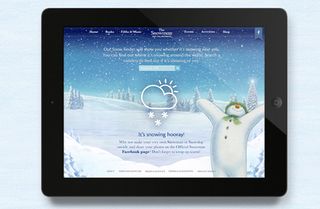
Some other recent projects we're particularly proud of include our work for Penguin Books on re-designing The Snowman website, not just for the challenge of designing such a visually rich site but for the chance to work with a brand that's a household name.
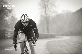
We also launched a website for retired Olympic track cyclist Sir Chris Hoy, the most decorated Brit in Olympic history. Although the site's content was very simple, we built in some new web techniques and animated parts that gave life and depth to an otherwise very static, plain site.

Thank you for reading 5 articles this month* Join now for unlimited access
Enjoy your first month for just £1 / $1 / €1
*Read 5 free articles per month without a subscription

Join now for unlimited access
Try first month for just £1 / $1 / €1
Get the Creative Bloq Newsletter
Daily design news, reviews, how-tos and more, as picked by the editors.
Tanya is a writer covering art, design, and visual effects. She has 16 years of experience as a magazine journalist and has written for numerous publications including ImagineFX, 3D World, 3D Artist, Computer Arts, net magazine, and Creative Bloq. For Creative Bloq, she mostly writes about digital art and VFX.


