8 of the most innovative web redesigns ever
Change is good! We check out at eight websites that have received smart and sometimes surprising new looks.
Successful redesigns aren't about bringing a site up to date by shoehorning in trendy design elements. Flat design, parallax scrolling and reams of SVG illustrations might rescue a site from being visually passé, but the very best redesigns introduce whole news ways of interacting with a site's content. Here we select our favourite eight redesigns that take previously outmoded, archaic web content and reinvent it in new, smart and often unique ways that dazzle and surprise.
01. GOV.UK
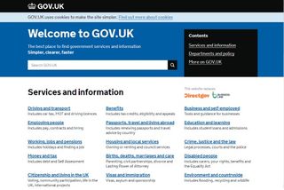
The UK government's redesigned website was named the Design Museum London's Design of the Year 2013, and for good reason. Gov.uk was created by an in-house Cabinet Office team led by designer Ben Terrett, and was tasked with incorporating thousands of existing and disparate governmental web pages into a single, unified site. It was a huge task, but one that was realized quite brilliantly in the clean and logical ordering of vital information made readily accessible for the millions of people who use the service daily.
02. Target
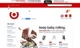
Target is the behemoth of the US retail sector that took a heck of a public pounding when it redesigned its main commerce site earlier this year. It's messy and overflowing, the design public said, and - shock horror - deployed drop shadows. Deserving criticism we say, because the 2011 redesign it replaced (produced by more than 20 contributing agencies, including Huge and SapientNitro) was a lesson in clean, understated UX that put the customer journey at the forefront of its retail experience, unifying what was a disparate, near Amazon-like, list of products to eleven core 'shopping aisles'.
03. Boston Globe
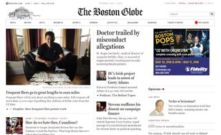
Okay, so let's talk responsive. And let's look at the first big media platform that embraced responsive design: The Boston Globe. The Globe's in-house editorial and design team together with the consultants at Filament Group and digital agency Upstatement produced the site redesign in September 2011, solving the publisher's need to work on multiple screens at multiple resolutions. Yes there were thousands of designer and blog examples of responsive design - but The Globe's was the first to put so much information into a responsive framework.
04. CNN

When CNN considered a redesign at the beginning of 2013 it did so on two cornerstone facts: it had to 'fit' news produced by more than 20 different media outlets and nine different editions in six languages into a single site; and that more than 40 percent of that site's traffic would be from mobile devices. The answer was to strip its editorial branding away almost entirely by introducing larger photos to anchor stories, and create a richly responsive site with mobile-first features such as story tagging and live updates.
05. USA Today

When one of the United States' biggest news brands redesigns its imprint, it takes months to wash through every nook and cranny of the previous output - from printed mastheads to mobile, desktop and other formats. Striving for uniformity, Fantasy Interactive approached usatoday.com with a simple edict: redesign and re-architect the entire digital experience using only two layers: the category landing pages and the article page itself. Amazingly it worked, and begat one of the purest, cleanest news sources on the web.
06. HMV
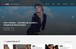
The mark of a great site redesign isn't so how much far it departs from a previous look and feel; but what new direction it can take its audience. HMV.co.uk was in the wilderness until Code ComputerLove in late 2013. The team introduced an editorially-led approach, cleaning up the previous storefront site and introducing a more social feel with band info, news, and other native content, as well as downloads and offers. It might be struggling in the high street, but HMC.co.uk rocks online.
Get the Creative Bloq Newsletter
Daily design news, reviews, how-tos and more, as picked by the editors.
07. MySpace
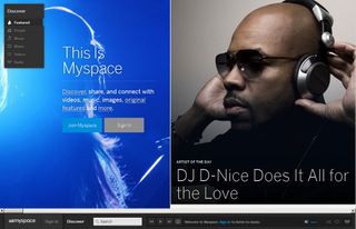
Remember MySpace? A wasteland of design wasn't it? Not so much now, as this fledgling social network relaunched last year with a sophisticated, intelligent and intimate redesign and knock-out horizontal parallax scrolling. Gone is the mess of a 'wall' postings, and now clean, clear typography, lack of page clutter and a cleaner approach to displaying content makes the new MySpace, well - possibly the prettiest social media platform around even if it's not the biggest.
08. Tech Crunch

Tech Crunch is no longer 'just' a technology news site. Like all media publishers, the brand now encompasses events, products, apps and more - and central to that is a unified branding proposition. This is the point Daniel Mall, who together with designer Brad Frost, UX expert Jennifer Brook, mobile guru Jonathan Stark, and famed developer Josh Clark started from for Tech Crunch's 2013 redesign. The result is a site that's recognizable by its branding before any content emerges, and a centralized content hub that feels familiar whether you're viewing it on a desktop or mobile device.
Words: Tom Dennis

Thank you for reading 5 articles this month* Join now for unlimited access
Enjoy your first month for just £1 / $1 / €1
*Read 5 free articles per month without a subscription

Join now for unlimited access
Try first month for just £1 / $1 / €1
The Creative Bloq team is made up of a group of design fans, and has changed and evolved since Creative Bloq began back in 2012. The current website team consists of eight full-time members of staff: Editor Georgia Coggan, Deputy Editor Rosie Hilder, Ecommerce Editor Beren Neale, Senior News Editor Daniel Piper, Editor, Digital Art and 3D Ian Dean, Tech Reviews Editor Erlingur Einarsson, Ecommerce Writer Beth Nicholls and Staff Writer Natalie Fear, as well as a roster of freelancers from around the world. The ImagineFX magazine team also pitch in, ensuring that content from leading digital art publication ImagineFX is represented on Creative Bloq.
