7 common mistakes in UX portfolios
Here's what not to do when creating a UX portfolio.
Design managers want to like your portfolio. They want to be impressed by your work, your process, your skills. But they can't do this unless you let them.
After consulting with CEOs, chief product officers, and UX designers, we've compiled the following list of what not to do. Here are seven mistakes to avoid the next time you're brushing up your UX portfolio.
01. Only focusing on visual displays
UX designers are not graphic designers. The UX skillset is a bit more abstract, existing more between the lines of psychology and design. Therefore, showing only the final visual product just barely scratches the surface.
As our team of designers at UXPin can all attest to, businesses want to see how you solve problems. This, of course, requires more explanation than just a slideshow of hero images.
The Solution
The best way to show problem solving is through case studies. UX designers should always include case studies in their portfolios — there's no better way to illustrate what advantage they can bring to a company.
Case studies can vary in how descriptive they are, but they should always hit the following marks:
Get the Creative Bloq Newsletter
Daily design news, reviews, how-tos and more, as picked by the editors.
- Problem — What problem was the product team tasked with solving?
- Solution — How did they solve it (explaining the process — see #3)
- Collaboration — Who did you work with, and how did you help facilitate the UX design process?
- Personalization — How was the solution personalized to the specific needs of the company?
- Results — How well did the solution perform?
When discussing the results, focus on the metrics that matter. Don't just talk about vanity metrics like pageviews or vague terms like "engagement". Explain the impact on the bottom line by discussing conversion or sales improvements (or related metrics like customer retention).
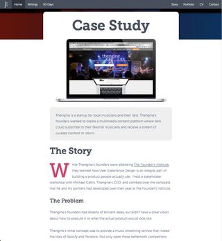
John Elison writes up detailed case studies for his portfolio, and partitions them into sections like The Problem, The Goal, The Team, and The Outcome. He fleshes out his case studies with screenshots and design documentation, and outlines each step of the process.
The entire study is presented as if he were telling a story — another demonstration of his UX skill.
02. Targeting a broad range
Narrow down your target to the industries and fields most likely to hire you, and tailor your site to them. Honing in on a specific type of job will specialize your portfolio, and make it easier to create.
The Solution
Even if you don't specialize in a certain industry, you should always categorize your work by industry. At a quick glance, hiring managers can see the breadth of experience and drill down if they like.
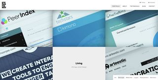
Stef Ivanov organizes his work into categories, like 'startup' above. This lets the right people see only the projects relevant to them.
03. Not describing the process
In many ways, the UX designer's process is their true skillset.Their techniques and problem-solving skills are the tools of the trade.
Documenting every project is a good habit, and comes in handy for portfolio. Including deliverables like sketches, mockups, wireframes, and prototypes demonstrate your value more than obsessing pixel-perfection.
The Solution
As explained in the free guide Web UI Design Best Practices, be specific about your explanations, and even break them out into steps.
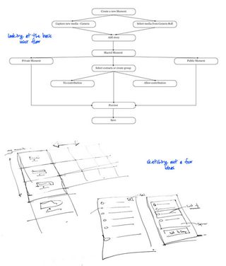
The British UX designer Anthony Anderson shows his process in a visually pleasing and informative manner. He lets the images do the talking, presenting documentation like user flows, sketches, wireframes, etc. along with concise annotations.
04. Not telling the whole truth about your role
All day every day, hiring managers hear from candidates who will say anything to get the job. The decision-makers in who gets the job are not as oblivious as you may think. Dishonest candidates never get very far.
The decision-makers are almost always familiar with the standard design process, and know the traditional roles. If a UX designer claims responsibility for another team-member's role, this raises a flag.
The Solution
You won't find any shortcuts here. Just be honest about your role. Giving credit to others when appropriate makes you look like a much stronger design facilitator.
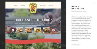
Not only does Cody James Sielawa state first and foremost what his role was (and therefore, wasn't) on a project, he also candidly discusses others' roles in the description. Ethics aside, this transparency adds credibility to his work.
05. Drowning out your best work
Because hiring managers are looking through portfolios all day (or at the end of the day, if they're also managing a UX team), they probably won't read yours front-to-back. Chances are they'll skim through it and only focus on 1 or 2 projects.
A common mistake for UX portfolios is drowning out the best work with lesser work. A good UX portfolio has only the best, and nothing more. It is lean and concise, and doesn't burden hiring managers.
The Solution
The real reason to only include your best work is that it's the only way to get seen.
If the decision-makers are skimming through your portfolio, every lesser piece you include decreases their chances of seeing your greatest work. Your great work might even seem less impressive by association.
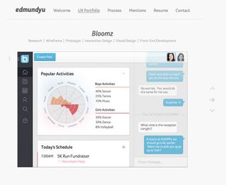
Edmund Yu keeps it short and sweet, with only 3 projects in his portfolio section.
The three extraordinary examples demonstrate his skill, and the brevity also channels traffic on his portfolio into other meaningful areas, like this thorough Process description and his quite impressive testimonials pages.
06. Seeing NDAs as dead ends
All the time, designers complain about how they can't use their best work because of non-disclosure agreements. While you should never break your NDAs, there are workarounds that let you display your work without violating confidentiality.
The Solution
- Ask for permission – If you tell the company you just want to use it for a portfolio, they may allow it — especially if you offer to remove any sensitive details.
- Hide sensitive information – On a related note, try blacking out or blurring parts of an image or document that might cause problems. Those reading your portfolio are looking at the big picture, not every single detail.
- Clever photo angles – If you're photographing the process, such as sketches or white boards, use an angle that shows the meaning without the specifics.
- Written account – When all else fails, simply describe the experience without visual aids. While images are best, a written account is better than nothing and still explains the UX process.
If your hands are tied (or you're just starting out), you can create a project specifically for your portfolio in your spare times. That way, you own all the rights, and can showcase your best qualities.
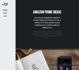
UX designer Simon Pan doesn't try to hide anything — he flat-out mentions his NDA and how he modified his description to include it in the portfolio. This kind of openness resonates with hiring managers. everyone in the industry respects how NDAs work.
07. Too much formality
This is a portfolio, not a court hearing. While you don't want to jump right into too many presonal stories, showing a little personality can actually help you get the job.
The Solution
Effective portfolios will sometimes offer up personal details about the designer to humanize them. Small but interesting traits, such as "I own 2 rescue cats", help you stand out in the hiring manager's mind. When you're up against 100s of candidates, personality certainly helps.
Connect the dots between your personal and professional interests. Talk about the personal reasons you got into UX design. What you like best about it, how you first showed interest, any shocking situations that happened on projects (and what you learned) — these stories paint you as a perceptive and driven designer.
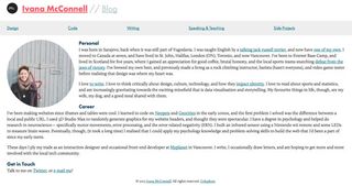
MyPlanet interaction designer Ivana McConnell strikes a nice balance between personality and professionalism. Your portfolio site doesn't need to get clever with parallax backgrounds and animations. It just needs to communicate as clearly as possible.
Don't underestimate the value of a simple biography that categorizes your personal and professional experiences. In the above example, notice how she connects her personal and professional life by explaining how her love of critical thinking and writing lead to a passion for design.
Conclusion
Getting the job the just the beginning. Your portfolio means nothing if the work inside it is bare or lackluster.
Craft your story the same way you would design a product. Appeal to logic by showcasing your abilities, then connect emotionally by describing your interests and background.
If you found this post helpful, check out the free e-book UX Design 2015 & 2016. Based on analyzing 71 successful digital products, the guide explains the most recent UX techniques designers should know to get ahead.
Jerry Cao is a content strategist at UXPin — the wireframing and prototyping app — where he develops in-app and online content for the wireframing and prototyping platform.
Like this? Read these!
- 10 UX portfolios done right
- 9 tips for creating your UX portfolio
- Web design training: The top online resources

Thank you for reading 5 articles this month* Join now for unlimited access
Enjoy your first month for just £1 / $1 / €1
*Read 5 free articles per month without a subscription

Join now for unlimited access
Try first month for just £1 / $1 / €1
The Creative Bloq team is made up of a group of design fans, and has changed and evolved since Creative Bloq began back in 2012. The current website team consists of eight full-time members of staff: Editor Georgia Coggan, Deputy Editor Rosie Hilder, Ecommerce Editor Beren Neale, Senior News Editor Daniel Piper, Editor, Digital Art and 3D Ian Dean, Tech Reviews Editor Erlingur Einarsson, Ecommerce Writer Beth Nicholls and Staff Writer Natalie Fear, as well as a roster of freelancers from around the world. The ImagineFX magazine team also pitch in, ensuring that content from leading digital art publication ImagineFX is represented on Creative Bloq.
