6 questions every homepage should answer
Egle Karalyte of My Visual Brief provides a handy checklist to make your website visitors stay longer.
However visitors arrive on your website, and whatever page they land on, they're usually going to make their way to the homepage to find out what it's all about.
So the homepage page needs to introduce your product or service in a way that leaves no hesitation.
It should entice visitors to explore your website further. And it should do it quickly – we're talking a couple of seconds. That's the amount of time we have to create a good first impression.
Learning from experience
But what type of information should the homepage provide? We at InfinVision have designed quite a few websites for our clients since 2008 and have learned some good lessons since the launch of My Visual Brief, a design briefing tool for graphic and web designers.
Drawing on those experiences, I'd like to share with you the six most common questions people ask themselves when visiting a homepage for the first time.
01. What is this? What does it offer?
The first question people ask themselves when they come to a new website is a simple one: 'What is this?' They want to understand clearly what the website offers or what the brand presents is all about. Here are a few good examples of how some websites answer this question.
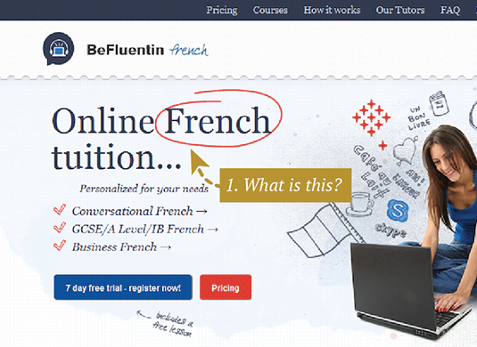
Befluentin highlights in oversized font size the type of service it provides. It even circles the language, 'French', so it is super clear for visitors to know what's on offer.
MyVisualBrief, meanwhile, clearly communicates the task that it helps its users to achieve: "Create a design brief quickly & visually".
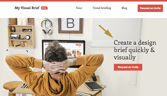
This sets the context for the visitors simply and concisely, and the clean, uncluttered layout draws the eye to the main message instantly.
02. Who is it for?
The next thing people want to be assured of is whether your product or service is truly for them. In other words, they ask themselves: 'Who is this website for?' Here are a few good examples of how you could answer this question.
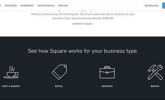
Squareup has segmented their audience on the homepage and with the help of nice icons, invites them to discover how the service could work for them.
Mobify addresses multiple audiences and communicates with each of them separately. This is a tricky design challenge and Mobify has solved it through a drop-down menu.
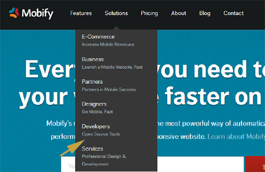
Note the subtitles. They communicate the benefit to each audience to make things instantly clear.
03. How much does it cost?
If you managed to keep your visitor's attention this far, the next thing they will want to know is how much your product or service costs. (If discussing pricing in your case is not relevant, skip this step.)
You could either highlight this information directly on the homepage or clearly show where they could find this information. Here are some good examples of how to show your pricing:
As part of the redesign process for our client Fotolia, we highlighted the pricing on the homepage, as this is one of their key differentiators in the stock photography market.
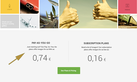
In contrast, Befluentin already has a lot of content on their homepage and adding pricing here would have been overcrowding the site. So in their case, we suggested to just have a pricing button that leads the visitor to the pricing page.
04. How does it work?
Once you've convinced your visitor that your brand is for them, the next thing they'll want to understand is how your service works.
From the design perspective, it's challenging to answer this question right on the homepage because we don’t want to overcrowd it with too many things, overwhelm the visitor and thus scare him/her away.
Let's look at a few effective examples…
Mint, a money management tool, highlights their 'how it works' information right on the homepage.
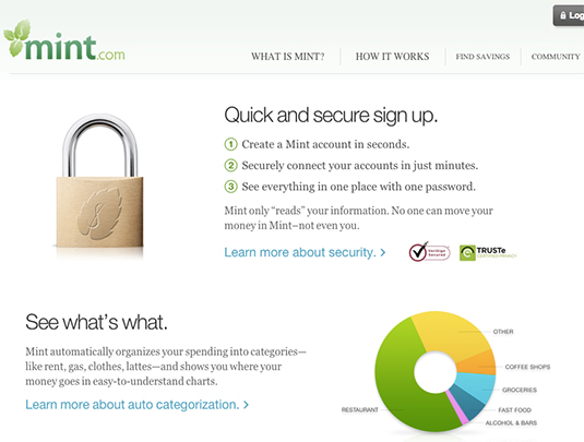
This ensures that the most important question their visitors ask themselves (as it relates to their money) is answered straight away without any further clicks. Visitors can also go to the dedicated 'how it works' page via the header.
oDesk, meanwhile, shows a 'how it works' button clearly visible on their homepage.
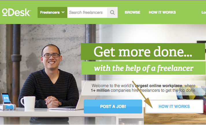
This is a secondary action button in comparison with the "post a job" button, which is a primary action. The design helps to reinforce this distinction.
05. Why should I trust this? Why is this credible?
We are always more comfortable and reassured with a particular product or service when we see proof that other people have actually found it useful or enjoyable. So your homepage should reassure your visitors that your company knows what it is doing and that they can fully trust you. To achieve this, there are a few techniques. Let's look into a few.
The most common one is to show testimonials on your website.
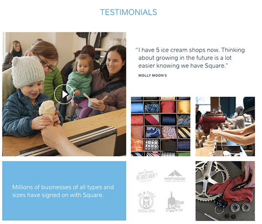
The Squareup website has a nice collage of images, a design choice that gives even more importance to the testimonials section.
My Visual Brief shows another example of how to display customer testimonials.
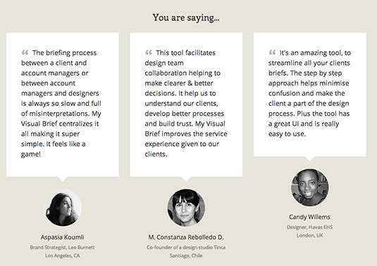
Note that using people's photos can make it 'more real' and more believable than faceless quotes that may put into question your credibility.
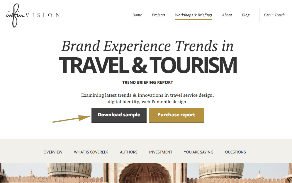
Giving out free information or samples is also a good way to let people test-drive your service without commitment. This is especially important if you sell a digital information product like a report.
People can download a sample report on InfinVision website as a sneak peek into the complete trend briefing report.
Your blog can also serve as a way to build trust with your visitors, reinforce your credibility and engage your audience. For example, Trust & Travel highlights the featured article from their blog right on the homepage.
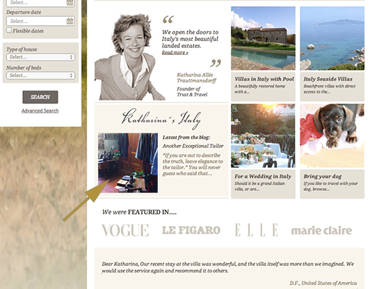
This showcases the brand's knowledge about Italy, reinforces their credibility and contributes to the ranking on search engines.
06. How to get started? What should I do next?
Now that you have convinced your visitors to choose you, they are ready to get started. Just don't forget to clearly show them what they should do next. Don't leave them confused as you will instantly lose the momentum. Make sure that your main call to action is clearly visible and attracts their attention well. Here are a few good examples:
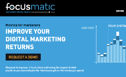
Focusmatic clearly calls us to 'request a demo' via a black button.
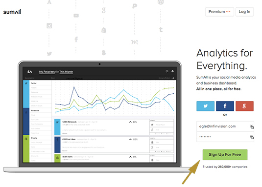
Sumall also invites us to sign up for a free trial via a simple sign up form and a green button that stands out.
Depending on your particular case, some of these questions might not be relevant and thus your homepage does not need to answer them. Treat this as short list of the most common questions people ask themselves when they visit a website for the first time and then choose to answer those questions that worry your audience the most.
Words: Egle Karalyte
Egle Karalyte is founder of My Visual Brief, a design briefing tool and InfinVision, a brand experience design consultancy.

Thank you for reading 5 articles this month* Join now for unlimited access
Enjoy your first month for just £1 / $1 / €1
*Read 5 free articles per month without a subscription

Join now for unlimited access
Try first month for just £1 / $1 / €1
Get the Creative Bloq Newsletter
Daily design news, reviews, how-tos and more, as picked by the editors.

The Creative Bloq team is made up of a group of art and design enthusiasts, and has changed and evolved since Creative Bloq began back in 2012. The current website team consists of eight full-time members of staff: Editor Georgia Coggan, Deputy Editor Rosie Hilder, Ecommerce Editor Beren Neale, Senior News Editor Daniel Piper, Editor, Digital Art and 3D Ian Dean, Tech Reviews Editor Erlingur Einarsson, Ecommerce Writer Beth Nicholls and Staff Writer Natalie Fear, as well as a roster of freelancers from around the world. The ImagineFX magazine team also pitch in, ensuring that content from leading digital art publication ImagineFX is represented on Creative Bloq.
