5 rules for visual direction in interaction design
Jerry Cao of UXPin explains how to ensure your visuals work with in harmony with user interactions.
03. Ensure visual consistency
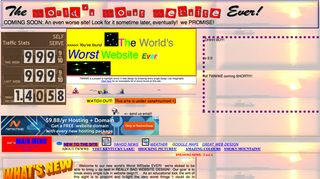
Consistency is important in all aspects of interaction design, not just visuals. However, inconsistencies in visuals are glaring (just check out the The World's Worst Website Ever to get a vision of design hell).

Consistency creates a sense of logic in how your site is designed and arranged, which creates a more gratifying experience (and we all know happy users are returning users).
People prefer consistency because, as we mentioned before, it improves predictability (which increases learnability). And when your interface is easier to learn, it's also more usable. People also don't like unpleasant surprises, as the Principle of Least Astonishment states:
The trouble with inconsistency is that it increases the "cognitive load." As Kathryn Whitenton, UX Specialist at the Nielson Norman Group, explains in a blog post on the topic, cognitive load is how much the users have to think when using a product.
Consistency creates a sense of logic in how your site is designed and arranged
Every inconsistency forces the user to stop and process what the difference means, why it's different, and how it affects their behavior. Therefore, the less inconsistencies, the smoother the interactions, and the better the experience. Inconsistencies can appear almost anywhere: Michael Zuschlag at UX Matters has a useful chart.
For instance, radio buttons in one section of an interface that allow for a single selection shouldn't allow multiple selections in other sections. This extends to copy as well, since if you call it "Save" in one section, you shouldn't call it "Store" in another. And if a picture opens up as a lightbox, it shouldn't open as a new tab elsewhere. Always ask yourself, 'How do I want the user to act?'
04. Use UI design patterns as a baseline
Think of UI patterns as design best practices that are specific to use cases. Since users are already familiar with design patterns, their use reduces the learning curve for your interface. Common UI patterns include carousels, related links, slideshows…the list goes on (as you can see by this site dedicated to cataloging them).
Get the Creative Bloq Newsletter
Daily design news, reviews, how-tos and more, as picked by the editors.

For instance, Netflix employs a "Related Content" UI pattern to help users find other movies or shows they might like. Because the content is intelligently generated, the interaction with the user feels more like a person suggesting something helpful. This isn't a groundbreaking design, but it is a quick and effective solution that makes your interface feel alive.
Of course, UI patterns aren't just plug-and-play templates, so you should still customize them based on the look and feel of your site.
To find the right patterns for your product, check out any number of pattern libraries, where you can browse patterns by their category, like "navigation" or "input." This year, we have released 2 separate catalogues of UI patterns (along with analysis of use cases as demonstrated by Fortune 500 companies): Web UI Design Patterns 2014 and Mobile UI Design Patterns 2014.
05. Create consistency through style guides
While UI patterns help improve familiarity, style guides ensure site-wide consistency.
Style guides are manuals that list your product's specific preferences for any area that could be hard to remember — things like the size and font for all site content, colour gradients for secondary versus primary navigation, the behavior of buttons upon clicking, etc.

At UXPin, we create our style guides as we update our site. This helps eliminate extra work down the line because we can just add new screenshots with technical details to our internal company wiki. As we described in The Guide to Mockups, this "chop and paste" method works perfectly for lean style guides that can be shared with the whole company.
We discuss style guides at length in our Web UI Design Best Practices, including how to make one, and what they include. For more examples of style guides, check out these great resources:
To learn more about consistency in interaction design, check out this overview of creating consistency in all areas of UX and this explanation of system, platform, and real-world consistency.
Takeaways
When people are online, they say they're "looking" at a website, not "interacting" with one, even though the latter is more accurate. We rely heavily on sight, and visuals guide us in the creation of our opinions, our solutions to problems, and what we believe is our best course of action. Because interaction design is so closely linked to the user experience, using visuals to create the best UX will indirectly but assuredly lead to better interactions.
To learn more, download the free e-book Interaction Design Best Practices: Words, Visuals, Space. Visual case studies are included from 30+ companies including Google, AirBnB, Facebook, Yahoo. Expert advice is included from Stephen P. Anderson, Jared Spool, and more.
Words: Jerry Cao
Jerry Cao is a content strategist at UXPin — the wireframing and prototyping app — where he develops in-app and online content for the wireframing and prototyping platform. To learn how to use mockups of all types and fidelities, check out The Guide to Mockups.
Like this? Read these!
- Create an app prototype with Pixate
- How to build an app: try these great tutorials
- Free graphic design software available to you right now!

Thank you for reading 5 articles this month* Join now for unlimited access
Enjoy your first month for just £1 / $1 / €1
*Read 5 free articles per month without a subscription

Join now for unlimited access
Try first month for just £1 / $1 / €1
The Creative Bloq team is made up of a group of design fans, and has changed and evolved since Creative Bloq began back in 2012. The current website team consists of eight full-time members of staff: Editor Georgia Coggan, Deputy Editor Rosie Hilder, Ecommerce Editor Beren Neale, Senior News Editor Daniel Piper, Editor, Digital Art and 3D Ian Dean, Tech Reviews Editor Erlingur Einarsson and Ecommerce Writer Beth Nicholls and Staff Writer Natalie Fear, as well as a roster of freelancers from around the world. The 3D World and ImagineFX magazine teams also pitch in, ensuring that content from 3D World and ImagineFX is represented on Creative Bloq.
